XCHART Statement: SHEWHART Procedure
Note: See Mean (X-BAR) Chart Examples in the SAS/QC Sample Library.
In the previous example, the OUTLIMITS= data set Gaplim saved control limits computed from the measurements in Partgaps. This example shows how these limits can be applied to new data provided in the following data set:
data gaps2;
   input Sample @;
   do i=1 to 5;
      input Partgap @;
      output;
   end;
   drop i;
   datalines;
22 287 265 248 263 271
23 267 253 285 251 271
24 249 252 277 269 241
25 243 248 263 282 261
26 287 266 256 278 242
27 251 262 243 274 245
28 256 245 244 243 272
29 262 247 252 277 266
30 244 269 263 278 261
31 245 264 246 242 273
32 272 257 277 265 241
33 251 249 240 260 261
34 289 277 275 273 261
35 267 286 275 261 272
36 266 256 247 255 241
37 291 267 267 252 262
38 258 245 264 245 281
39 277 267 241 272 244
40 252 267 272 245 252
41 243 241 245 263 248
;
The following statements create an ![]() chart for the data in GAPS2 using the control limits in
chart for the data in GAPS2 using the control limits in Gaplim:
ods graphics on;
title 'Mean Chart for Gap Widths';
proc shewhart data=gaps2 limits=Gaplim;
   xchart Partgap*Sample / odstitle=title;
run;
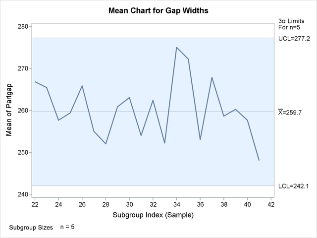
The ODS GRAPHICS ON statement specified before the PROC SHEWHART statement enables ODS Graphics, so the ![]() chart is created using ODS Graphics instead of traditional graphics. The chart is shown in Figure 17.103.
chart is created using ODS Graphics instead of traditional graphics. The chart is shown in Figure 17.103.
The LIMITS= option in the PROC SHEWHART statement specifies the data set containing the control limits. By default, this information is read from the first observation in the LIMITS= data set for which
-
the value of
_VAR_matches the process namePartgap -
the value of
_SUBGRP_matches the subgroup-variable nameSample
The chart indicates that the process is in control, since all the means lie within the control limits.
In this example, the LIMITS= data set was created in a previous run of the SHEWHART procedure. You can also create a LIMITS= data set with the DATA step. See LIMITS= Data Set for details concerning the variables that you must provide.

