Details: MVPMONITOR Procedure
Computation of  Control Limits
The control limits for the chart are the same for all of the statistics on the chart. The control limits are computed using the method of Tracy, Young, and Mason (1992), in which the distribution of the statistic is shown to follow a scaled beta distribution:
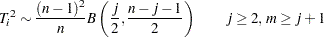 |
Here,  denotes the observation,
  denotes the number of principal components in the model, and
  denotes the number of observations.
The upper control limit is computed as the  quantile of this distribution, and the lower control limit is computed by the
  quantile. You can use the ALPHA= option in the TSQUARECHART statement to specify the
  .
.
Computation of SPE Control Limits
The SPE chart plots the sum of squares of the residuals from the principal components model. If either  or the data matrix has rank less than
  , then the SPE statistic is not defined and an SPE chart is not produced. The SPE statistic for observation is denoted
 |
where is the number of variables and  is the
  th observation for the
  th variable in the error matrix,
  , in the principal components model
 |
The distribution of  has been approximated in the literature under different conditions. Two methods for computing control limits for are implemented by the MVPMONITOR procedure. One method is used when the data used to build the principal components model consists of a single measurement per time point. The other method applies when there are multiple measurements per time point (Jensen and Solomon; 1972; Nomikos and MacGregor; 1995).
One Observation per Time Point
When there is a single observation at each time point, the data matrix  is
is  , with exactly one observation at each time point in either the DATA= or HISTORY= data set. The derivation of the control limits uses the central limit theorem approach of Jensen and Solomon (1972). They begin by defining
 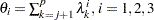 , where
  is the th eigenvalue from the principal components model.
Then the quantity
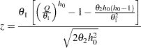 |
is distributed  as
as  , where
  is defined as
  . The upper control limit for all is then computed by
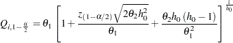 |
where  is the percentile of the standard normal distribution. The lower control limit is obtained similarly using . You can specify with the ALPHA= option in the SPECHART statement.
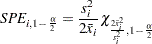
Multiple Observations per Time Point
When there are multiple observations at each time period in the DATA= data set to PROC MVPMODEL, a different approximation of the SPE distribution is used to compute control limits. The approximate distribution at time is the scaled chi-squared distribution:
 |
where  and
and  are the mean and variance of the SPE statistics at time . The upper control limit for all observations at time point is computed as the percentile of the scaled chi-squared distribution:
 |
Similarly the lower control limit is computed from the percentile. You can specify with the ALPHA= option in the SPECHART statement.
In this experimental version of PROC MVPMONITOR, it is not possible to create an SPE chart for multiple observations per time point in a Phase II analysis. For additional details concerning the distribution approximations, refer to Nomikos and MacGregor (1995) and Jackson and Mudholkar (1979).
Contribution Plots
One way to diagnose the behavior of out-of-control points in multivariate charts is with contribution plots (Miller, Swanson, and Heckler; 1998). These plots tell you which variables contribute to the distance between the points in a score, SPE, or chart and the sample mean of the data.
A contribution plot is a bar chart of the contributions of the process variables to the statistic. For the th SPE statistic, the contribution of the th variable is the th entry of the vector  , which is computed as
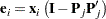 |
Here is the vector of errors from the principal components model for observation and  is the th observation. The contributions to the th statistic are computed similarly as the entries of the vector
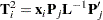 |
where  is the matrix of the first eigenvectors and
  is the diagonal matrix of the first eigenvalues.
Note: This procedure is experimental.