| The SHEWHART Procedure |
Constructing Charts for Means and Ranges
The following notation is used in this section:
|
process mean (expected value of the population of measurements) |
|
process standard deviation (standard deviation of the population of measurements) |
|
mean of measurements in |
|
range of measurements in |
|
sample size of |
|
number of subgroups |
|
weighted average of subgroup means |
|
expected value of the range of |
|
standard error of the range of |
|
|
|
|


 independent normally distributed variables with unit standard deviation

 th percentile of the standard normal distribution
Plotted Points
Each point on the  chart indicates the value of a subgroup mean (
 ). For example, if the tenth subgroup contains the values 12, 15, 19, 16, and 14, the mean plotted for this subgroup is
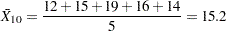 |
Each point on the  chart indicates the value of a subgroup range (
 ). For example, the range plotted for the tenth subgroup is
 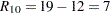 .
.
Central Lines
On an chart, by default, the central line indicates an estimate of  , which is computed as
 |
If you specify a known value ( ) for , the central line indicates the value of .
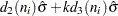
On an chart, by default, the central line for the  th subgroup indicates an estimate for the expected value of , which is computed as
  , where
  is an estimate of
  . If you specify a known value (
 ) for , the central line indicates the value of
  . Note that the central line varies with
  .
.
Control Limits
You can compute the limits in the following ways:
as a specified multiple (
 ) of the standard errors of
  and above and below the central line. The default limits are computed with
  (these are referred to as
  limits).
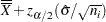
 as probability limits defined in terms of
 , a specified probability that or exceeds the limits
The following table provides the formulas for the limits.
Control Limits |
|
|---|---|
|
LCL |
UCL |
|
|
LCL |
UCL |
|
Probability Limits |
|
|
LCL |
UCL |
|
|
LCL |
UCL |
|
 lower limit =


The formulas for charts assume that the data are normally distributed. If standard values and are available for and , respectively, replace  with and with in Table 13.71. Note that the limits vary with and that the probability limits for are asymmetric around the central line.
You can specify parameters for the limits as follows:
Specify
with the SIGMAS= option or with the variable _SIGMAS_ in a LIMITS= data set. Specify
with the ALPHA= option or with the variable _ALPHA_ in a LIMITS= data set. Specify a constant nominal sample size
 for the control limits with the LIMITN= option or with the variable _LIMITN_ in a LIMITS= data set.
 Specify
with the MU0= option or with the variable _MEAN_ in a LIMITS= data set. Specify
with the SIGMA0= option or with the variable _STDDEV_ in a LIMITS= data set.
Copyright © SAS Institute, Inc. All Rights Reserved.