Statistical Graphics
You can use the SERIES subroutine to create a series plot, which is also known as a line plot. The subroutine requires two vector arguments: values for the X variable and values for the Y variable.
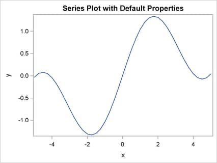
The following statements provide a simple example of creating a series plot. The PDF function evaluates the normal density
function at evenly spaced points in the interval ![]() . The SERIES subroutine creates the graph that is shown in Figure 15.10.
. The SERIES subroutine creates the graph that is shown in Figure 15.10.
proc iml;
x = do(-5, 5, 0.1);
y1 = pdf("Normal", x, 0, 1);

title "Series Plot with Default Properties";
run Series(x, y1);
For a more complicated example, the following statements create a series plot by using the GROUP=, OTHER=, GRID=, LABEL=, XVALUES=, and YVALUES= options. The result is shown in Figure 15.11.
title "Series Plot with Groups and Reference Lines";
y2 = pdf("Normal", x, 0, 1.5);
g = repeat({1,2}, 1, ncol(x));   /* 1,1,1,...,2,2,2 */
x = x  || x ;
y = y1 || y2;

call Series(x, y) group=g                 /* assign color/marker shape */
                 other="refline -2 2 / axis=x"   /* add reference line */
                 grid={X Y}
                 label={"X" "Normal Density"}
                 xvalues=-4:4
                 yvalues=do(0,0.4,0.05);
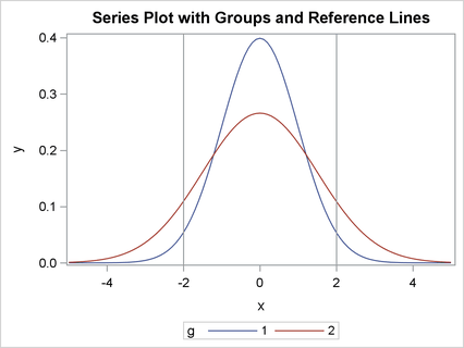
The following list explains the options that are used to create Figure 15.11:
-
The GROUP= option specifies a vector of values that determine groups in the plot. In Figure 15.11, the two curves have different values of the grouping variable, which is set by using the
gmatrix. -
The OTHER= option specifies statements in the SGPLOT procedure. In Figure 15.11, the REFLINE statement draws two horizontal lines on the plot.
-
The GRID= option specifies whether grid lines are displayed for the X and Y axes. Figure 15.11 shows grid lines for the Y axis.
-
The LABEL= option specifies axis labels for the X and Y axes. In Figure 15.11, both axes are labeled.
-
The XVALUES= option specifies a vector of values for ticks for the X axis. In Figure 15.11, the tick marks on the horizontal axis are spaced one unit apart in the interval
![$[-4, 4]$](images/imlug_graphics0005.png) .
.
-
The YVALUES= option specifies a vector of values for ticks for the Y axis. In Figure 15.11, the tick marks on the vertical axis are spaced 0.05 units apart in the interval
![$[0, 0.4]$](images/imlug_graphics0006.png) .
.