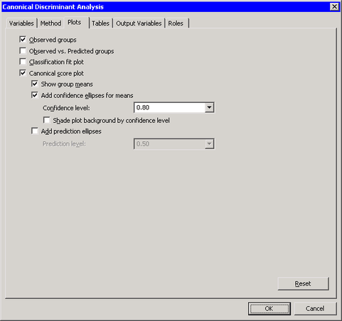
| The Plots Tab |
You can use the Plots tab to create plots that graphically display results of the analysis. (See Figure 29.10.)
Creating a plot often adds one or more variables to the data table. The following plots are available:
- Observed groups
creates a spine plot (a one-dimensional mosaic plot) of the groups for the Y variable.- Observed vs. Predicted groups
creates a mosaic plot of the groups for the Y variable versus the group as classified by a discriminant function. Each observation is placed in the group that minimizes the generalized squared distance between the observation and the group mean.- Classification fit plot
-
creates a plot that indicates how well each observation is classified by the discriminant function. This plot is shown in Figure 29.11. Observations that are close to two or more group means are selected in the plot.For each observation, PROC DISCRIM computes posterior probabilities for membership in each group. Let
 be the maximum posterior probability for the
  th observation. The classification fit plot is a plot of
  versus . Figure 29.11 A Classification Fit Plot
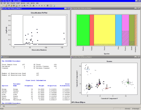
- Canonical score plot
-
creates a plot of the first two canonical variables. (If there is only one canonical variable, then a histogram of that variable is created instead.)- Show group means
displays the mean of each group in the score plot.- Add confidence ellipses for means
-
displays a confidence ellipse for the mean of each group in the score plot.- Confidence level
specifies the probability level for the confidence ellipse.- Shade plot background by confidence level
specifies that the background of each scatter plot be shaded according to a nested family of confidence ellipses.
- Add prediction ellipses
-
displays a prediction ellipse for the mean of each group in the score plot, assuming multivariate normality within each group.- Prediction level
specifies the probability level for the prediction ellipse.