| What Proportion of the Data Satisfies Certain Conditions? |
A CDF plot appears as the lower right plot in Figure 15.6. The CDF plot shows a graph of the empirical cumulative distribution function. You can use the CDF plot to examine relationships between data values and data proportions.
For example, Figure 15.7 graphically answers the question, "What observations are contained in the upper quintile (20%) of the data?" The selected observations show that the answer to the question is, "Data values greater than or equal to 1013 hPa." Similarly, you can ask a converse question, "What percentage of the data has values less than or equal to 1000 hPa?" The answer (0.4%) can also be obtained by interacting with the CDF plot.
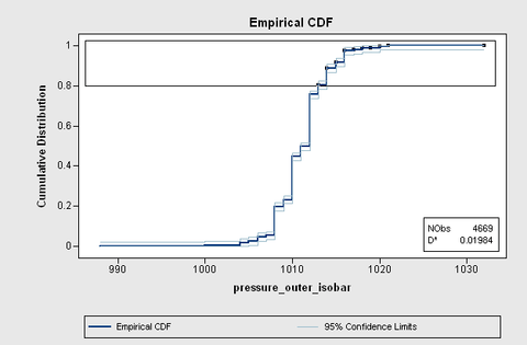
The CDF plot also shows how data are distributed. For example, the long vertical jumps in the CDF that occur at even values (1008, 1010, and 1012 hPa) indicate that there are many observations with these values. In contrast, the short vertical jumps at odd values (for example, 1009, 1011, and 1013 hPa) indicate that there are not many observations with these values. This fact is not apparent from the histogram, because the default bin width is 2 hPa.