| Exploring Data in Two Dimensions |
| Example: Create a Mosaic Plot |
In this section you create a mosaic plot of the nation and industry variables of the Business data set. The nation variable gives the nation of each business listed in the data set, and the industry variable assigns each business to a category that describes the business.
To create a mosaic plot:
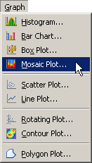
Select Graph  Mosaic Plot from the main menu, as shown in Figure 6.1.
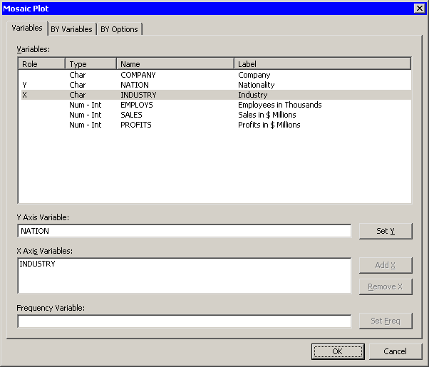
The Mosaic Plot dialog box appears. (See Figure 6.2.)
Select the nation variable, and click Set Y.
Select the industry variable, and click Add X.
Click OK.
Note:The mosaic also supports an optional frequency variable.
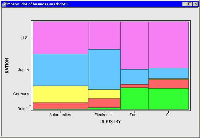
A mosaic plot appears (Figure 6.3), which shows the relative proportions of businesses in this data set as grouped by nation and industry. The mosaic plot shows that the U.S. food companies make up the largest subset, because that cell has the largest area. Other large cells include Japanese automobile companies, Japanese electronics companies, and U.S. oil companies. The plot also shows that there are no German food companies in the data set.
You can click a cell to select the observations contained in that cell. Clicking a cell also shows you the number of observations in that cell. You can click while holding down the CTRL key to select observations in multiple cells. You can draw a selection rectangle to select observations in contiguous cells.
You can create mosaic plots of any nominal variables, numeric or character. However, the variables should have a small to moderate number of levels.
The cells in this mosaic plot represent the count (number of observations) of businesses in each nation and industry. However, you might be more interested in comparing the revenue generated by these businesses. You can make this comparison by re-creating the mosaic plot and adding sales as a frequency variable.
Select Graph Mosaic Plot from the main menu.
The Mosaic Plot dialog box appears.
Select the nation variable, and click Set Y.
Select the industry variable, and click Add X.
Select the sales variable, and click Set Freq.
Click OK.
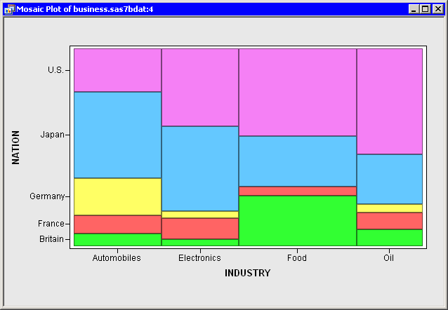
A mosaic plot appears (Figure 6.4), which shows the relative proportions of sales for each nation and industry. The mosaic plot shows that the U.S. oil companies generate the most revenue, followed by the U.S. and Japanese automobile companies. Companies from the U.S. and Japan account for over two thirds of the sales.
Similarly, if you were interested in comparing the number of employees in these businesses, you could use employees as a frequency variable. However, note that you could not compare profits in this way, because some profits are negative and the mosaic plot ignores any observation whose frequency is negative. You should also make sure that the frequency variable contains integers; noninteger values are truncated.
Copyright © SAS Institute, Inc. All Rights Reserved.