| Model Fitting: Logistic Regression |
Example: Fit a Logistic Regression Model
Neuralgia is pain that follows the path of specific nerves. Neuralgia is most common in elderly persons, but it can occur at any age. In this example, you use a logistic model to compare the effects of two test treatments and a placebo on a dichotomous response: whether or not the patient reported pain after the treatment. In particular, the example examines three explanatory variables:
Treatment, the administered treatment. This variable has three values: A and B represent the two test treatments, and P represents the placebo treatment.
Sex, the patient gender
Age, the patient’s age, in years, when treatment began
Some questions that you might ask regarding these data include the following:
Is either treatment better than the placebo at reducing neuralgia?
How does age or gender affect the results?
The following steps answer these questions:
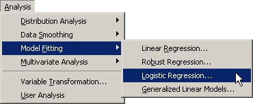
Select Analysis  Model Fitting Logistic Regression from the main menu, as shown in Figure 23.1.
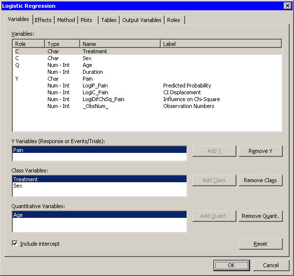
The Logistic Regression dialog box appears. (See Figure 23.2.)
You can model the probability that a patient reports no pain after treatment in order to determine whether the treatments are effective.
Select Pain, and click Add Y.
The Treatment and Sex variables are both classification variables, whereas Age is a quantitative (that is, interval) variable.
Select Treatment. While holding down the CTRL key, select Sex. Click Add Class.
Select Age, and click Add Quant.
Note:Alternatively, you can double-click a variable to automatically add it as an explanatory variable. Nominal variables are automatically added as classification variables; interval variables are automatically added as quantitative variables.
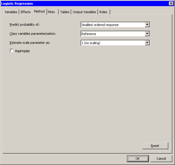
Click the Method tab.
The Method tab becomes active, as shown in Figure 23.3. You can use this tab to set options for the analysis.
The first option on this tab specifies whether the analysis predicts the probability of the smallest ordered response. The responses for this example are "Yes" and "No." Since "No" precedes "Yes" in alphabetical ordering, the smaller ordered response is "No." This example predicts the probability that a patient will report no pain.
This example includes data for a placebo treatment. It is easier to interpret the parameters of the model if you choose a reference parameterization for the coding of the classification variable. (For further details on parameterizations, see the section "CLASS Variable Parameterization" in the "Details" section of the documentation for the LOGISTIC procedure.)
Select Reference for the Classification variables parameterization option.
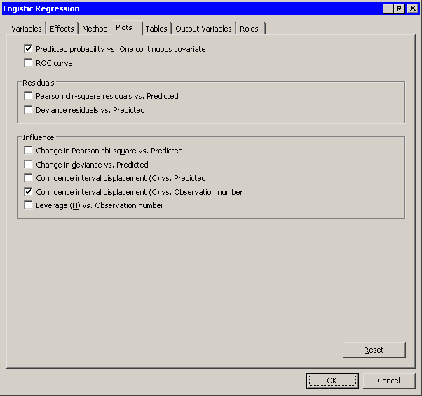
Click the Plots tab.
The Plots tab becomes active, as shown in Figure 23.4. This tab controls which graphs are produced by the analysis.
By default, the analysis creates three plots.
Clear Change in Pearson chi-square residuals vs. Predicted to reduce the number of plots that the analysis creates.
Click OK.
Two plots appear, along with output from the LOGISTIC procedure. One plot might be hidden beneath the other. Move the plots so that they are arranged as in Figure 23.5.
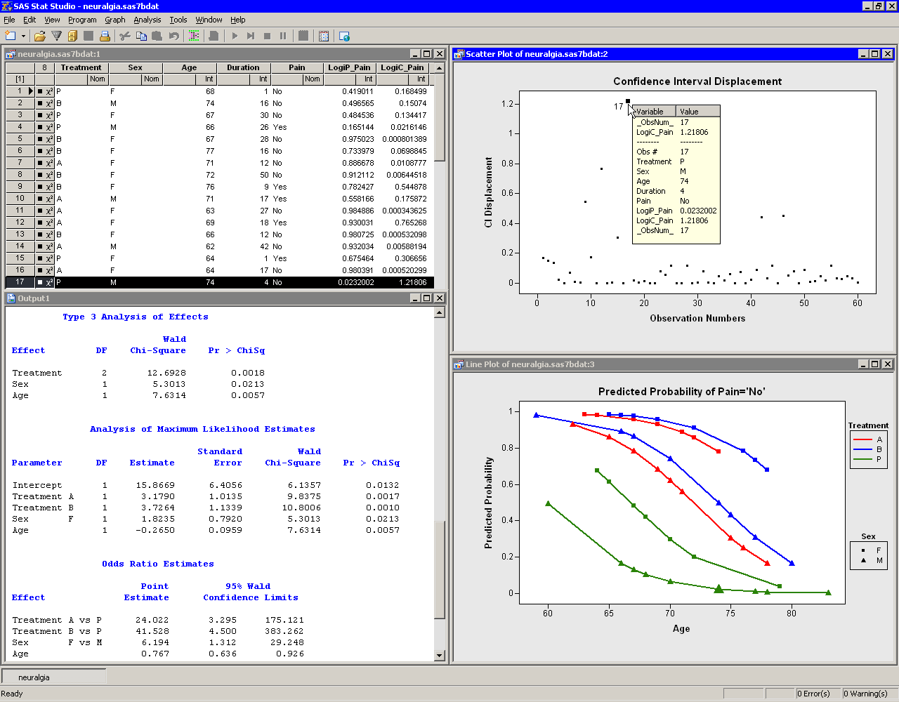
The tables created by the LOGISTIC procedure appear in the output window. The "Model Fit Statistics" table indicates that the model with the specified explanatory variables is preferable to an intercept-only model. The "Type 3 Analysis of Effects" table indicates that all explanatory variables in this model are significant.
The "Analysis of Maximum Likelihood Estimates" table displays estimates for the parameters in the logistic model. The  -values for Treatment A and B (0.0017 and 0.0010, respectively) indicate that these treatments are significantly better at treating neuralgia than the placebo. The negative estimate for the age effect indicates that older patients in the study responded less favorably to treatment than younger patients.
The "Odds Ratio Estimate" table enables you to quantify how changes in an explanatory variable affect the likelihood of the response outcome, assuming the other variables are fixed.
For an interval explanatory variable, the odds ratio approximates how much a unit change in the explanatory variable affects the likelihood of the outcome. For example, the estimate for the odds ratio for Age is 0.767. This indicates that the outcome of eliminating neuralgia occurs only 77% as often among patients of age  , as compared with those of age
  . In other words, neuralgia in older patients is less likely to go away than neuralgia in younger patients.
For a categorical explanatory variable, the odds ratio compares the odds for the outcome between one level of the explanatory variable and the reference level. The estimate of the odds ratio for treatment A is 24.022. This means that eliminating neuralgia occurs 24 times as often among patients that receive treatment A as among those receiving the placebo. Similarly, eliminating neuralgia occurs more than 41 times as often in patients that receive treatment B, compared to the placebo patients. In the same way, eliminating pain occurs six times more often in females than in males. For a detailed description of how to interpret the odds ratio, including a discussion of various parameterization schemes, see the "Odds Ratio Estimation" section of the documentation for the LOGISTIC procedure.
The results of the analysis are summarized by the line plot of predicted probability versus Age. Each line corresponds to a joint level of Treatment and Sex. The line colors indicate levels of Treatment; marker shapes indicate gender.
The line plot graphically illustrates a few conclusions from the "Analysis of Maximum Likelihood Estimates" table:
Given a gender and an age, treatment A and treatment B are better at treating neuralgia than the placebo.
Given a treatment and an age, females tend to report less pain than males.
The efficacy of the treatments decreases with the age of the patient.
This analysis did not include an interaction term between treatment and gender, so no conclusions are possible regarding whether the treatments affect pain differently in men and women. Also, this analysis did not compare treatment A with treatment B.
The other graph in Figure 23.5 plots the confidence interval (CI) displacement diagnostic versus the observation numbers. The CI displacement measures the influence of individual observations on the regression estimates. Observations with large CI displacement values are influential to the prediction. Often these observations are outliers for the model.
For example, the observation with the largest CI displacement value is selected in Figure 23.5. (You can double-click an observation to display the observation inspector, described in Chapter 8, Interacting with Plots. ) This patient is a 74-year-old male who was given a placebo. He reported no pain after the treatment, in spite of the fact that the model predicts only a 2% probability that this would happen. The patient with the next largest CI displacement value (not selected in the figure) was a 69-year-old female receiving treatment A. She reported that her pain persisted, although the model predicted a 93% probability that she would not report pain.
Copyright © SAS Institute, Inc. All Rights Reserved.