| Distribution Analysis: Distributional Modeling |
| Plots Tab |
You can use the Plots tab to create the following plots:
- Histogram with density estimators
creates a histogram overlaid with density curves for the parametric distributions that are specified on the Estimators tab.- Quantile-quantile plots
creates one Q-Q plot for each parametric distribution that is specified on the Estimators tab.- Empirical cumulative distribution function (CDF)
creates a plot of the empirical cumulative distribution function.
Note:SAS/IML Studio adds a density curve to an existing histogram when both of the following conditions are satisfied:
The histogram is the active window when you select the analysis.
The histogram variable and the analysis variable are the same.
Q-Q Plots
A Q-Q plot graphically indicates whether there is agreement between quantiles of the data and quantiles of a theoretical distribution. If the quantiles of the theoretical and data distributions agree, the plotted points fall along a straight line. For most distributions, the slope of the line is the value of the scale parameter, and the intercept of the line is the value of the threshold or location parameter. (For the lognormal distribution, the slope is  , where
  is the value of the scale parameter.) The parameter estimates for the distribution that best fits the data appear in an inset in the Q-Q plot.
Table 15.1 presents reasons why the points in a Q-Q plot might not be linear.
Description of Point Pattern |
Possible Interpretation |
|---|---|
All but a few points fall on a line. |
There are outliers in the data. |
Left end of pattern is below the line; right end of pattern is above the line. |
There are long tails at both ends of the data distribution. |
Left end of pattern is above the line; right end of pattern is below the line. |
There are Short tails at both ends of the data distribution. |
Curved pattern with slope that increase from left to right |
Data distribution is skewed to the right. |
Curved pattern with slope that decreases from left to right |
Data distribution is skewed to the left. |
Most points are not near line |
Data do not fit the theoretical distribution. |
 with scale parameter
  and location parameter
  .
. Note:When the variable being graphed has repeated values, the Q-Q plot produced by SAS/IML Studio is different from the Q-Q plot produced by the UNIVARIATE procedure. The UNIVARIATE procedure arbitrarily ranks the repeated values and assigns a quantile for the theoretical distribution based on the ranks. Two observations with the same value are assigned different quantiles. If a variable has many repeated values, the Q-Q plot produced by the UNIVARIATE procedure looks like a staircase. However, SAS/IML Studio (and SAS/INSIGHT) averages the ranks of repeated values. Two observations with the same value are assigned the same quantiles for the theoretical distribution.
CDF Plots
A CDF plot shows the empirical cumulative distribution function. You can use the CDF plot to examine relationships between data values and data proportions. For example, you can determine whether a given percentage of your data is below some upper control limit. You can also determine what percentage of the data has values within a given range of values.
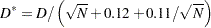
The inset for the CDF plot displays two statistics. The first is the number of nonmissing observations for the plotted variable. The second is labeled  . If
. If  is the 95% quantile for Kolmogorov’s distribution (
 ) and
) and  is the number of nonmissing observations, then (D’Agostino and Stephens; 1986)
 |
The 95% confidence limits in the CDF plot are obtained by adding and subtracting from the empirical CDF. They form a confidence band around the estimate for the cumulative distribution function.
Copyright © SAS Institute, Inc. All Rights Reserved.