Data Requirements for 3-D Plots
Overview of the Data Requirements for 3-D Plots
Both of the plot statements
that can be used in the OVERLAY3D layout are parameterized plots (see Plot Statement Terminology and Concepts). This means
that the input data must conform to certain prerequisites in order
for the plot to be drawn.
Parameterized plots
do not perform any internal data transformations or computing for
you. So, in most cases, you will need to perform some kind of preliminary
data manipulation to set up the input data correctly before executing
the template. The types of data transformations that you need to perform
are commonly known as "binning" and "gridding."
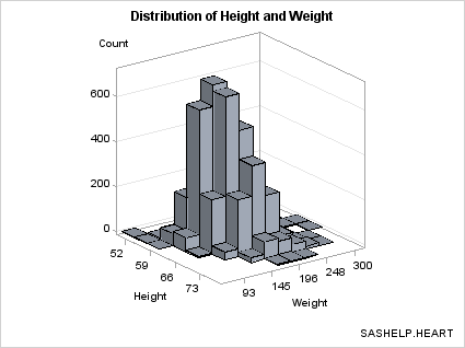
Producing Bivariate Histograms
A bivariate histogram
shows the distribution of data for two continuous numeric variables.
In the following graph, the X axis displays HEIGHT values and the
Y axis displays WEIGHT values. The Z axis represents the frequency
count of observations. The Z values could be some other measure (for
example, percentage of observations), but they can never be negative.
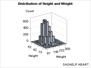
As with a standard histogram,
the X and Y variables in the bivariate histogram have been uniformly
binned, which means that their data ranges have been divided into
equal sized intervals (bins), and that observations are distributed
into one of these bin combinations.
The BIHISTOGRAM3DPARM statement,
which produced this plot, does not perform any binning computation
on the input columns. Thus, you must pre-bin the data. In the following
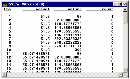
example, the binning is done with PROC KDE (part of the SAS/STAT product).
proc kde data=sashelp.heart;
  bivar height(ngrid=8) weight(ngrid=10) /
        out=kde(keep=value1 value2 count) noprint plots=none;
run;
In this program, the
NGRID= option sets the number of bins to create for each variable.
The default for NGRID is 60. The binned values for HEIGHT are stored
in VALUE1, and the binned values for WEIGHT are stored in VALUE2.
This selection of bins produces 1 observation for each of the 80 bin
combinations. Frequency counts for each bin combination are placed
in a COUNT variable in the output data set.
Notice that when you
form the grid by choosing the number of bins, the bin widths (about
3.5 for HEIGHT and about 26 for WEIGHT) are most often non-integer.
The following template
definition displays this data. By default, the BINAXIS=TRUE setting
requests that X and Y axes show tick values at bin boundaries. Also
by default, XVALUES=MIDPOINTS and YVALUES=MIDPOINTS, which means that
the X and Y columns represent midpoint values rather than lower bin
boundaries (LEFTPOINTS) or upper bin boundaries (RIGHTPOINTS). Not
all of the bins in this graph can be labelled without collision because
the graph is small. Thus, the ticks and tick values were thinned.
The non-integer bin values are converted to integers ( TICKVALUEFORMAT=5.
) to simplify the axis tick values. DISPLAY=ALL means "show outlined,
filled bins."
proc template;
  define statgraph bihistogram1a;
    begingraph;
      entrytitle "Distribution of Height and Weight";
      entryfootnote halign=right "SASHELP.HEART";
      layout overlay3d / cube=false zaxisopts=(griddisplay=on)
          xaxisopts=(linearopts=(tickvalueformat=5.))
          yaxisopts=(linearopts=(tickvalueformat=5.));
        bihistogram3dparm x=value1 y=value2 z=count /
          display=all;
      endlayout;
    endgraph;
  end;
run;

proc sgrender data= kde template=bihistogram1a;
  label value1="Height" value2="Weight";
run;
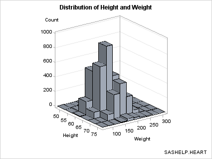
Eliminating Bins that Have No Data. Notice
that the bins of 0 frequency (there are several) are included in
the plot. If you want to eliminate the bins where there is no data,
you can generate a subset of the data. The subset makes it a bit clearer
where there are bins with small frequency counts verses portions of
the grid with no data.
proc sgrender data= kde template=bihistogram1a;
  where count > 0;
  label value1="Height" value2="Weight";
run;
Displaying Percentages on Z Axis. To display
the percentage of observations on the Z axis instead of the actual
count, you need to perform an additional data transformation to convert
the counts to percentages.
proc kde data=sashelp.heart;
  bivar height(ngrid=8) weight(ngrid=10) /
        out=kde(keep=value1 value2 count) noprint plots=none;
run;

data kde;
  if _n_ = 1 then do i=1 to rows;
    set kde(keep=count) point=i nobs=rows;
    TotalObs+count;
  end;
  set kde;
  Count=100*(Count/TotalObs);
  label Count="Percent";
run;

proc sgrender data= kde template=bihistogram1a;
   label value1="Height" value2="Weight";
run;

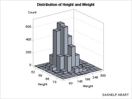
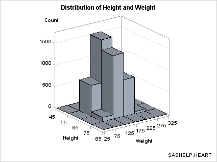
Setting Bin Width. Another technique for binning data
is to set a bin width and compute the number of observations in each
bin. In the DATA step below, 5 is the bin width for HEIGHT and 25
for WEIGHT. With this technique you do not know the exact number
of bins, but you can assure that the bins are of a "good" size.
data heart;
  set sashelp.heart(keep=height weight);
  if height ne . and weight ne .;
  height=round(height,5);
  weight=round(weight,25);
run;
After rounding, HEIGHT
and WEIGHT can be used as classifiers for a summarization. Notice
that the COMPLETETYPES option forces all possible combinations of
the two variables to be output, even if no data exists for a particular
crossing.
proc summary data=heart nway completetypes;
  class height weight;
  var height;
  output out=stats(keep=height weight count) N=Count;
run;
The template can be
simplified because we know that the bin midpoints are uniformly spaced
integers. For this selection of bin widths, 6 bins were produced for
HEIGHT and 10 for WEIGHT.
proc template;
  define statgraph bihistogram2a;
    begingraph;
      entrytitle "Distribution of Height and Weight";
      entryfootnote halign=right "SASHELP.HEART";
      layout overlay3d / cube=false zaxisopts=(griddisplay=on);
        bihistogram3dparm x=height y=weight z=count /
          display=all;
      endlayout;
    endgraph;
  end;
run;

proc sgrender data=stats template=bihistogram2a;
run;
If
you prefer to see the axes labeled with the bin endpoints rather the
bin midpoints, you can use the ENDLABELS=TRUE setting on the BIHISTOGRAM3DPARM
statement. Note that the ENDLABELS= option is independent of the XVALUES=
and YVALUES= options.
In the following example,
the bin widths are changed to even numbers (10 and 50) to make the
bin endpoints even numbers:
proc template;
  define statgraph bihistogram2a;
    begingraph;
      entrytitle "Distribution of Height and Weight";
      entryfootnote halign=right "SASHELP.HEART";
      layout overlay3d / cube=false zaxisopts=(griddisplay=on);
        bihistogram3dparm x=height y=weight z=count /
          binaxis=true endlabels=true display=all;
      endlayout;
    endgraph;
  end;
run;
data heart;
  set sashelp.heart(keep=height weight);
  height=round(height,10);
  weight=round(weight,50);
run;
proc summary data=heart nway completetypes;
  class height weight;
  var height;
  output out=stats(keep=height weight count) N=Count;
run;

proc sgrender data=stats template=bihistogram2a;
run;
If you choose bin widths that are too small, "gaps" might be displayed
among axis ticks values, which might cause the following message:
WARNING: The data for a HISTOGRAMPARM statement is not appropriate.
         HISTOGRAMPARM statement expects uniformly-binned data. The
         histogram might not be drawn correctly.
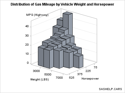
Because BIHISTOGRAM3DPARM
is a parameterized plot, you can use it to show the 3-D data summarization
of a response variable Z, which must have non-negative values, by
two numeric classification variables that are uniformly spaced (X
and Y). That is, even though the graphical representation is a bivariate
histogram, the Z axis does not have to display a frequency count or
a percent.
data cars;
  set sashelp.cars(keep=weight horsepower mpg_highway);
  if horsepower ne . and weight ne .;
  horsepower=round(horsepower,75);
  weight=round(weight,1000);
run;

proc summary data=cars nway completetypes;
  class weight horsepower;
  var mpg_highway;
  output out=stats mean=Mean ;
run;

proc template;
  define statgraph bihistogram2b;
    begingraph;
      entrytitle
       "Distribution of Gas Mileage by Vehicle Weight and Horsepower";
      entryfootnote halign=right "SASHELP.CARS";
      layout overlay3d / cube=false zaxisopts=(griddisplay=on) rotate=130;
        bihistogram3dparm y=weight x=horsepower z=mean / binaxis=true
          display=all;
      endlayout;
    endgraph;
  end;
run;

proc sgrender data=stats template=bihistogram2b;
run;
Producing Surface Plots
A surface plot shows
points that are defined by three continuous numeric variables and
connected with a polygon mesh. A polygon mesh is a collection of
vertices, edges, and faces that defines the shape of a polyhedral
object, which simulates the surface. For a surface to be drawn, the
input data must be "gridded"; that is, the X and Y data ranges are
split into uniform intervals (the grid), and the corresponding Z values
are computed for each X,Y pair. Smaller data grid intervals produce
a smoother surface because more smaller polygons are used but are
more resource intensive because of the large number of polygons that
are generated. Larger data grid intervals produce a coarser, faceted
surface because the polygon mesh has fewer faces and is less resource
intensive.
The faces of the polygons
can be filled, and lighting is applied to the polygon mesh to create
the 3-D effect. It is possible to superimpose a grid on the surface.
The grid display is a sampling of the data grid boundaries that intersect
the surface. The grid display can be thought of as a simpler see-through
line version of the surface and can be rendered with or without displaying
the filled surface.
The default appearance of a surface
is a filled polygon mesh with superimposed grid lines.
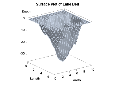
surfaceplotparm x=length y=width z=depth;
The SURFACEPLOTPARM
statement assumes that the response/Z values have been provided for
a uniform X-Y grid. Missing Z values will leave a "hole" in the surface.
The observations in
the input data set should form an evenly spaced grid of horizontal
(X and Y) values and one vertical (Z) value for each of these combinations.
The observations should be in sorted order of Y and X to obtain an
accurate graph. The sort direction for Y should be ascending. The
sort direction of X can be either ascending or descending.
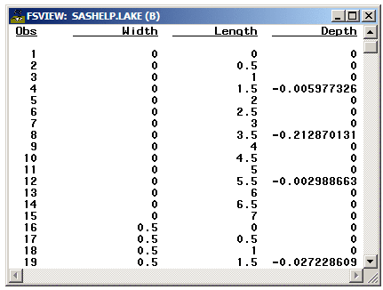
In the following example,
315 observations in SASHELP.LAKE are gridded into a 15 by 21 grid.
The length of the grid is from 0 to 7 by .5, and the width of the
grid is from 0 to 10 by .5 There are no missing Depth values.
Input data with
non-gridded columns should be preprocessed with PROC G3GRID. This
procedure creates an output data set, and it allows specification
of the grid size and various methods for computed interpolated Z column(s).
For further details, see the documentation for PROC G3GRID in the SAS/GRAPH: Reference.
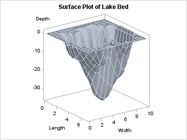
Using PROC G3GRID, the
following code performs a Spline interpolation and generates a surface
plot. By increasing the grid size and specifying a SPLINE interpolation,
a smoother surface is rendered.
proc g3grid data=sashelp.lake out=spline;
  grid width*length = depth / naxis1=75 naxis2=75 spline;
run;

proc sgrender data=spline template=surfaceplotparm;
run;
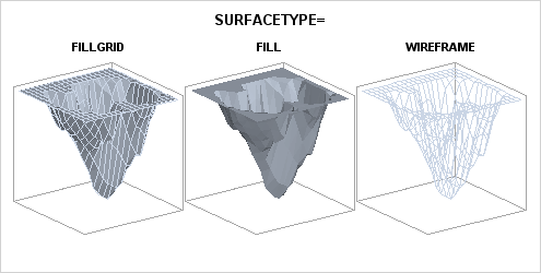
The SURFACETYPE= option offers three
different types of surface rendering:
| FILLGRID | a filled surface with grid outlines (the default) |
| FILL | a filled surface without grid outlines |
| WIREFRAME | an unfilled (see through) surface with grid outlines |
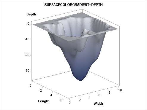
Adding a Color Gradient. The surface can be colored
with a gradient that is based on a response variable by setting a
column on the SURFACECOLORGRADIENT= option. The following example
uses the DEPTH variable:
proc template;
  define statgraph surfaceplotparm;
    begingraph;
      entrytitle "SURFACECOLORGRADIENT=DEPTH";
      layout overlay3d / cube=false;
      surfaceplotparm x=length y=width z=depth /
        surfacetype=fill
        surfacecolorgradient=depth
        colormodel=twocolorramp
        reversecolormodel=true ;
      endlayout;
    endgraph;
  end;
run;

/* create gridded data for surface */
proc g3grid data=sashelp.lake out=spline;
  grid width*length = depth / naxis1=75 naxis2=75 spline;
run;

proc sgrender data=spline template=surfaceplotparm;
run;
The COLORMODEL=TWOCOLORRAMP setting indicates a style
element. Four possible color ramps are supplied in every style. The
REVERSECOLORMODEL=TRUE setting exchanges (reverses) the start color
and end color that is defined by the color model. The colors were
reversed so that the darker color maps to the lower depths.
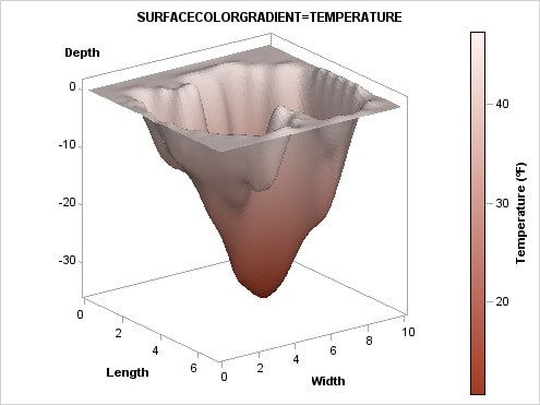
Using Color
to Show an Additional Response Variable. The SURFACECOLORGRADIENT=
option does not have to use the Z= variable. In the next example,
another variable, TEMPERATURE is used. Notice that it is possible
to display a continuous legend when you use the SURFACECOLORGRADIENT=
option. Several legend options can be used. Using other color ramps
and continuous legends are discussed in more detail in Adding Legends to a Graph.
ods escapechar="^"; /* Define an escape character */

proc template;
  define statgraph surfaceplot;
   begingraph;
     entrytitle "SURFACECOLORGRADIENT=TEMPERATURE";
     layout overlay3d / cube=false;
       surfaceplotparm x=length y=width z=depth / name="surf"
           surfacetype=fill
           surfacecolorgradient=temperature
           reversecolormodel=true
           colormodel=twocoloraltramp ;
       continuouslegend "surf" /
           title="Temperature (^{unicode '00B0'x}F)" ;
     endlayout;
   endgraph;
  end;
run;

data lake;
  set sashelp.lake;
  if depth = 0 then Temperature=46;
  else Temperature=46+depth;
run;

/* create gridded data for surface */
proc g3grid data=lake out=spline;
   grid width*length = depth temperature / naxis1=75 naxis2=75 spline;
run;

proc sgrender data=spline template=surfaceplot;
run;