How Plot Statements Affect Axis Construction
Primary
and Secondary Axes. The LAYOUT OVERLAY container supports
two horizontal (X and X2) and two vertical (Y and Y2) axes. The
bottom axis (X) and the left axis (Y) are the default axes, referred
to as the primary axes. The top axis (X2) and the right axis (Y2)
are referred to as the secondary axes and are displayed only if they
are requested. For example, consider this simple layout block:
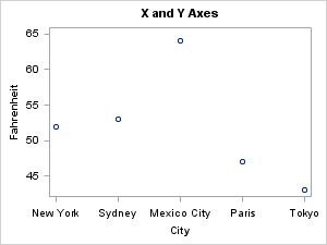
The defaults result
in an XY plot having only two axes, X and Y. However, you can request
that either the X or Y columns be mapped to the X2 or Y2 axis. The
XAXIS= option can be set to X or X2. Similarly, the YAXIS= option
can be set to Y or Y2:
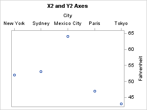
A single plot statement
can activate one horizontal and one vertical axis. It cannot activate
both horizontal or both vertical axes. Thus, to see both a Y and Y2
axis based on the same Y column, you could specify an additional plot
statement:
layout overlay;
  scatterplot x=city y=fahrenheit / xaxis=x yaxis=y ;
  scatterplot x=city y=fahrenheit / xaxis=x yaxis=y2 ;
endlayout;
layout overlay;
  scatterplot x=city y=fahrenheit;
  scatterplot x=city y=fahrenheit / yaxis=y2 ;
endlayout;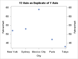
Note that this coding
produces two overlaid scatter plots, each with five markers. Because
the five (X,Y) value pairs and the five (X,Y2) value pairs are identical,
the Y and Y2 axes are identical and the markers are exactly superimposed.
However, it is not necessary to create a second plot when you want
the secondary axis to be a duplicate of the primary axis. A more direct
way to accomplish this is shown in Specifying Axis Options.
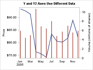
The next two examples
show the independent nature of primary and secondary axes. In each
case, a different data column is mapped to the Y and Y2 axes.
layout overlay;
  seriesplot x=date y=price;
  needleplot x=date y=volume / yaxis=y2;
endlayout;
As the following figure
shows, the primary and secondary Y axes are independently scaled and
there is not a necessary connection between the units or data ranges
of either axis.
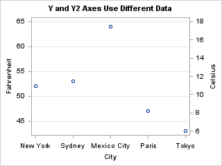
In the next example,
even though the Y and Y2 variables are different, the primary and
secondary Y axes represent the same data range in different units.
In such cases, the positioning of the tick values on each axis should
be coordinated so that the grid lines represent the same temperature
on each axis. Apply Axis Thresholds provides example code that shows how to coordinate the tick value
positions.