Default Axis Construction and Related Options
Determine Axis Type
To determine axis types,
the OVERLAY container examines all of the stand-alone plot statements
that are specified. It also examines whether an axis type has been
specified with the TYPE= setting on an axis option (for example, on
XAXISOPTS=). If there is only one stand-alone plot, or a plot is designated
as PRIMARY, the rules are simple:
-
If the plot statement that is mapped to an axis treats data values as discrete (such as the X= column of the BARCHART or BOXPLOT statement), the axis type is DISCRETE for that axis, regardless of whether the data column that is mapped to the axis is character or numeric. A DISCRETE axis has tick values for each unique value in a data column.
-
If the plot statement that is mapped to an axis specifies a numeric column and the column has a date, time, or datetime format associated with it, the axis type is TIME. See TIME Axes for examples. Otherwise, the numeric axis type is LINEAR, the general numeric axis type. See LINEAR Axes for examples.
-
A LOG axis is never automatically created. To obtain a LOG axis, you must explicitly declare the axis type with the TYPE=LOG option. See LOG Axes for examples.
When the overlay container
has multiple plots that generate axes, GTL can determine default axis
features for the shared axes, or you can use the PRIMARY= option on
one of the plot statements to specify which plot you want the GTL
to use.
Example: For the following layout block, the BARCHART is considered the
primary plot because it is the first stand-alone plot that is specified
in the layout and no other plot has been set as the primary plot.
A BARCHART requires a discrete X-axis. You cannot change the axis
type. It does not matter whether QUARTER is a numeric or character
variable. Because the SERIESPLOT can use a discrete axis, the overlay
is successful.
layout overlay;
  barchart   x=quarter y=actualSales;
  seriesplot x=quarter y=predictedSales;
endlayout;
Example: For the following layout block, the first SERIESPLOT is considered
primary. If the QUARTER variable is numeric and has a date format,
then the X-axis type is TIME. If the variable is numeric, but does
not have a date format, then the axis type is LINEAR. If the variable
is character, then the axis type is DISCRETE.
layout overlay;
  seriesplot x=quarter y=predictedSales;
  seriesplot x=quarter y=actualSales;
endlayout;
Example: For the following layout block, the X-axis is DISCRETE because
it was declared to be DISCRETE and this does not contradict any internal
decision about axis type because both SERIESPLOT and BARCHART support
a discrete axis. It does not matter whether QUARTER is a numeric or
character variable.
layout overlay / xaxisopts=(type=discrete);
  seriesplot x=quarter y=predictedSales;
  barchart   x=quarter y=actualSales;
endlayout;
Example: For the following layout block, the SERIESPLOT is the primary plot.
If QUARTER is a character variable, a discrete axis is used and the
overlay is successful. However, if QUARTER is a numeric variable,
either a TIME or LINEAR axis is used, the BARCHART overlay fails,
and a message is written to the log.
layout overlay;
  seriesplot x=quarter y=predictedSales;
  barchart   x=quarter y=actualSales;
endlayout;
Apply Axis Options
Each of the four possible
axes (X, Y, X2, Y2) can be managed with a set of options that apply
to axes of any type. In addition, option bundles are available for
managing each specific axis type. For example, the following syntax
shows the option bundles that are available on the LAYOUT OVERLAY
statement's XAXISOPTS= option:
LAYOUT OVERLAY </ XAXISOPTS=(general-options LINEAROPTS=(options )
DISCRETEOPTS=(options ) TIMEOPTS=(options ) LOGOPTS=(options ) ) >;
DISCRETEOPTS=(options ) TIMEOPTS=(options ) LOGOPTS=(options ) ) >;
YAXISOPTS= (same-as-xaxisopts )
Y2AXISOPTS=(same-as-xaxisopts )
X2AXISOPTS=(same-as-xaxisopts )
Y2AXISOPTS=(same-as-xaxisopts )
X2AXISOPTS=(same-as-xaxisopts )
Determine Axis Data Range
After the type of each
axis is determined in the layout, the data ranges of all plot statements
that contribute to an axis are compared. For LINEAR, TIME, and LOG
axes, the minimum of all minimum values and the maximum of all maximum
values are derived as a "unioned" data range. For a DISCRETE axis,
the data range is the set of all unique values from the sets of all
values. The VIEWMIN= and VIEWMAX= options for LINEAR, TIME, and LOG
axes can be used to change the displayed axis range. For examples, see LINEAR Axes, TIME Axes, and LOG Axes.
Determine Axis Label
The default axis label is determined by the primary plot.
If a label is associated with the data column, the label is used.
If no column label is assigned, the column name is used for the axis
label. Each set of axis options provides LABEL= and SHORTLABEL= options
that can be used to change the axis label. By default, the font characteristics
of the label are set by the current style, but the plot statement's
LABELATTRS= option can be used to change the font characteristics.
See Axis Appearance Features Controlled by the Current Style. The following
examples show how axis labels are determined and how to set an axis
label.
data growth;
do Hours=1 to 15 by .5;
Bacteria= 1000*10**( sqrt(Hours ));
Virus= 1000*10**(log(hours));
label bacteria="Bacteria Growth" virus="Virus Growth";
output;
end;
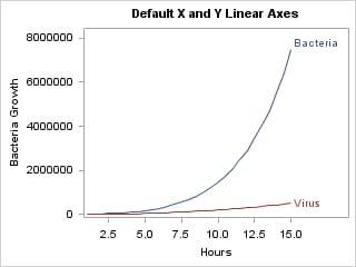
run;To plot the growth trend
for both Bacteria and Virus in the same graph, we can use a simple
overlay of series plots. Whenever two or more columns are mapped to
the same axis, the primary plot determines the axis label. In the
following example, the first SERIESPLOT is primary by default, so
its columns determine the axis labels. In this case, the Y-axis label
is determined by the BACTERIA column.
layout overlay / cycleattrs=true;
  seriesplot x=Hours y=Bacteria/ curvelabel="Bacteria";
  seriesplot x=Hours y=Virus / curvelabel="Virus";
endlayout;
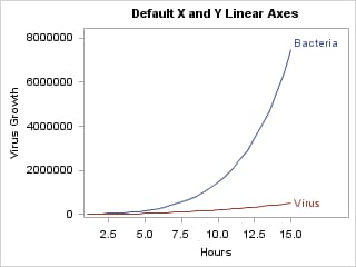
If we designate another plot
statement as "primary," its X= and Y= columns are used to label the
axes. The PRIMARY= option is useful when you desire a certain stacking
order of the overlays, but you want the axis characteristics to be
determined by a plot statement that is not the default primary plot
statement. In the following example, the second SERIESPLOT is set
as the primary plot, so its columns determine the axis labels. In
this case, the Y-axis label is determined by the VIRUS column.
layout overlay / cycleattrs=true;
  seriesplot x=Hours y=Bacteria/ curvelabel="Bacteria";
  seriesplot x=Hours y=Virus / curvelabel="Virus" primary=true ;
endlayout;
In the previous two examples, allowing
the primary plot to determine the Y-axis label did not result in an
appropriate label because a more generic label is needed. To achieve
this, you must set the axis label yourself with the LABEL= option.
layout overlay / cycleattrs=true
    yaxisopts=(label="Growth of Virus and Bateria Cultures") ;
  seriesplot x=Hours y=Bacteria/ curvelabel="Bacteria";
  seriesplot x=Hours y=Virus / curvelabel="Virus";
endlayout;
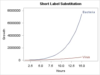
Short Labels. If the data column's label is long, or if you supply a long string
for the label, the label might be truncated if it does not fit in
the allotted space. This might happen when you create a small graph
or when the font size for the axis label is large.
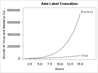
As a remedy for these situations, you can specify a "backup"
label with the SHORTLABEL= option. The short label is displayed whenever
the default label or the LABEL= string does not fit.
layout overlay / cycleattrs=true
    yaxisopts=(label="Growth of Virus and Bacteria Cultures"
               shortlabel="Growth" );
  seriesplot x=Hours y=Bacteria/ curvelabel="Bacteria";
  seriesplot x=Hours y=Virus / curvelabel="Virus";
endlayout;
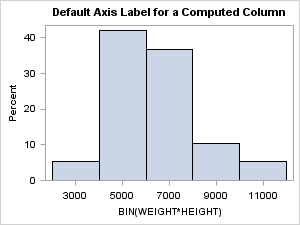
Computed Columns. Another situation where you might want to control the axis label
is when a computed column is used.
You can use an EVAL
expression to compute a new column that can be used as a required
argument. Such columns have manufactured names in the associated data
object. The name is based on the input column(s) and the functional
transformation that was applied to the input column. In this example,
BIN(WEIGHT*HEIGHT) is the manufactured name.
Determine Axis Tick Values
The tick values for
LINEAR and TIME axes are calculated according to an internal algorithm
that produces good tick values by default. This algorithm can be modified
or bypassed with axis options. For examples, see LINEAR Axes, DISCRETE Axes, and LOG Axes.
By default, the font
characteristics of the tick values are set by the current style, and
the tick mark values progress along the axis from the least value
to the highest value. You can set alternative font characteristics
with the TICKVALUEATTRS= option. For more information, see Axis Appearance Features Controlled by the Current Style.
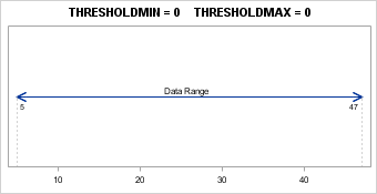
Apply Axis Thresholds
For LINEAR and LOG axes
only, part of the default axis construction computes a small number
of "good" tick values for the axis. This list might include "encompassing"
tick values that go beyond the data range on both the lower or upper
side of the axis. The THRESHOLDMIN= and THRESHOLDMAX= options of LINEAROPTS
= ( ) can be used to establish rules for when to add encompassing
tick marks. In the following example, the data range is 5 to 47. When
the THRESHOLDMIN=0 and THRESHOLDMAX=0, the lowest and highest tick
marks are always at or inside the data range. Notice that the lowest
tick mark is 10 and the highest tick mark is 40.
When the THRESHOLDMIN=1
and THRESHOLDMAX=1, the lowest and highest tick marks are always at
or outside the data range. Notice that the lowest tick mark is 0 and
the highest tick mark is 50.
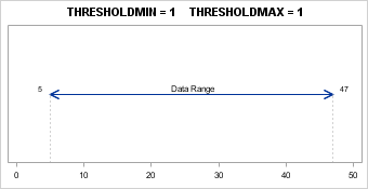
When the thresholds
are set to any value between 0 and 1, a computation is performed to
determine whether an encompassing tick is added. The default value
for both thresholds is .3. Notice that the highest tick mark is 50
and the lowest tick mark is 10. In this case, an encompassing tick
was added for the highest tick but not for the lowest tick.
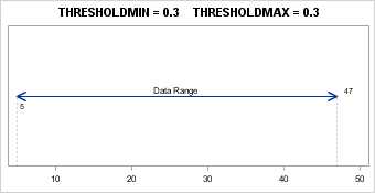
At the high end of the
axis, there is a tick mark at 40. The THRESHOLDMAX= option determines
whether a tick mark should be displayed at 50. The threshold distance
is calculated by multiplying the THRESHOLDMAX= value (0.3) by the
tick interval value (10), which equals 3. Measuring the threshold
distance 3 down from 50 yields 47, so if the highest data value is
between 47 and 50, a tick mark is displayed at 50. In this case, the
highest data value is 47 and it is within the threshold, so the tick
mark at 50 is displayed.
At the low end of the
axis, there is a tick mark at 10. The THRESHOLDMIN= option determines
whether a tick mark should be displayed at 0. The threshold distance
is calculated by multiplying the THRESHOLDMIN= value (0.3) by the
tick interval value (10), which equals 3. Measuring the threshold
distance of 3 up from 0 yields 3, so if the lowest data value is between
0 and 3, a tick mark is displayed at 0. In this case, the lowest data
value is 5 and it is not within this threshold, so the tick mark at
0 is not displayed.
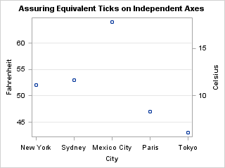
Thresholds are important
when you want the Y and Y2 (or X and X2) axes to have ticks marks
located at equivalent locations on different scales. By preventing
"encompassing" ticks from being drawn, you can ensure that the axis
ranges for the two axes correctly align. The following example accepts
the default minimum and maximum data values for each axis. Notice
that the five scatter points for each plot are superimposed exactly.
layout overlay /
  yaxisopts=(griddisplay=on
             linearopts=(integer=true thresholdmin=0 thresholdmax=0 ))

  y2axisopts=(linearopts=(integer=true thresholdmin=0 thresholdmax=0 ));
 scatterplot  x=city y=fahrenheit;
 scatterplot  x=city y=celsius / yaxis=y2;
endlayout;
In the following
example, the axes have different but equivalent ranges that are established
with the VIEWMIN= and VIEWMAX= options (32F <==> 0C and 86F
<==> 30C).
layout overlay /
    yaxisopts= (griddisplay=on
                linearopts=(integer=true thresholdmin=0 thresholdmax=0
                            viewmin=32 viewmax=86 ))

    y2axisopts= (linearopts=(integer=true thresholdmin=0 thresholdmax=0
                             viewmin=0 viewmax=30 ));

  scatterplot  x=City y=Fahrenheit;
  scatterplot  x=City y=Celsius / yaxis=y2;
endlayout;

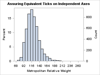
This next example creates
equivalent ticks for a computed histogram. We want to ensure that
the percentage and actual count correspond on the Y and Y2 axes.
Apply Axis Offsets
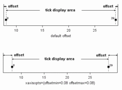
In addition to axis
thresholds, there are also axis offsets. Offsets are small gaps that
are potentially added to each end of an axis: before the start of
the data range and after the end of the data range. Offsets can be
applied to any type of axis. For example, axis offsets are automatically
added to allow for markers to appear at the first or last tick without
clipping the marker
For plots such as box
plots, histograms, and bar charts, offset space is added to ensure
that the first and last box or bar does not get clipped.
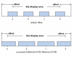
The
OFFSETMIN= option on a layout statement controls the distance from
the beginning of the axis to the first tick mark (or minimum data
value). The OFFSETMAX= option controls the distance between last tick
(or maximum data value) and the end of the axis. Both OFFSETMIN=
and OFFSETMAX= can be set to AUTO, AUTOCOMPRESS, or a numeric range.
The default offset is AUTO. AUTO automatically provides enough offset
to display markers and other graphical features. AUTOCOMPRESS provides
enough offset to keep the minimum and maximum tick marks from extending
beyond the axis length. The numeric range is a value from 0 to 1 that
is used to calculate the offset as a percentage of the full axis length.
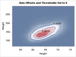
For some plots, the
axis offsets are not desirable. To illustrate this, consider the contour
plot below. Notice that the entire plot area between minimum and maximum
data values is filled with colors that correspond to a Z value. The
narrow white bands around the top and right edges of the filled area
and the axis wall boundaries are due to the default axis offsets.
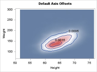
To eliminate the "extra"
gaps at the ends of the axes, we can set axis offsets and thresholds
to zero. An offset is a value between 0 and 1 that represents a percentage
of the length of the axis.