LINEAR Axes
Setting the Axis Data Range and Tick Values
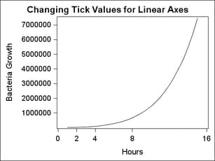
For a
LINEAR axis, you can set the tick values in several ways. If you use
TICKVALUELIST = ( values )
or TICKVALUESEQUENCE= ( start-end increment ) syntax, the values that you specify will be used as long as those
values are within the actual range of the data. Notice in the following
example that the smallest and largest tick values on the Y axis are
not what was requested because the Y-axis data range did not include
0 or 8000000. To extend (or reduce) the axis data range, you can use
the VIEWMIN= and VIEWMAX= sub-options of the LINEAROPTS= option. Notice
that because the X-axis was extended with these options, all the specified
tick values were used. The X-axis also illustrates that the tick values
do not have to be uniformly spaced. (Please note that choosing tick
values in this manner does NOT create a log scale. See LOG Axes for information
about log axes.)
Formatting Axis Tick Values
Linear
axes use special techniques that provide the generation of "good"
tick values that are based on the data range. If a tick value format
is not specified, the column formats provide a "hint" on how to represent
the tick values, but those formats do not generally control the representation
or precision of the tick values.
To force
a given format to be used for a linear axis, you can use syntax similar
to the following, where you specify any SAS numeric format:
linearopts=(tickvalueFormat= best6. )Note: GTL currently
honors most but not every SAS format. For a list of supported formats, see SAS Formats Not Supported.
If you
simply want the column format of the input data column to be directly
used, specify the following:
linearopts=(tickvalueFormat=data)
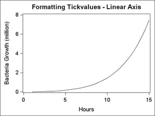
There are special options to control
tick values. INTEGER=TRUE calculates good integers to use as tick
values given the range of the data. EXTRACTSCALE=TRUE can be used
to extract some factor of ten from all tick values in order to reduce
the overall width of the tick values and improve legibility. The extracted
factor is concatenated to the existing axis label. In the following
example, a factor of 1000000 (million) is extracted from the Y-axis
values and the text (million) is appended to the axis label.
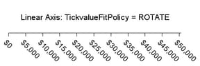
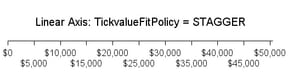
Avoiding Tick Value Collisions
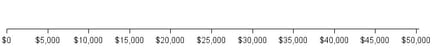
Another
intelligent feature that axes have is to change the display of tick
values whenever the tick value text becomes too crowded. For example,
the axis below comfortably shows eleven tick values:
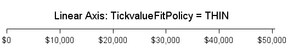
If
the size of the graph decreases or the font size for the tick values
increases, the axis ticks and tick values will automatically be "thinned"
by removing alternating ticks and tick values. LINEAROPTS = (TICKVALUEFITPOLICY=THIN)
is the default action for linear axes: