Categories of Statements
Plot Statements—Terminology and Concepts
Overview
GTL has
numerous plot statements that can be combined with one another in
many different ways. In future releases of GTL, new layout and plot
statements will be added to supplement those now available. GTL has
been designed as a high-level toolkit that enables you to create
a large variety of graphs by combining its constructs in different
ways. As you might imagine, not all combinations of statements are
possible, and most of the invalid combinations are caught during template
compilation. Rather than trying to create graphs by trial and error,
it is recommended that you understand a few basic "rules of assembly"
to guide your efforts and make the language easier to work with. To
that end, some new terminology is useful.
Plot Terminology
Computed plots internally
perform computational transformations on the input data and, as necessary,
add new columns to a data object in order to render the requested
plot. For example, a LOESSPLOT requires two numeric columns of raw
input data (X=column and Y=column). A loess fit line is computed for these
input point pairs, a new set of points on a fit line is generated,
and a new column that contains the computed points is added to the
data object. A smoothed line is drawn through the computed points.
Most computed plots have several options to control the computation
performed. Another form of computed plot is one with user-defined
data transformations. For example, you can use an EVAL( ) function
to compute a new column such as
Y= eval(log10(column)). This transforms column values into corresponding logarithmic
values. Why is it important to know whether a plot is computed? Certain
layouts such as PROTOTYPE currently do not allow computed plots to
be included.
Parameterized plots
simply render the input data they are given. They are useful whenever
you have input data that does not need to be preprocessed or that
has already been summarized (possibly an output data set from a procedure
like PROC FREQ). For example, BARCHARTPARM draws one bar per input
observation: the X= column provides
the bar tick value and the Y=column provides the bar length. So a bar chart with five bars requires
a data set with five observations and two variables. A parameterized
bar chart statement is useful when the computed BARCHART statement
does not perform the type of computation you want, and you have done
the summarization yourself. Many parameterized plots have a "PARM"
suffix added to their name. Another common situation is when you want
to draw a fit line and a confidence band from a set of data that already
has the appropriate set of (X,Y) point coordinates. For these situations
you would use a SERIESPLOT statement for the fit line and a BANDPLOT
statement for the confidence band. Why is it important to know whether
a plot is parameterized? Parameterized plots ensure that no additional
computation will take place on the input data. Thus, input data that
does not meet the special requirements on the parameterized plot might
result in bad output or a blank graph.
A stand-alone plot
is one that can be drawn without any other accompanying plot. In general,
a plot is stand-alone if its input data defines a range of values
for all axes that are needed to display the plot. For example, the
observations plotted in a SCATTERPLOT normally span a certain data
range in both X and Y axes. This information is necessary to successfully
draw the axes and the markers. Why is it important to know which
plots are stand-alone? Because most layouts need to know the extents
of the X and Y axis to draw the plot.
A dependent plot is
one that, by itself, does not provide enough information for the axes
that are needed to successfully draw the plot. For example, the
REFERENCELINE statement draws a straight line perpendicular to one
axis at a given input point on the same axis. Because there is only
one point provided, there is not enough information to determine the
full range of data for this axis. Furthermore, no information is
provided for the data range of the second axis. Thus, a REFERENCELINE
statement does not provide enough information by itself to draw the
axes and the plot. Such a plot needs to work with another "Stand-alone"
plot, which will provide the necessary information to determine the
data extents of the two axes.
When you overlay two
or more plots, the layout container determines the type of axis to
use, the data range of all axes, and the default format and label
to use for each axis. By default, the first encountered stand-alone
plot is used to decide the axis type and axis format and label. In
some cases, you desire a certain overlay stacking and must order your
statements accordingly. This might result in undesirable axis properties.
By adding the PRIMARY=TRUE option to a stand-alone plot, you can request
that this plot be used to determine axis type and axis format and
label. A dependent plot cannot be designated as primary.
GTL supports both 2D
and 3D graphics. Currently there are only two 3D plot statements (SURFACEPLOTPARM
and BIHISTOGRAM3DPARM). 3D plot statements must be used in a 3D layout.
2D plot statements cannot be used in a 3D layout, and 3D plot statements
cannot be used in a 2D layout. For more information on layouts, see Layout Containers.
Plot Statements Categorized by Type
Plot statements
are generally categorized as stand-alone or dependent, computed or
parameterized, and 2D or 3D. The following tables show the distribution
of plots in these categories.
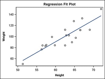
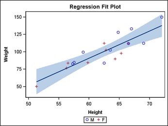
Plot Concepts
To illustrate the use of the different types of plot
statements, consider the following template. In this template, named
MODELFIT, a SCATTERPLOT is overlaid with a REGRESSIONPLOT. The REGRESSIONPLOT
is a computed plot because it takes the input columns (HEIGHT and
WEIGHT) and transforms them into two new columns that correspond to
points on the requested fit line. By default, a linear regression
(DEGREE=1) is performed with other statistical defaults. The model
in this case is WEIGHT=HEIGHT, which in the plot statement is specified
with
X=HEIGHT (independent variable) and Y=WEIGHT (dependent variable). The number of observations
generated for the fit line is around 200 by default.
Note: Plot statements
have to be used in conjunction with Layout statements. To simplify
our discussion, we will continue using the most basic layout statement:
LAYOUT OVERLAY. This layout statement acts as a single container
for all plot statements placed within it. Every plot is drawn on
top of the previous one in the order that the plot statements are
specified, with the last one drawn on top.
proc template;
  define statgraph modelfit;
    begingraph;
	entrytitle "Regression Fit Plot";
      layout overlay;
        scatterplot x=height y=weight /
                    primary=true;
        regressionplot x=height y=weight;
      endlayout;
    endgraph;
  end;
run;

proc sgrender data=sashelp.class
              template=modelfit;
run;
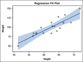
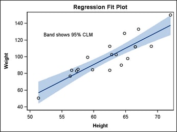
The REGRESSIONPLOT statement can also generate sets of
points for the upper and lower confidence limits of the mean (CLM),
and for the upper and lower confidence limits of individual predicted
values (CLI) for each observation. The CLM="name" and CLI="name" options cause
the extra computation. However, the confidence limits are not displayed
by the regression plot. Instead, you must use the dependent plot statement
MODELBAND, with the unique name as its required argument. Notice that
the MODELBAND statement appears first in the template, ensuring that
the band will appear behind the scatter points and fit line. A MODELBAND
statement must be used in conjunction with a REGRESSIONPLOT, LOESSPLOT,
or PBSPLINEPLOT statement.
layout overlay;
  modelband "myclm" ;
  scatterplot x=height y=weight /
    primary=true;
  regressionplot x=height y=weight /
    alpha=.01 clm="myclm" ;
endlayout;
This is certainly the easiest way to construct this type
of plot. However, you might want to construct a similar plot from
an analysis by a statistical procedure that has many more options
for controlling the fit. Most procedures create output data sets that
can be used directly to create the plot you want. Here is an example
of using non-computed, stand-alone plots to build the fit plot. First
choose a procedure to do the analysis.
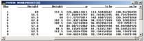
proc reg data=sashelp.class noprint;
  model weight=height / alpha=.01;
  output out=predict predicted=p lclm=lclm uclm=uclm;
run; quit;
The output
data set, PREDICT, contains all the variables and observations in
SASHELP.CLASS plus, for each observation, the computed variables P,
LCLM, and UCLM.
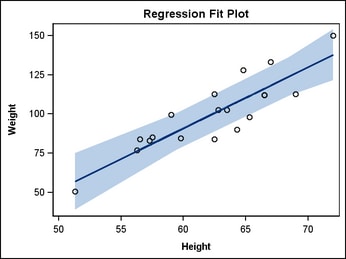
Now the template can use
simple, non-computed SERIESPLOT and BANDPLOT statements for the presentation
of fit line and confidence bands.
proc template;
  define statgraph fit;
    begingraph;
      entrytitle "Regression Fit Plot";
      layout overlay;
        bandplot x=height
          limitupper=uclm
          limitlower=lclm /
          fillattrs=GraphConfidence;
        scatterplot x=height y=weight /
          primary=true;
        seriesplot x=height y=p /
          lineattrs=GraphFit;
      endlayout;
    endgraph;
  end;
run;

proc sgrender data=predict template=fit;
run;
Legend Statements
GTL supports two types of legends:
a discrete legend that is used to identify graphical features such
as grouped markers, lines, or overlaid plots; and a continuous legend
that shows the range of numeric variation as a ramp of color values.
Legend statements are dependent on one or more plot statements and
must be associated with the plot(s) that they describe. The basic
strategy for creating legends is to "link" the plot statement(s)
to a legend statement by assigning a unique, case-sensitive name to
the plot statement on its NAME= option and then referencing that name
on the legend statement.
layout overlay;
  modelband "clm";
  scatterplot x=height y=weight /
    primary=true
    group=sex name="s" ; /* the name is case-sensitive */
  regressionplot x=height y=weight /
    alpha=.01 clm="clm";
  discretelegend "s" ;   /* case must match the case on NAME= */
endlayout;
For more
information, seeAdding Legends to a Graph.
Text Statements
GTL supports
statements that add text to predefined locations of the graph. SAS
Title and Footnotes statements do not contribute to the graph. However,
there are comparable ENTRYTITLE and ENTRYFOOTNOTE statements. Like
Title and Footnote statements, multiple instances of these statements
can be used to create multi-line text.
layout overlay;
  modelband "clm";
  scatterplot x=height y=weight /
    primary=true;
  regressionplot x=height y=weight /
    alpha=.05 clm="clm";
  entry "Band shows 95% CLM" /
    autoalign=auto;
endlayout;
For more
information, seeAdding and Changing Text in a Graph.
Layout Containers
Layout
statements, a key feature of the GTL, form "containers" that determine
how the plots, legends and texts items are drawn in the graph. GTL
supports many different layout statements that are suitable for different
usage. However, these fall into two main categories.
Layout
blocks always begin with the LAYOUT keyword followed by a keyword
indicating the purpose of the layout. All layout blocks end with an
ENDLAYOUT statement. The following table summarizes the available
layouts.


To learn
more about layouts, refer to the appropriate chapter:
-
Using a Simple Single-cell Layout (OVERLAY)
-
Using an Equated Layout (OVERLAYEQUATED)
-
Using 3D Graphics (OVERLAY3D)
-
Using a Simple Multi-cell Layout (GRIDDED)
-
Using an Advanced Multi-cell Layout (LATTICE)
-
Using Classification Panels (DATAPANEL, DATALATTICE, PROTOTYPE)