Distribution Plots
About Distribution Plots
You can use the SGPLOT
and SGPANEL procedures to produce plots that characterize the frequency
or the distribution of your data.
About Box Plots
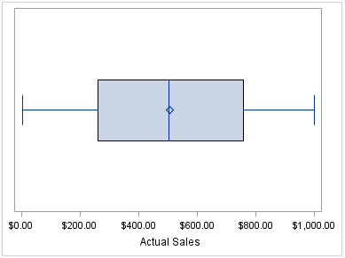
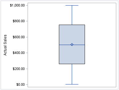
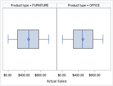
A box plot summarizes
the data and indicates the median, upper and lower quartiles, and
minimum and maximum values. The plot provides a quick visual summary
that easily shows center, spread, range, and any outliers. The SGPLOT
and the SGPANEL procedures have separate statements for creating horizontal
and vertical box plots.
The following examples
show product sales summaries. Examples are provided for the SGPLOT
and the SGPANEL procedures.
The following two examples
use the SGPLOT procedure to create a horizontal and a vertical plot,
respectively.
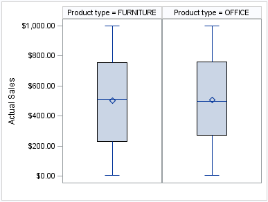
The following two examples
use the SGPANEL procedure to create a horizontal and a vertical plot,
respectively. The box plots are paneled by product type.
See Also
HBOX Statement (SGPANEL procedure)
VBOX Statement (SGPANEL procedure)
HBOX Statement (SGPLOT procedure)
VBOX Statement (SGPLOT procedure)
About Density Plots
After creating a histogram,
you might use a density plot to fit various distributions to the data.
The most common density plot uses the normal distribution, which is
defined by the mean and the standard deviation.
A density plot can be
used by itself, combined with another density plot, and overlaid on
a histogram.
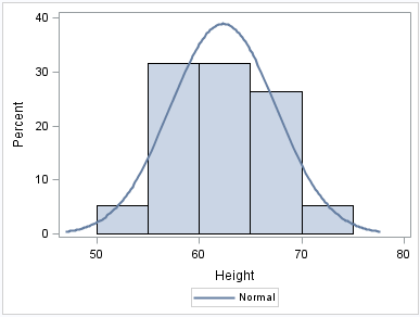
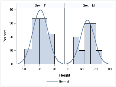
The following examples
show a density plot overlaid on a histogram. Examples are provided
for the SGPLOT and the SGPANEL procedures.
The SGPANEL example
shows output that is paneled by gender. The UNISCALE= ROW option specifies
that only the shared row axes are identical. The column axes vary
based on the values of the height for the respective genders.
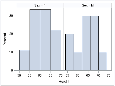
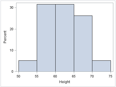
About Histograms
Histograms consist of
a series of columns representing the frequency of a variable over
a discrete interval or class.
The following examples
show the height distribution for a class of students. Examples are
provided for the SGPLOT and the SGPANEL procedures.
The SGPANEL example
shows output that is paneled by gender. The UNISCALE= ROW option ensures
that only the shared row axes are identical. The column axes vary
based on the values of the height for the respective genders.