Example Program and Statement Details
Example Program
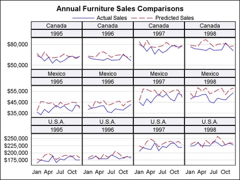
This example shows
a four-column, three-row data panel using two classification variables.
With this layout, each data cell is subsetted and labeled with the
values of the classification variables.
proc template;
 define statgraph layoutdatapanel;
  begingraph;
    entrytitle "Annual Furniture Sales Comparisons";
    layout datapanel classvars=(country year) /
      columns=4 rows=3 rowdatarange=union
      headerlabeldisplay=value
      headerbackgroundcolor=GraphAltBlock:color
      rowaxisopts=(display=(tickvalues) griddisplay=on
        linearopts=(tickvalueformat=dollar12.))
      columnaxisopts=(display=(tickvalues)
        timeopts=(tickvalueformat=monname3.));
      layout prototype / cycleattrs=true;
        seriesplot x=month y=TotalActual / name="Actual";
        seriesplot x=month y=TotalPredict / name="Predict";
      endlayout;
      sidebar / align=top;
        discretelegend "Actual" "Predict" / border=false;
      endsidebar;
    endlayout;
  endgraph;
 end;
run;

proc summary data=sashelp.prdsal2 nway;
  class country year month;
  var actual predict;
  output out=prdsal2 sum=TotalActual TotalPredict;
run;

proc sgrender data=prdsal2 template=layoutdatapanel;
run;
Statement Summary
The LAYOUT DATAPANEL
statement creates a grid of graphs, based on the values of one or
more classifications variables. The main differences between this
layout and the DATALATTICE layout is that this layout supports more
than two classification variables, and it provides more control over
the grid layout.
By default, the number
of cells in the layout is determined by a crosstabulation table of
all the classification variables plus any empty cells needed to complete
the last row or column of the grid. The contents of each data cell
are based on a graph prototype that you specify in the graph-prototype-block.
You can enhance the display using one or more sidebar-statement-blocks.
For classification variables that have many values, you can use the COLUMNS= option or the ROWS= option, or both with the PANELNUMBER= option to generate multiple panel
displays.
The order of the value
pairings for the classification variables is determined by the order
that the variables are specified on the CLASSVARS= argument. The last
named variable’s values vary most rapidly (like nested DO loops).
Variable values are always returned in data order.
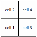
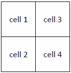
By default, the first
data cell to be filled is in the layout’s top left corner,
and data cells are filled from left-to-right, top-to-bottom. Use the START= option to change the starting data cell to the bottom left
corner, and use the ORDER= option to determine whether data
cells fill by column or by row. See the START= option for illustrations on how START= and ORDER= interact
to manage the fill sequence for data cells.
Required Argument
The CLASSVARS= argument
is required to specify a list of classification variables, using the
following syntax:
CLASSVARS=(class-var1 …class-varN)
By default, a data cell
is created for each crossing of these variables in the input data.
The total number of grid cells created is the result of a crosstabulation
table of all the classification variables plus any empty cells needed
to complete the last row or column of the grid. You can request that
data cells be generated for all possible crossings, even when the
class variables have no values at those crossings. For more information,
see the SPARSE= option.
If the class variable
is of type character, its values are returned in data order. To control
the ordering of the values, you can sort the input data by the classification
variables. If the class variable is of type numeric, the values are
displayed in ordinal order.
Formats can be assigned
to class variables to create classification levels (for example, an
AGEGROUPFMT. format for numeric AGE). In this case, the classification
is performed after the format is applied. For numeric data, the order
is ordinal, based on the first value in each class.
Use the INCLUDEMISSINGCLASS option to control whether cells are
displayed when any value crossing contains a missing value.
The output
size does not grow automatically as the number of cells increases.
To set a panel size for the current template, use the DESIGNHEIGHT=
and DESIGNWIDTH= options in the BEGINGRAPH statement. To set a panel
size for all templates in the current SAS session, use the HEIGHT=
and WIDTH= options in the ODS GRAPHICS statement. Size settings in
the ODS GRAPHICS statement override size settings in the BEGINGRAPH
statement. The default output width is 640px, and the default output
height is 480px.
As the number of cells
in the grid increases, the size of each cell decreases. At some point
the cells might become so small that a meaningful graph cannot be
rendered. The CELLHEIGHTMIN= and CELLWIDTHMIN= options set a threshold for the smallest
cell. If the actual cell height or width becomes smaller, no panel
is drawn. The default minimum cell size is CELLHEIGHTMIN=100px and
CELLWIDTHMIN=100px.
Using the default panel
size and cell size, the DATAPANEL layout accommodates a grid of about
24 cells (6 columns by 4 rows). If you know that the number of cells
is larger, you should increase the overall panel size, or decrease
the minimum cell size, or both. You can also use the ROWS=, COLUMNS=, and PANELNUMBER= options to partition your data so
that a number of smaller grids are produced that cumulatively show
all of the value crossings.
Prototype Block
You must specify a single graph-prototype-block within
the LAYOUT DATAPANEL block, using the following syntax:
Note: You can specify only one
LAYOUT PROTOTYPE block in the LAYOUT DATAPANEL block. If you specify
more than one, only the last prototype block specified is honored.
The remaining prototype blocks are ignored.
The graph-prototype-block determines
the graphical content of each data cell and is repeated within each
data cell, based on the subsets of the classification variables.
For more information
about the LAYOUT PROTOTYPE block and the list of available options,
see LAYOUT PROTOTYPE Statement.
Sidebar Blocks
A LAYOUT DATAPANEL enables
you to display sidebars outside
of the axis areas. A sidebar spans across columns or rows and is useful
for displaying information that applies to all of the columns or all
of the rows. For example, sidebars are useful for displaying a legend.
Options
specifies the color
of the layout background.
Interaction: OPAQUE= TRUE must be in effect in order for the color to be seen.
By default, OPAQUE=FALSE.
specifies the attributes
of the border line around the layout. See General Syntax for Attribute Options for the syntax
on using a style-element and Line Options for available line-options.
specifies the minimum
height of a cell in the grid.
Use this option in
conjunction with the CELLWIDTHMIN= option to set the minimum cell size.
The overall size of
the panel is constrained by the HEIGHT= and WIDTH= options in the
ODS GRAPHICS statement. As the number of cells in the grid increases,
the size of each cell decreases. At some point the cell becomes so
small that a meaningful graph cannot be rendered. This option sets
the minimum height threshold for all cells. If the actual cell height
becomes smaller, no panel is drawn.
specifies the minimum
width of a cell in the grid.
Use this option in
conjunction with the CELLHEIGHTMIN= option to set the minimum cell size.
The overall size of
the panel is constrained by the HEIGHT= and WIDTH= options in the
ODS GRAPHICS statement. As the number of cells in the grid increases,
the size of each cell decreases. At some point the cell becomes so
small that a meaningful graph cannot be rendered. This option sets
the minimum width threshold for all cells. If the actual cell width
becomes smaller, no panel is drawn.
specifies X-axis options
for all columns. For a list of options, see Axis Options for LAYOUT DATALATTICE/DATAPANEL.
specifies X2-axis options
for all columns. For a list of options, see Axis Options for LAYOUT DATALATTICE/DATAPANEL
Details: This option is needed only if you use a plot
statement that supports a secondary X2 axis. If you do not use that
statement’s XAXIS= option to map data to the X2 axis, this
option is ignored. For more information about how data are mapped
to the axes, see Plot Data Are Mapped to a Designated Axis
specifies how the X-axes
of instances of the graph-prototype are
scaled.
scales the X-axis data
ranges across all layout columns and panels (when PANELNUMBER= is in effect).
specifies how the X2-axes
of instances of the graph-prototype are
scaled.
scales the X2-axis
data ranges across all layout columns and panels (when PANELNUMBER= is in effect).
Details: This option is needed only if you use a plot
statement that supports a secondary X2 axis. If you do not use that
statement’s XAXIS= option to map data to the X2 axis, this
option is ignored. For more information about how data are mapped
to the axes, see Plot Data Are Mapped to a Designated Axis
specifies the number
of columns in the layout.
-
If this option is not specified and ROWS= is specified, the number of data cells (and columns) increases dynamically to allow all classifier values to be presented.
-
If both this option and ROWS= are specified, a grid of that size is created, regardless of the number of classifier values. If the number of classifier values is greater than the grid size, no graphs are created for some classifier values. If the number of classifier values is small and the grid size large, there might be empty cells created.
Interaction: The
overall grid size is constrained the HEIGHT= and WIDTH= options in
the ODS GRAPHICS statement. As the grid size grows, the cell size
shrinks. To control the minimum size of a cell use the CELLHEIGHTMIN= and CELLWIDTHMIN= options.
The PANELNUMBER= option enables you to create multiple
smaller grids that completely partition the classifier values.
specifies the color
and font attributes of the data labels. See General Syntax for Attribute Options for the syntax
on using a style-element and Text Options for available text-options.
specifies what information
is displayed in an inset. The variable-list defines
one or more variables whose names and values appear as a small table
in the data cells. The variables can be either numeric or character.
Variable names are separated by spaces.
Restriction: No
predefined information is available for the inset. You must create
the desired inset information as part of your input data. This is
most typically done as follows (see the chapter on classification
panels and the chapter on insets in SAS Graph Template Language: User's Guide for complete
examples):
-
Create a separate data set for the inset columns making sure that the column names are different from the other columns used in graph. The number observations of inset data should match the number of cells in the classification panel. The ordering of the inset observations should be the same as population order of the cells of the classification panel, taking into account the CLASSVARS= argument and the ORDER= and START= options. Typically, the number of observations for the inset data is smaller than the other input data for the graph.
The variable values
are associated with the data cells by data order. That is, the first
observation from all the variables in variable-list are
used in the first data cell, the second observation from all variables
in variable-list are used in
the second data cell, and so on. If a value is missing for an observation,
the corresponding name-value pair
is skipped in the affected data cell.
The location and appearance
of the inset is controlled by the INSETOPTS= option.
specifies location
and appearance options for the inset information.
The appearance-options can
be any one or more of the settings that follow. The options must be
enclosed in parentheses, and each option is specified as a name
= value pair.
specifies whether the
inset is automatically aligned within the layout.
| NONE | Do not automatically align this inset. This inset’s position is set by the HALIGN= and VALIGN= appearance-options. |
| AUTO | Attempt to center this inset in the area that is farthest from any surrounding markers. Data cells might have different inset placements. |
| (location-list) | Restrict this inset’s possible locations to those locations in the specified location-list, and use the location-list position that least collides with the data cell’s other graphics features. The location-list is blank-separated and can contain any of these locations: TOPLEFT TOP TOPRIGHT LEFT CENTER RIGHT BOTTOMLEFT BOTTOM BOTTOMRIGHT. Example: AUTOALIGN = (TOPRIGHT TOPLEFT) |
specifies the text
properties of the entire inset. See General Syntax for Attribute Options for the syntax
on using a style-element and Text Options for available text-options.
specifies the text
properties of the inset’s title string. See General Syntax for Attribute Options for the syntax
on using a style-element and Text Options for available text-options.
specifies whether data
cells are populated by column priority or by row priority.
Interaction: The
starting point for rendering data cells is controlled by the START=
option. See the START= option for examples.
specifies the amount
of extra space that is added inside the layout border.
Default: The
default padding for all sides is 0. Values without units are in pixels
(px). A unit must be provided if other than pixels.
Enables separate settings
for the left, right, top, and bottom padding dimensions. Use the pad-options to
create non-uniform padding. These options must be enclosed in parentheses.
Each option is specified as a name = value pair.
Sides not assigned padding are padded with the default amount.
| LEFT=dimension | specifies the amount of extra space added to the left side. |
| RIGHT=dimension | specifies the amount of extra space added to the right side. |
| TOP=dimension | specifies the amount of extra space added to the top. |
| BOTTOM=dimension | specifies the amount of extra space added to the bottom. |
specifies the number
of the panel to produce.
This option enables
you to partition a large grid into a number of smaller sized grids
under these conditions:
Example: Suppose
there are two classifiers (CLASS1 has 10 unique values and CLASS2
has 11 unique values). By setting some smaller grid size, say ROWS=3
and COLUMNS=4, and making the value of PANELNUMBER= a dynamic or macro
variable, you can create 10 panels (9 panels with 12 data cells and
1 panel with 2 data cells) that collectively display all 110 possible
crossings. You simply invoke PROC SGRENDER or a DATA step 10 times,
incrementing the dynamic value for PANELNUMBER each time.
specifies Y-axis options
for all rows. For a list of options, see Axis Options for LAYOUT DATALATTICE/DATAPANEL.
specifies Y2-axis options
for all rows. For a list of options, see Axis Options for LAYOUT DATALATTICE/DATAPANEL.
Details: This option is needed only if you use a plot
statement that supports a secondary Y2 axis. If you do not use that
statement’s YAXIS= option to map data to the Y2 axis, this
option is ignored. For more information about how data are mapped
to the axes, see Plot Data Are Mapped to a Designated Axis
specifies how the Y-axes
of instances of the graph-prototype are
scaled.
scales the Y-axis data
ranges across all layout rows and panels (when PANELNUMBER= is in effect).
Use the ROWAXISOPTS= option to control shared axis features.
See the PANELNUMBER= option for a discussion of how to
create multiple panels.
specifies how the Y2-axes
of instances of the graph-prototype are
scaled.
scales the Y2-axis
data ranges across all layout rows and panels (when PANELNUMBER= is in effect).
Details: This option is needed only if you use a plot
statement that supports a secondary Y2 axis. If you do not use that
statement’s YAXIS= option to map data to the Y2 axis, this
option is ignored. For more information about how data are mapped
to the axes, see Plot Data Are Mapped to a Designated Axis
specifies the amount
of empty space between the rows.
-
If this option is not specified and COLUMNS= is specified, the number of data cells (and rows) increases dynamically to allow all classifier values to be presented.
-
If both this option and COLUMNS= are specified, a grid of that size is created, regardless of the number of classifier values. If the number of classifier values is greater than the grid size, no graphs are created for some classifier values. If the number of classifier values is small and the grid size large, there might be empty cells created.
Interaction: The
overall grid size is constrained the HEIGHT= and WIDTH= options in
the ODS GRAPHICS statement. As the grid size grows, the cell size
shrinks. To control the minimum size of a cell use the CELLHEIGHTMIN= and CELLWIDTHMIN= options.
The PANELNUMBER= option enables you to create multiple
smaller grids that completely partition the classifier values.
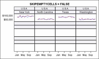
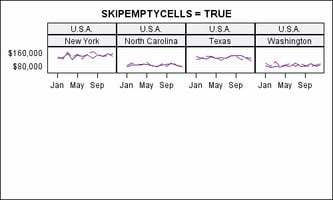
specifies whether the
external axes skip the empty cells in a partially filled grid.
Discussion: Whenever
the total number of classifier crossings (data cells) is not evenly
divisible by the panel size (columns * rows), the last panel is partially
filled with data cells and padded with empty cells to complete the
grid.
In this example, there
are 16 data cells arranged in a 4-column, 3-row grid. This is default
appearance of the last panel:
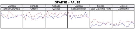
Specifies whether crossings
of the class variables include only the crossings in the data or all
possible crossings.
By default, if a crossing
of the class variables has a missing value as part of the data, a
data cell is created for it.
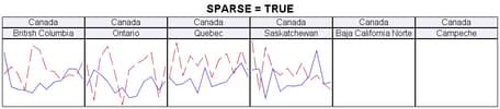
Discussion: In
this example, the classification variables are COUNTRY and STATE.
There are 3 distinct values of COUNTRY (Canada, Mexico, and U.S.A.)
Within Canada and Mexico there are 4 states, and within U.S.A. there
are 8 states. All state names are unique to each country. Therefore,
there are 16 unique STATE values and 48 unique crossings of COUNTRY
and STATE, but there are data for only 16 of the crossings.
Assume that a data
panel layout is created with COLUMNS=6 and SPARSE=TRUE, meaning to
display all possible crossings. This is what the first row would look
like. Blank data cells are added whenever there are no data values
for a crossing: