Example Program and Statement Details

Example Graph

The following graph was generated by the Example Program:
Example Graph with a Title

Example Program

proc template;
  define statgraph entrytitle;
    begingraph;

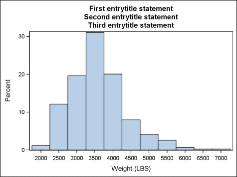
      entrytitle "First entrytitle statement" ;

        layout overlay;
          histogram weight;
        endlayout;

      entrytitle "Second entrytitle statement" ;
      entrytitle "Third entrytitle statement" ;

    endgraph;
  end;
run;

proc sgrender data=sashelp.cars template=entrytitle;
run;

Statement Summary

The ENTRYTITLE statement places title text above the graphical area. More than one ENTRYTITLE statement can be used. Titles appear in the order of the ENTRYTITLE statements within the template.
Title Text is Displayed Above the Graphical Area
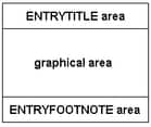
When adding an ENTRYTITLE statement to a template definition, the statement must be located within the BEGINGRAPH block but outside of the outermost layout block.
  • All ENTRYTITLE statements that appear in the template are gathered and placed in the ENTRYTITLE area.
  • The placement of an ENTRYTITLE statement is relevant only in relation to other ENTRYTITLE statements.
  • As the number of ENTRYTITLE statements increases the size of the graphical area is reduced.
Titles always span the entire width of the output. By default, titles are “center-aligned,” based on the type of the outermost layout. The meaning of “center-aligned” varies by layout type and the number of columns in the layout:
Layout Type
Default horizontal centering of titles
GRIDDED
OVERLAY3D
LATTICE (COLUMNS > 1)
DATAPANEL (COLUMNS > 1)
DATALATTICE (COLUMNS > 1)
Centered on width of entire graph
OVERLAY
OVERLAYEQUATED
LATTICE (COLUMNS = 1)
DATAPANEL (COLUMNS = 1)
DATALATTICE (COLUMNS = 1)
Centered on the plot area

Required Arguments

text-item <…<text-item>>
specifies one or more pieces of text for the entry. Each text-item has the following form:
<prefix-option<prefix-option>>"string" | dynamic | character-expression | {text-command}
Each piece of text can have multiple prefix options that precede the piece of text. A piece of text is either a string literal, a dynamic, or a text command. All text-items with the same HALIGN= setting are concatenated into one string. Up to three strings can result for each ENTRY statement. Leading and trailing blanks in the concatenated string are always used.
When used, a prefix option applies not only to immediately following piece of text but also to ALL subsequent text strings and text-commands. If the same prefix option appears more than once, it has the effect of overriding the last used prefix of the same name.
Requirement:
  • string must be enclosed in quotation marks.
  • character-expression must be enclosed in an EVAL function.
  • text-command must be enclosed in braces.
Restriction: The maximum length for the title text is 512 characters.
See Managing Text Items for more information and several examples.

Options and Text Commands

prefix-option
Description
Specifies the horizontal alignment of a text-item.
Specifies font attributes for a text-item.
text-command
Description
{SUB}
Specifies that the string or dynamic appears as a subscript.
{SUP}
Specifies that the string or dynamic appears as a superscript.
Specifies a glyph (graphical character) to be displayed using its Unicode specification or keyword equivalent.
Statement Option
Description
Specifies the color of the title background.
Specifies whether a border is displayed around the title.
Specifies the properties of the border line.
Specifies whether the title background is opaque.
Specifies the amount of extra space that is reserved inside the title border.
Specifies an alternate title to use if the specified title is too long for the output width.
Specifies the text properties of the entire title text.
Specifies how to handle a title that is too long to fit in the output width.
BACKGROUNDCOLOR=style-reference | color
specifies the color of the title background.
Default: The GraphBackground:Color style reference.
style-reference
A reference of the form style-element:style-attribute. Only the style-attribute named COLOR is used.
Interaction: OPAQUE=TRUE must be in effect for the color to be seen. By default, OPAQUE=FALSE.
BORDER=boolean
specifies whether a border is displayed around the title.
Default: FALSE
BORDERATTRS=style-element | style-element (line-options) | (line-options)
specifies the attributes of the border line around the title. See General Syntax for Attribute Options for the syntax on using a style-element and Line Options for available line-options.
Default: The GraphBorderLines style element.
Interaction: BORDER=TRUE must be set for this option to have any effect.
HALIGN=CENTER | LEFT | RIGHT
prefix-option that specifies the horizontal alignment of a text-item.
Default: CENTER
Each text-item has a horizontal alignment, and text-items with the same alignment are always concatenated together.
OPAQUE=boolean
specifies whether the title background is opaque (TRUE) or transparent (FALSE).
Default: FALSE
Interaction: When this option is set to FALSE, the background color is not used.
PAD=dimension | (pad-options)
specifies the amount of extra space that is reserved inside the title border.
Default: (LEFT=3 RIGHT=3 TOP=0 BOTTOM=0)
dimension
Specifies a dimension to use for the extra space at the left, right, top, and bottom of the title border.
(pad-options)
Enables separate settings for the left, right, top, and bottom padding dimensions. Use the pad-options to create non-uniform padding. These options must be enclosed in parentheses. Each option is specified as a name = value pair. Sides not assigned padding are padded with the default amount.
Values without units are in pixels (px). A unit must be provided if other than pixels.
LEFT=dimension specifies the amount of extra space added to the left side.
RIGHT=dimension specifies the amount of extra space added to the right side.
TOP=dimension specifies the amount of extra space added to the top.
BOTTOM=dimension specifies the amount of extra space added to the bottom.
SHORTTEXT= (text-item <…<text-item>>)
specifies an alternate title to use if the specified title is too long for the output width. If the shortened text is itself too long, it is truncated.
Default: no default
Interaction: This option has no effect unless TEXTFITPOLICY=SHORT.
Interaction: This option is ignored if any text-items include an HALIGN= prefix option.
Interaction: The horizontal alignment of the shortened text is derived from the horizontal alignment of the title to be shortened.
{ SUB "string" | dynamic }
text-command that specifies that the string or dynamic is to appear as subscript text.
Default: no default
Example: entrytitle "y = " b{sub "0"} " + b" {sub "1"} "x";
{ SUP "string" | dynamic }
text-command that specifies that the string or dynamic is to appear as superscript text.
Default: no default
Example: entrytitle "R" {sup "2"} " = " RSQUARED;
TEXTATTRS=style-element | style-element (text-options) | (text-options)
as a statement option, specifies the text properties of the entire entry text. As a prefix-option, specifies the text properties of individual text-items. See General Syntax for Attribute Options for the syntax on using a style-element and Text Options for available text-options.
Default: The GraphTitleText style element.
This option can be used as both a prefix option and a statement option. When used as a prefix option, it overrides the statement option.
When used as a prefix option, TEXTATTRS=( ) cancels the last used TEXTATTRS= prefix option. It resets all text options to those set by 1) the TEXTATTRS= statement option or 2) the default style element for the statement (GraphTitleText) if no TEXTATTRS= statement option is used.
TEXTFITPOLICY=WRAP | SHORT | TRUNCATE
specifies how to handle a title that is too long to fit in the output width.
Default: WRAP
WRAP
specifies that the text wraps to the next line(s).
SHORT
specifies that the text indicated by the SHORTTEXT= option be substituted when the title does not fit.
TRUNCATE
specifies that the text is truncated to make it fit.
Interaction: If you specify SHORT for this option, you should assign a shortened version of the title with the SHORTTEXT= option. If the shortened title is itself too long, it is truncated.
{ UNICODE "hex-string"x | keyword | dynamic }
text-command that specifies a glyph (character) to be displayed using its Unicode specification or keyword equivalent.
Default: no default
"hex-string"x
A four-byte hexadecimal constant that represents a UNICODE character in the current font. For a complete listing, see http://unicode.org/charts/charindex.html.
keyword
A SAS keyword for a UNICODE character. For a listing of SAS supplied keywords, see Reserved Keywords and Unicode Values.
dynamic
The dynamic must resolve to either "hex-string"x or a keyword for a UNICODE character.
Examples: The following statements show how to use the {UNICODE} text command:
entrytitle {unicode alpha} "=" CONF;

entrytitle {unicode "03B1"x} "=" CONF;
This text command attempts to access a UNICODE value in the current font. Not all fonts support accessing characters via their UNICODE value. Some fonts only support a limited set of UNICODE values. If the UNICODE value is not accessible, the command might be ignored or an unprintable character might be substituted.