Example Program and Statement Details
Example Program
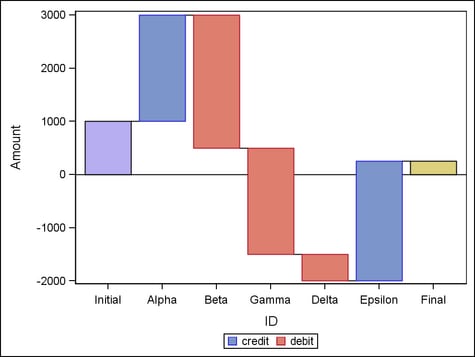
data transactions;
input ID $ Amount type $;
datalines;
Alpha 2000 credit
Beta -2500 debit
Gamma -2000 debit
Delta -500 debit
Epsilon 2250 credit
;
proc template;
  define statgraph waterfallchart;
    begingraph;
      layout overlay;
        waterfallchart category=id response=amount /
          colorgroup=type
          initialbarvalue=1000
          name="waterfall";
        discretelegend "waterfall";
      endlayout;
    endgraph;
  end;
run;

proc sgrender data=transactions template=waterfallchart;
run;
Statement Summary
The input data for the
WATERFALLCHART statement is raw, unsummarized input data, and the
statement calculates appropriate summarization statistics (sum or
mean). By default, the bars in the chart appear in the order in which
the CATEGORY values are present in the input data. A waterfall chart
is typically used to show credit and debit transactions or successive
changes to a given state.
In a waterfall chart,
the bars that are calculated from the data are called “transaction”
bars. The transaction bars represent the values of the RESPONSE variable
across a series of intermediate values for the specified CATEGORY
variable. You can manage the color of the transaction bars using the COLORGROUP, COLORMODEL, or COLORRESPONSE= option.
A waterfall chart can
also display an “initial” bar and a “final”
bar. The value of the initial bar determines the starting response
value for the first transaction bar. To set the initial value, use
the INITIALBARVALUE= option. If the initial bar is not
displayed, the first transaction bar has a starting response value
of 0. The value of the final bar is set automatically to the ending
value of the last transaction bar.
Options
specifies the text
properties of the bar label text. See General Syntax for Attribute Options for the syntax
on using a style-element and Text Options for available text-options.
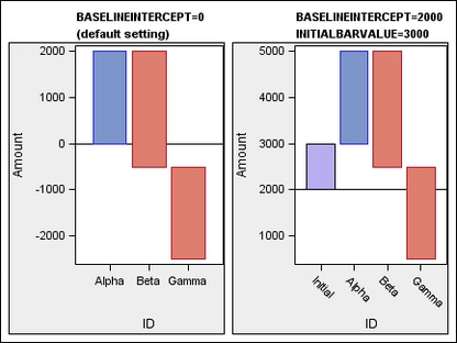
specifies the response-axis
intercept for the baseline.
Interaction: This
setting affects only the chart’s “initial” and
“final” bars. If no initial bar value is specified,
then the first transaction bar is drawn from 0, no matter what is
set for the baseline value.
specifies a column
that is used to discretely color the transaction bars.
specifies
a discrete attribute variable that is defined in a DISCRETEATTRVAR statement.
Default: no
default. All the transaction bars have only one fill and one outline
color, determined by the ODS style or set by the FILLATTRS= and OUTLINEATTRS= options.
Interaction: If
a column or expression is
specified, the unique column values are found and the transaction
bar colors are derived from the GraphData1 - GraphDataN style elements.
The COLOR attribute is used for the bar fill colors and the CONTRASTCOLOR
attribute is used for the bar outline colors.
Interaction: If
a variable that is associated with an attribute map is specified,
then the color mapping defined by the associated DISCRETEATTRMAP statement
is used for the transaction bars.
Tip: To
manage the color of the “initial” bar, use the INITIALBARATTRS= option. To manage the color of the
“final” bar, use the FINALBARATTRS= option.
specifies a style element
to use to determine the colors of the transaction bars.
name of a style element.
The style element should contain these style attributes:
| STARTCOLOR | color for the smallest data value of the column that is specified on the COLORRESPONSE= option |
| NEUTRALCOLOR | color for the midpoint of the range of the column that is specified on the COLORRESPONSE= option |
| ENDCOLOR | color for the highest data value of the column that is specified on the COLORRESPONSE= option |
Tip: To
manage the color of the “initial” bar, use the INITIALBARATTRS= option. To manage the color of the
“final” bar, use the FINALBARATTRS= option.
specifies the values
to use to map the transaction-bar colors to a continuous color gradient.
specifies
a range attribute variable that is defined in a RANGEATTRVAR statement.
-
If a numeric-column or an expression is specified, then the value of the COLORMODEL= option determines the color ramp.
Tip: To
produce “discrete” color mapping, the RANGEATTRMAP statement
can define an attribute map that maps a single color to all values
greater than 0, and another color to all values less than 0.
Tip: The FILLTYPE= option can be used to indicate whether the color mapping
is used to produce solid or gradient fills.
specifies the appearance
of the trend lines that connect the bars. See General Syntax for Attribute Options for the syntax
on using a style-element and Line Options for available line-options.
specifies the appearance
of trend lines that denote a decreasing value between bars. See General Syntax for Attribute Options for the syntax
on using a style-element and Line Options for available line-options.
specifies the appearance
of trend lines that denote an increasing value between bars. See General Syntax for Attribute Options for the syntax
on using a style-element and Line Options for available line-options.
enhances the visual
appearance of the filled bars.
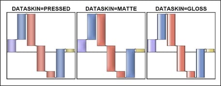
Requirement: For
this option to have any effect, the fill must be enabled by the ODS
style or the DISPLAY= option.
Interaction: When
a data skin is applied, all bar outlines are set by the skin, and
the OUTLINEATTRS= option is ignored.
specifies the degree
of the transparency of the bar fill, bar outline, and trend lines,
if displayed.
Tip: The
FILLATTRS = option can be used to set transparency
for just the filled bar area. The INITIALBARATTRS= and FINALBARATTRS= options can be used to specify transparency
for the initial and final bars. You can combine this option with FILLATTRS=,
INITIALBARATTRS=, and FINALBARATTRS= to set one transparency for the
bar outlines and trend lines but a different transparency for the
bar fills. Example:
datatransparency=0.2 fillattrs=(transparency=0.6)
specifies which bar
features to display.
a list of options,
enclosed in parentheses, that must include one or more of the following:
CONNECT—Displays
line segments (trend lines) connecting adjacent bar. The connection
point is determined by the CONNECT= option.
Tip: To
control the appearance of the bars, use the COLORMODEL=, FILLATTRS=, and OUTLINEATTRS= options.
Tip: To
control the appearance of the trend lines, use the CONNECTATTRS=, CONNECTDECREASINGATTRS=, and CONNECTINCREASINGATTRS= options.
specifies the appearance
of the filled transaction bars. See General Syntax for Attribute Options for the syntax
on using a style-element and Fill Options for available fill-options.
-
If the COLORGROUP= option is not specified, the GraphDataDefault:Color style reference.
Interaction: This
option is ignored if either the COLORMODEL= or COLORRESPONSE= option is specified.
Tip: The DATATRANSPARENCY= option sets the transparency for
the bar fill, bar outline, and trend lines. You can combine this option
with DATATRANSPARENCY= to set one transparency for the bar outlines
and trend lines but a different transparency for the bar fills. Example:
datatransparency=0.2 fillattrs=(transparency=0.6)
determines whether
a solid or gradient fill is used in the bars.
Tip: The
colors that are used depend on whether the COLORGROUP= option or the COLORRESPONSE= option is also specified.
specifies the appearance
of the “final” bar, if displayed. See General Syntax for Attribute Options for the syntax
on using a style-element and Fill Options for available fill-options.
specifies the appearance
of the “initial” bar, if displayed. See General Syntax for Attribute Options for the syntax
on using a style-element and Fill Options for available fill-options.
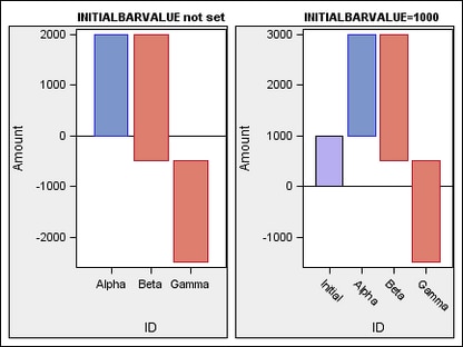
specifies a value for
the “initial” bar. The initial bar’s value is
used as the starting response value for the first transaction bar.
Interaction: If
this option is not specified, the initial bar is not included in the
chart and the first transaction bar is drawn from response value 0.
This is true even if an intercept value is set by the BASELINEINTERCEPT= option.
specifies the appearance
of the bar outlines. See General Syntax for Attribute Options for the syntax
on using a style-element and Line Options for available line-options.
Interaction: For
this option to have any effect, outlines must be enabled by the ODS
style or the DISPLAY= option.
specifies user-defined
roles that can be used to display information in the tooltips. Columns
for the tooltip display are specified in the TIP= option.
Requirement: The
role names that you choose must be unique and different from the pre-defined
roles CATEGORY, RESPONSE, COLORGROUP, and COLORRESPONSE.
specifies the information
to display when the cursor is positioned over a bar. If this option
is used, it replaces all the information displayed by default. Roles
for columns that do not contribute to the waterfall chart can be specified
along with roles that do.
Default: The
columns assigned to these roles are automatically included in the
tooltip information: CATEGORY and RESPONSE.
an ordered, blank-separated
list of unique WATERFALLCHART and user-defined roles. WATERFALLCHART
roles include CATEGORY, RESPONSE, COLORGROUP, and COLORRESPONSE.
Requirement: To
generate tooltips, you must include an ODS GRAPHICS ON statement that
has the IMAGEMAP option specified, and write the graphs to the ODS
HTML destination.
Interaction: The
labels and formats for the TIP variables can be controlled with the TIPLABEL= and TIPFORMAT= options.
specifies display formats
for the information that is defined by the tooltip roles.
Default: The
column format of the variable assigned to the role or BEST6. if no
format is assigned to a numeric column.
Requirement: This
option provides a way to control the formats of columns that appear
in tooltips. Only the roles that appear in the TIP= option are used. Columns must be assigned to the roles
for this option to have any effect.
specifies display labels
for the information that is defined by the tooltip roles.
Requirement: This
option provides a way to control the labels of columns that appear
in tooltips. Only the roles that appear in the TIP= option are used. Columns must be assigned to the roles
for this option to have any effect.
specifies an HTML page
to display when a bar is selected.
Requirement: To
generate selectable bars, you must include an ODS GRAPHICS ON statement
that has the IMAGEMAP option specified, and write the graphs to the
ODS HTML destination.
For non-grouped data,
the values of the column are expected to be same for each unique RESPONSE
value. If they are not, the results might be unpredictable. The URL
value can be blank for some RESPONSE values, meaning that no action
is taken when the bars for those RESPONSE values are selected. The
URL value can be the same for different RESPONSE values, meaning that
the same action is taken when the bars for those RESPONSE values are
selected.
specifies whether data
are mapped to the primary X (bottom) axis or to the secondary X2 (top)
axis.
Interaction: The
overall plot specification and the layout type determine the axis
display. For more information, see How Axis Features Are Determined.
specifies whether data
are mapped to the primary Y (left) axis or to the secondary Y2 (right)
axis.
Interaction: The
overall plot specification and the layout type determine the axis
display. For more information, see How Axis Features Are Determined.