Example Program and Statement Details
Example Graph
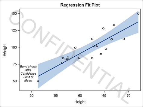
The following graph
was generated by the Example Program. The first
DRAWTEXT statement shows how to draw multiple lines of text in a specific
position within the graph. The second DRAWTEXT statement shows how
to create a watermark, which is achieved by applying transparency
to text that is rotated within the graph.
Example Program
proc template;
 define statgraph modelfit;
  begingraph;
    entrytitle "Regression Fit Plot";
    layout lattice;
      layout overlay / xaxisopts=(offsetmin=.1);
        drawtext textattrs=(style=italic size=8pt)
          "Band shows 99% Confidence Limit of Mean" /
          anchor=bottomleft width=15 widthunit=percent
          xspace=wallpercent yspace=wallpercent
          x=0 y=10 justify=center ;
        modelband "myclm";
        scatterplot x=height y=weight / primary=true;
        regressionplot x=height y=weight / alpha=.01 clm="myclm";
      endlayout;
    endlayout;
    drawtext textattrs=(color=gray size=52pt) "CONFIDENTIAL" /
      transparency=.75 rotate=-35
      width=110 widthunit=percent justify=center ;
  endgraph;
 end;

proc sgrender data=sashelp.class template=modelfit;
run;
Statement Summary
A DRAWTEXT statement
draws a text box that contains one or more lines of text. The text
can be formatted, using the TEXTATTRS= prefix option. By default, the text
box is drawn in the center of the graph. You can change the default
position with the options ANCHOR=, X=, Y=, XSPACE=, and YSPACE=.
For general
information about the types of elements that can be drawn with the
draw statements, the drawing space and drawing units that they use,
and how the drawn elements are anchored, see Key Concepts for Using Draw Statements. For detailed usage information, consult the SAS Graph Template Language: User's Guide.
Required Argument
specifies one or more
pieces of text for the text box. Each text-item has the following form:
Each piece of text
can have a prefix setting that precedes the piece of text. A piece
of text is either a string literal, a dynamic, or a text command.
All text-items are concatenated
into one string, which might be wrapped, based on the settings for
the WIDTH= and WIDTHUNIT= settings. Leading and trailing blanks
in the concatenated string are always used.
When used, a prefix
option applies to the immediately following piece of text and also
to all subsequent text strings and text-commands until another prefix
option is specified.
See Managing Text Items for more information and several examples.
Options and Text Commands
specifies an anchor
point for the text box.
Discussion: The anchor point can be at the center of the text box or at eight
points on the border of the text box bounding box. The following figure
shows the anchor points for TOPLEFT and LEFT.

The coordinates of
the anchor point are set by the X= and Y= options, and by the XSPACE= and YSPACE= options. The XAXIS= and YAXIS= option might affect positioning when
the XSPACE= or YSPACE= options are set to DATAPIXEL, DATAPERCENT,
or DATAVALUE.
The text box has a
fixed width, determined by the WIDTH= and WIDTHUNIT= options. The height of the text box
is based on the amount of text specified and the font size. The height
of the text grows in a direction that is related to the anchor point.
For example, if ANCHOR=TOPLEFT, the text box height extends downward
from the anchor point and its width extends to the right. If ANCHOR=CENTER,
half the text box width and half the text box height extend equally
left and right, as well as top to bottom from the anchor point. If
ANCHOR=BOTTOM, the text box height extends upward from the anchor
point and the text box width is centered at the anchor point.
specifies the properties
of the border line that is drawn around the text box. See General Syntax for Attribute Options for the syntax
on using a style-element and Line Options for available line-options.
DRAWSPACE= GRAPHPERCENT | GRAPHPIXEL | LAYOUTPERCENT | LAYOUTPIXEL
| WALLPERCENT | WALLPIXEL | DATAPERCENT | DATAPIXEL | DATAVALUE
specifies a default
drawing space and drawing units for this DRAWTEXT statement.
Interaction: This statement and all of the draw statements inherit the global
DRAWPSACE= setting from the DRAWSPACE= option in the BEGINGRAPH statement.
Setting this option changes the setting for only this DRAWTEXT statement.
Specifies the alignment
of text that wraps within the text box.
Interaction: Text is wrapped based on the width of the specified text, the font
size, and the setting in the PAD= option.
specifies whether the
text box appears on top of (FRONT) or behind (BACK) the graph.
Interaction: If this option is set to BACK, the text box is drawn behind background
areas, such as a layout or legend background.For elements that are obstructed because they are in the
back layer, you can suppress the display of filled areas in the graph.
Or, you can use transparency to manage the element visibility. For
more information, see About Drawing Layers.
specifies the amount
of extra space that is reserved inside the text box’s border.
Enables separate settings
for the left, right, top, and bottom padding dimensions. Use the pad-options to create non-uniform padding. These
options must be enclosed in parentheses. Each option is specified
as a name = value pair. Sides
not assigned padding are padded with the default amount.
| LEFT=dimension | specifies the amount of extra space added to the left side. |
| RIGHT=dimension | specifies the amount of extra space added to the right side. |
| TOP=dimension | specifies the amount of extra space added to the top. |
| BOTTOM=dimension | specifies the amount of extra space added to the bottom. |
specifies the angle
of rotation for the text box, measured in degrees. The angle is measured
as if a horizontal line extended to the right through the text box
anchor point. Positive angles rotate the text box counter clockwise,
and negative angles rotate the text box clockwise. The angle specification
can exceed 360 degrees in absolute value.
prefix-option that specifies the color and font
properties of the entire text string or individual text-items. See General Syntax for Attribute Options for the syntax
on using a style-element and Text Options for available text-options.
Interaction: When multiple TEXTATTRS=( ) prefix options are used, each one cancels
the last, resetting all text properties to the default set by the
GraphValueText style element. Subsequent text-items to the right are then assigned the text properties specified in
the closest TEXTATTRS=( ) setting to their left. Thus, to vary the
text properties across text-items, you do not have to override settings from a previous TEXTATTRS=(
) setting. Each TEXTATTRS=( ) specification resets all text properties
to the default so that only the new settings are applied to subsequent text-items.
text-command that specifies a glyph (character)
to be displayed using its Unicode specification or keyword equivalent.
A four-byte hexadecimal
constant that represents a UNICODE character in the current font.
For a complete listing, see http://unicode.org/charts/charindex.html.
A SAS keyword for a
UNICODE character. For a listing of SAS supplied keywords, see Reserved Keywords and Unicode Values..
This text command
attempts to access a UNICODE value in the current font. Not all fonts
support accessing characters via their UNICODE value. Some fonts support
only a limited set of UNICODE values. If the UNICODE value is not
accessible, the command might be ignored or an unprintable character
might be substituted.
specifies whether the
value that is specified for the WIDTH= option is interpreted as a
percentage value, a pixel value, or a value that is in the units of
the data.
Interaction: This setting combines with the XSPACE= setting to interpret the width that
is set in the WIDTH= argument.
XSPACE= GRAPHPERCENT | GRAPHPIXEL | LAYOUTPERCENT | LAYOUTPIXEL
| WALLPERCENT | WALLPIXEL | DATAPERCENT | DATAPIXEL | DATAVALUE
specifies the drawing
space and drawing units for interpreting the value that is specified
in the X= option.