Quick-Start Example Two: Enhance the Simple Quick-Start Graph

About Quick-Start Example Two

This example builds on and enhances the graph that you created in quick-start example one, which showed the distribution of the weight of individuals who participated in a medical study.
The graph that you create here adds more information to the example. In this example, you add a kernel density plot to the histogram. You also create a second column that contains a box plot, add a global legend, and change the line format of the kernel density curve.
Enhanced Graph
Enhanced Graph

Step One: Open Quick-Start Example One

Open the graph that you created and saved in quick-start example one.
Select Filethen selectOpen, and then navigate to the file that you saved.
If you have not yet created the graph, then follow the steps provided in Quick-Start Example One: Design a Simple Graph to create the graph.

Step Two: Add a Kernel Density Plot to the Histogram

  1. From the Plot Layers panel, click and drag the Kernel icon to the graph.
    The Kernel icon looks like this: kernel icon
    The Assign Data dialog box appears.
  2. In the Assign Data dialog box, keep the default selections and click OK. The kernel plot is added to your graph.

Step Three: Add a Column Cell to the Graph

Right-click anywhere within the plot area of the graph and select Add a Column. A new blank column is added to the graph. The column consists of one cell that contains the text “(drop a plot here...)”.
blank column added to the graph

Step Four: Add a Box Plot to the New Cell

  1. From the Plot Layers panel of the Elements pane, click and drag the Box icon to the new cell in the graph.
    The Box icon looks like this: Box icon
    The Assign Data dialog box appears.
  2. In the Assign Data dialog box, complete these steps:
    • Select SASHELP from the Library list box.
    • Select HEART from the Data Set list box.
    • Select SEX from the X list box.
    • Select WEIGHT from the Y list box.
    Assign Data dialog box, variables for the box plot
  3. Click OK.
The graph now contains a box plot.
Graph with box plot in second column

Step Five: Add a Global Legend to the Graph

  1. Click Global Legend icon in the toolbar to add a global legend. The Global Legend dialog box appears.
  2. Select the check box next to normal and kernel.
    Global Legend dialog box with normal and kernel plots selected.
  3. Click OK.
The graph now contains a global legend.
Graph with a global legend

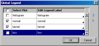
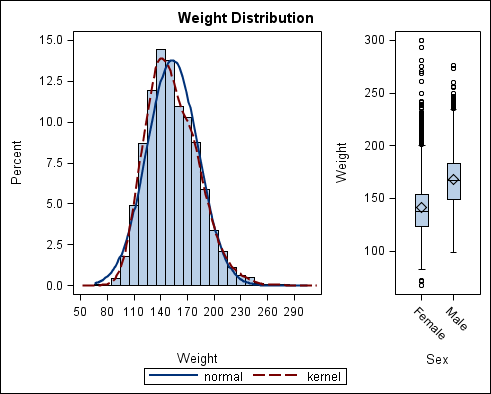
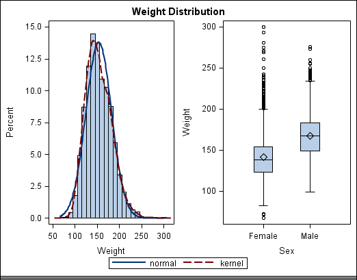
Step Six: Change the Format of the Kernel Plot

In the example, both the normal and the kernel density plots have the same visual properties, and you cannot distinguish between the two. In this step, you change the format of the kernel plot so that you can distinguish the kernel plot from the normal plot.
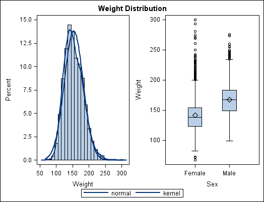
  1. Right-click anywhere within the plot area of the first cell (column one) and select Plot Properties. The Cell Properties dialog box appears with the Plots tab displayed.
  2. From the Plot list box, select kernel.
    Note: Alternatively, in step 1, right-click directly on the kernel plot and select Plot Properties. Then kernel is already selected in the Plot list box.
    Cell Properties dialog box
  3. From the Style Element list box, select GraphFit2.
    Cell Properties dialog box
  4. Click OK.
The kernel curve is now a red dashed line. This change makes it easier to distinguish the normal curve from the kernel curve. Note also that the legend has been updated with the new property.
Kernel curve has a different format
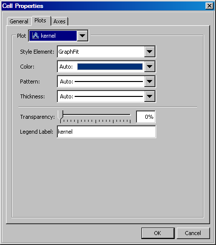
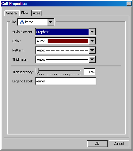
Style elements are obtained from ODS styles and determine the format of plot elements. It is preferable to change the style element rather than the explicit line properties of the kernel plot. Changing the style element guarantees that the kernel and normal plots are visually distinct for any style that is applied to the graph.

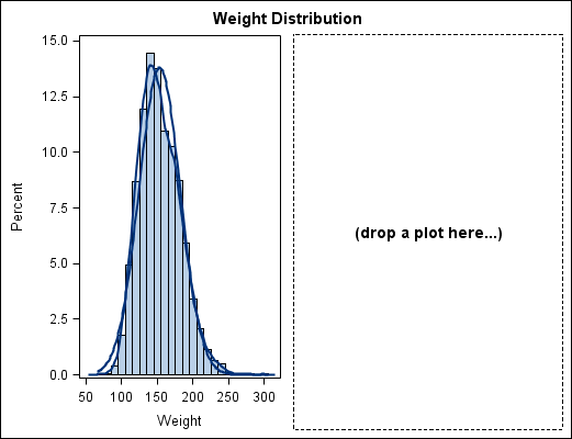
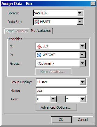
Step Seven: Widen the Cell in the First Column

Both cells in the graph currently have the same width. You can widen the cell that contains the histogram so that the histogram has more space.
  1. Position the cursor between the two cells of the graph. A dashed line appears between the cells and the cursor changes to a two-headed arrow two-headed arrow.
  2. Click and drag the dashed line toward the right. The cell with the histogram becomes wider and the cell with the box plot becomes narrower.
The first cell is wider than the second cell

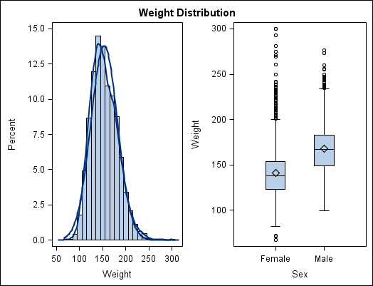
Step Eight: Save the Graph

To save the graph, select Filethen selectSave As and then specify the filename and type. For more information, see Save a Graph to a File.