Example of Using the Designer

About This Example

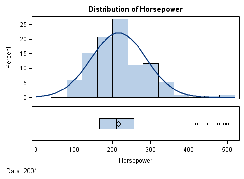
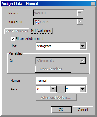
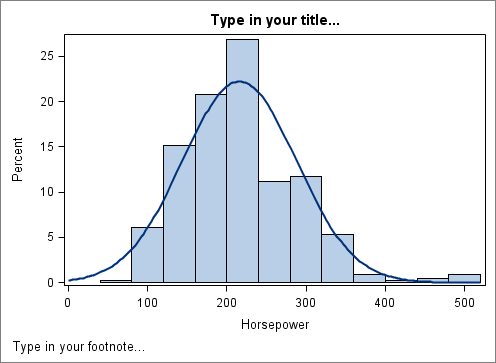
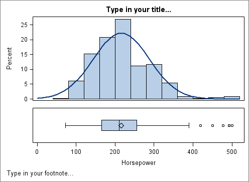
In this example, you create a paneled graph with two cells, each containing different types of plots. The graph shows the horsepower distribution for automobiles. The example uses the SASHELP.CARS data.
Two-Cell Graph Example
There are several ways to create and customize this graph. The following steps show one way to create the graph.

Step One: Create the First Cell and Assign Data

  1. Start the ODS Graphics Designer. In the SAS windowing environment, select Toolsthen selectODS Graphics Designer. The designer opens and displays the Graph Gallery.
  2. On the Basic tab of the Graph Gallery, double-click the Histogram icon.
    Graph Gallery
    The Assign Data dialog box appears. When you create a graph from the Graph Gallery, the graph has placeholder data assigned to its plot. The Assign Data dialog box enables you to easily change the data that is associated with the plot.
  3. In the Assign Data dialog box, complete these steps:
    • Select SASHELP from the Library list box.
    • Select CARS from the Data Set list box.
    • Select HORSEPOWER from the X list box.
    Assign Data dialog box
  4. Click OK.
  5. From the Plot Layers panel of the Elements pane, click and drag the Normal icon to the graph.
    Assign Data dialog box
    The Assign Data dialog box appears.
  6. In the Assign Data dialog box, do not change the default selections.
    Assign Data dialog box
    Click OK. A normal curve is added to your graph.
Here are the results of your graph so far.
Histogram and Normal Plots

Step Two: Add a Second Cell, Adjust Cell Height, and Use a Common Axis

  1. Right-click anywhere within the plot area and select Add a Row. A new row cell is added below the histogram.
  2. From the Plot Layers panel, click and drag the Box(H) icon to the new cell. The Assign Data dialog box appears.
  3. In the Assign Data dialog box, complete these steps:
    • Select SASHELP from the Library list box.
    • Select CARS from the Data Set list box.
    • Select HORSEPOWER from the Y list box.
  4. Click OK.
    Both cells in the graph currently have the same height. In the next step, you adjust the cell height so that the histogram has more space.
  5. To adjust the height of the two cells:
    1. Position the cursor between the two cells of the graph. A dashed line appears between the cells and the cursor changes to a two-headed arrow two-headed arrow.
    2. Click and drag the dashed line downward. The cell with the histogram becomes taller, and the cell with the box plot becomes shorter.
  6. Specify that both cells share a common X axis.
    Right-click the bottom axis label and select Common Column Axis.
Here are the results of your changes.
Graph with two cells

Step Three: Customize the Title and Footnote

  1. Double-click the placeholder title. The placeholder text is highlighted:
    title text box
  2. In the text box, enter Distribution of Horsepower.
  3. In the bottom left corner of the graph, double-click the placeholder footnote. The placeholder text is highlighted.
  4. In the text box, enter Data: 2004.

Step Four: Save the Graph

Save this graph so that you can later return to it. The next section references this example.
  1. Select Filethen selectSave As.
  2. Save the file to the desired location. Specify the name that you want for the file. For example, you might enter horsepower. The file type SGD Files (*.sgd) is selected by default.
  3. Click Save.