| Autocorrelation Plots |
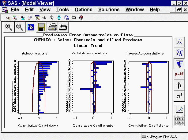
Select the third icon from the top in the vertical toolbar. This switches the Viewer to display a plot of autocorrelations of the model prediction errors at different lags, as shown in Figure 43.41. Autocorrelations, partial autocorrelations, and inverse autocorrelations are displayed, with lines overlaid at plus and minus two standard errors. You can switch the graphs so that the bars represent significance probabilities by selecting the Correlation Probabilities item on the toolbar or from the View menu. For more information about the meaning and use of autocorrelation plots, see Chapter 7, The ARIMA Procedure.
Figure 43.41
Model Viewer: Autocorrelations Plot