Monitoring Reports
About Monitoring Reports
After
you execute a performance definition or run the %MM_RunReports() macro
in production mode, as a batch job, SAS Decision Manager
stores the output data sets on the SAS Content Server. You can view
the performance monitoring results on the Performance
Results tab or on the Attachments page.
When you create monitoring
reports using the New Report window, the
report creates the following charts:
Assessment charts
Assessment charts
summarize the utility that you can expect by using the respective
models, as compared to using only baseline information. Assessment
charts can present a model's lift at a given point in time or
the sequential lift performance of a model's lift over time.
A monitoring report creates the following assessment charts:
-
Lift
-
Cumulative Lift
-
Percent Response
-
Cumulative Percent Response
-
Captured Response
-
Cumulative Captured Response
-
Actual versus Predicted for prediction models
-
Actual versus Residual for prediction models
-
Population Stability Trend for prediction models
Assessment charts are
created for the Monitoring Report.
Lift Trend chart
A Lift Trend chart
displays the cumulative lift of the champion model, over time.
Gini - ROC chart
Sensitivity is the
proportion of true positive events, and specificity is the proportion
of true negative events. The Gini - ROC chart plots Sensitivity on
the Y axis and 1 - Specificity on the X axis.
Gini - Trend Chart
When the Gini - ROC
chart is created, the Gini index for each ROC curve is also created.
The Gini index represents the area under the ROC curve and is a benchmark
statistic that can be used to summarize the predictive accuracy of
a model. The Gini - Trend chart plots a model's Gini index scores
over time, and these are used to monitor model degradation over time.
KS Chart
The KS chart uses the
Kolmogorov-Smirnov statistic to measure the maximum vertical separation,
or deviation between the cumulative distributions of events and non-events.
KS Trend Chart
When you create a Kolmogorov-Smirnov
report, the underlying KS statistic and the corresponding probability
cutoff are read from a summary data set in the Resources folder. The
KS Trend chart uses a summary data set that plots the KS Statistic
over time. The KS Trend chart is used to monitor model degradation
over time.
Actual versus Predicted
You use the Actual
versus Predicted plot to see how predicted values match actual values.
Actual versus Residual
You use the Actual
versus Residual plot to determine how good the model is at predicting
values by examining errors and error trending, and comparing them
to the actual values.
Population Stability Trend
The Population Stability
Trend chart measures the shift of the scoring output variable distribution
over time. Scoring output that is based on a development sample is
used as the baseline distribution. The deviation index is used to
indicate the shift for a given point in time.
Before you create a
Monitoring Report or a Champion and Challenger Performance Report,
you must ensure that certain project and model properties are set. For more information,
see Verify Project and Model Property Settings.
Create a Monitoring Report
To create a Monitoring
report:
-
Click
 and select Monitoring. The New
Report window appears.
and select Monitoring. The New
Report window appears.
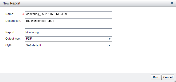
-
Enter a name and description if you do not want to use the default values.
-
Select an output type. The default is PDF.
-
Select a style for the report. When the SAS default option is selected, the default style and themes are used in generating the report. For example, the SAS default style for the HTML output type is HTMLBLUE.
-
Click Run. The report is generated and appears in the default viewer for the selected output type.
See Also
Copyright © SAS Institute Inc. All Rights Reserved.
Last updated: February 22, 2017