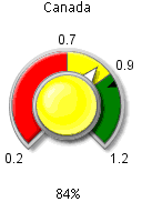
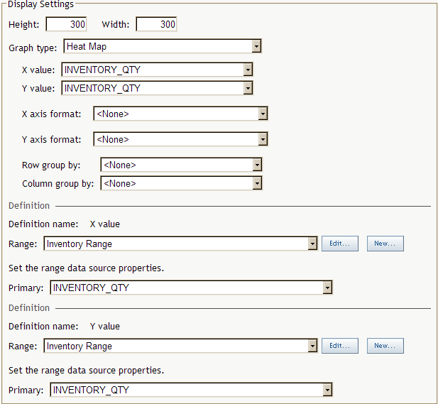
Indicator Displays
KPI Display
Overview
The KPI display shows a single KPI or multiple KPIs.
For a single KPI, the display shows the KPI associated with a single
data value.
Define a KPI Display
You define a KPI
display when you create or edit an indicator. For more information,
see Create or Edit an Indicator.
-
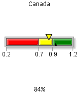
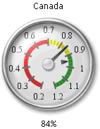
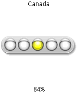
You can also click Select to view the gauges graphically. For more information, see Select a Gauge for an Indicator.

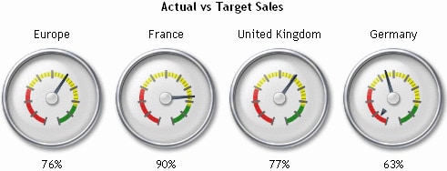
Gauged Graph Display
Overview
The gauged
graph display applies a range to a standard graph display such as
bar graph or line graph. For the best results, the data model should
return only one value for each unique value in the Category
label data column, thereby avoiding aggregation of the
data. The category variable is specified by the data column selected
for the Category label field when the data
source was defined.
If the
gauged graph display does aggregate data, the gauged graph displays
data points at the average interval for each data series. The indexes
of the aggregated intervals are averaged to determine the interval
to display and the color of the bar.
Define a Gauged Graph Display
You define
a gauged graph display when you create or edit an indicator. For more information,
see Create or Edit an Indicator.
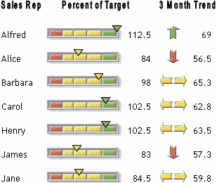
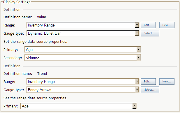
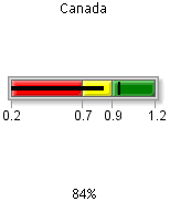
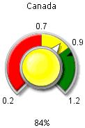
Bar and Trend Display
Overview
The bar
and trend display shows two sets of gauges and their corresponding
values. The first column displays the name of the data field. The
second column displays the first gauge (which is based on the primary
and secondary values) and its corresponding value. The third column
displays the second gauge (which is based on the primary trend) and
its corresponding value.
Although
you could choose any two data series to represent the value and trend,
this display is designed to display a value and a precalculated trend
value. To produce the best visual representation possible, follow
these guidelines:
-
By default, the range intervals are displayed for a dynamic gauge. If the gauge is too narrow, the text of the range intervals can overlap and become illegible. Clear the option Display range intervals when you select the gauge. For more information, see Select a Gauge for an Indicator.
Define a Bar and Trend Display
You define
a bar and trend display when you create or edit an indicator. For more information,
see Create or Edit an Indicator.
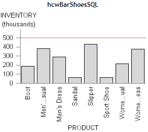
Graph Display
Stored Processes
You can
use a stored process with a graph display to produce a graphical display
that is not possible with the SAS BI Dashboard itself. To use a stored
process, you must create a stored process that is appropriate for
inclusion in a dashboard and then derive the URL that renders the
stored process output.
Use these
guidelines to create a stored process:
-
The output should be small in size, perhaps no more than 300 X 300 pixels.Conserving space is a dashboard is important so that dashboard users can get a broad overview of disparate metrics. Although a stored process that renders a graph might look good when it uses most of the window, the graph will displace all other information in the dashboard. If you cannot communicate the data in a small amount of space and users need to see other data in the same dashboard, consider using aggregation or another technique to reduce the amount of data that the stored process renders. Consider modifying the stored process in SAS Enterprise Guide to suppress the title and footnotes, and use the minimal template for output.
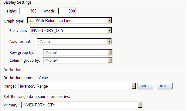
Define a Graph Display
You define a graph
display when you create or edit an indicator. For more information,
see Create or Edit an Indicator.
Range Map Display
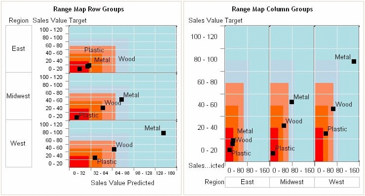
Define a Range Map Display
You define
a range map display when you create or edit an indicator. For more information,
see Create or Edit an Indicator.
KPI Table Display
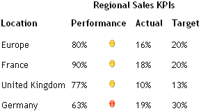
Define a KPI Table Display
You define
a KPI table display when you create or edit an indicator. For more information,
see Create or Edit an Indicator.
-
You can also click Select to view the gauges graphically. For more information, see Select a Gauge for an Indicator.
Interactive (Adobe Flash-based) Displays
Overview
The interactive
displays use Adobe Flash to enable dashboard users to interactively
traverse large amounts of detail data by sliding along a summary chart.
Detail data can be easily compared using two methods. In the first
method, a column by which to group data is selected when the display
is defined. In the second method, the user selects different detail
slices to compare while viewing the display.
Setting
up an interactive display is nearly identical to setting up a gauged
graph display. However, an interactive display has more options and
uses data in a more sophisticated way than the gauged graph display.
For the
best results using the interactive displays, the data model must meet
these requirements:
-
(Optional) To enable an interactive display to express forecasting data to business users, the data model must contain a column for forecasted values, for lower confidence values, and for upper confidence values.An interactive bar chart display can summarize either the detail data expressed in the detail charts or can summarize a different field of data.At the indicator level, the set up of the interactive displays is essentially the same as for other gauged graphs, except that the use of data for the interactive displays is more sophisticated. The only significant difference is that the interactive displays support the concept of dependent ranges. A dependent range takes the value of another range for the range definition. This scheme enables a data set generated by the SAS Forecast Server to be useful to the SAS BI Dashboard and the interactive displays without the need for complicated intermediary data transformations.
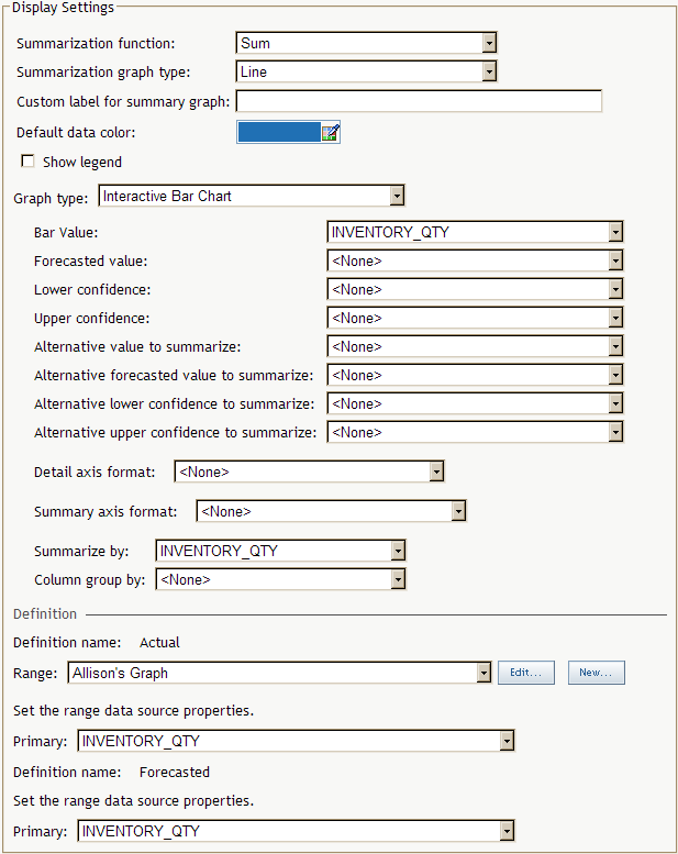
Define an Interactive Summary Chart And Detail Chart Display
You define an interactive summary chart and detail chart
display when you create or edit an indicator. For more information,
see Create or Edit an Indicator.

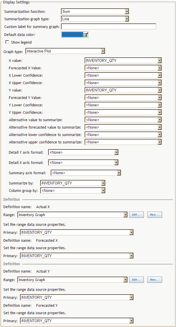
Define an Interactive Summary Chart And Detail Plot Display
You define an interactive summary chart and detail plot
display when you create or edit an indicator. For more information,
see Create or Edit an Indicator.
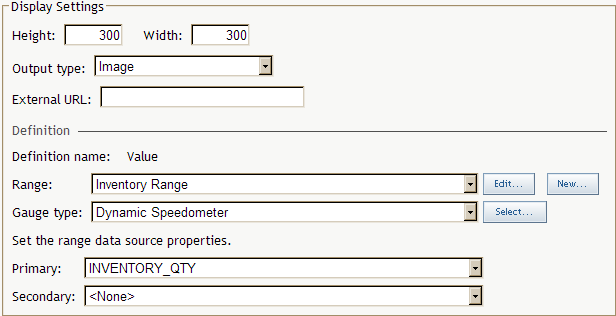
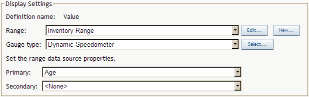
Dynamic Gauges
Select a Gauge for an Indicator
You select a
gauge for an indicator when you create or edit an indicator, or personalize
an indicator. For more information, see Create or Edit an Indicator or Personalize an Indicator.
