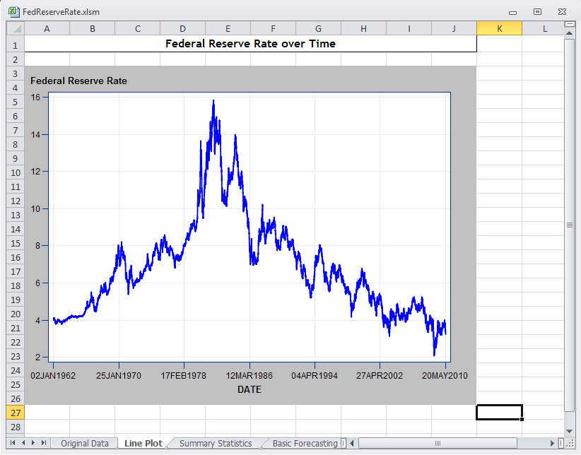
Finally, you want to observe how
the Federal Reserve rate has changed over time. To quickly determine
any trends, you decide to create a line plot of the Federal Reserve
rates from January 2, 1962, to May 20, 2010.
-
In the Original Data
worksheet, select the Excel data.
-
On the
SAS tab,
click
Tasks and select
Graph Line Plot
. The
Choose Data dialog
box appears.
-
For the input data,
select
Excel Data. Because you previously
selected the data in the Original Data worksheet, the range of the
data appears in the
Excel Data box.
-
For the location of
the results, select
New worksheet. By default,
the name of this worksheet is Line Plot.
Click
OK.
The Line Plot task appears.
-
In the
Data panel,
assign DATE to the
Horizontal role and VALUE
to the
Vertical role.
In the selection pane,
select
AppearancePlots.
-
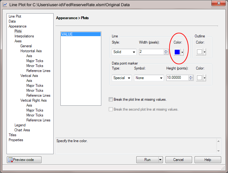
In the
Appearance
> Plots panel, specify blue as the line color.
In the selection pane,
select
AppearanceAxesGeneral.
-
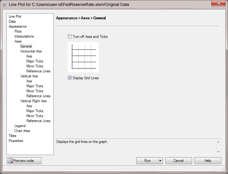
In the
Appearance
> Axes > General panel, select the
Display
Grid Lines check box.
In the selection pane,
select
AppearanceAxesHorizontal AxisMajor Ticks.
-
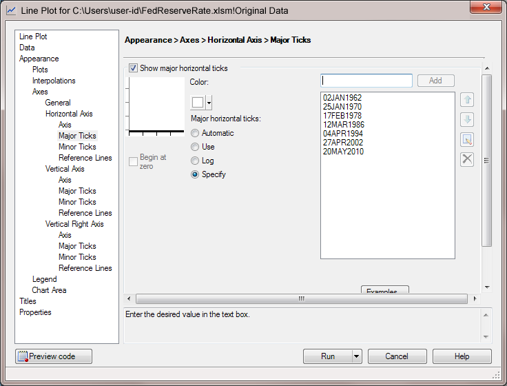
In the
Appearance
> Axes > Horizontal Axis > Major Ticks panel,
select
Specify, and then add the following
values for the major tick marks:
In the selection pane,
select
AppearanceAxesVertical AxisAxis.
-
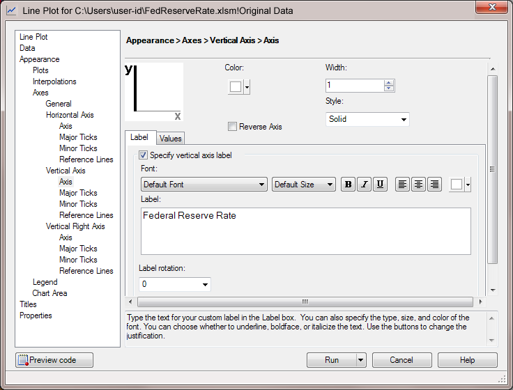
In the
Appearance
> Axes > Vertical Axis > Axis panel, enter
Federal
                              Reserve Rate
in the
Label field.
In the selection pane,
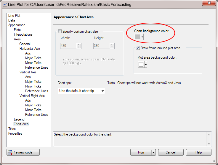
select
Chart Area.
-
In the
Chart
Area panel, select gray as the background color for the
chart.
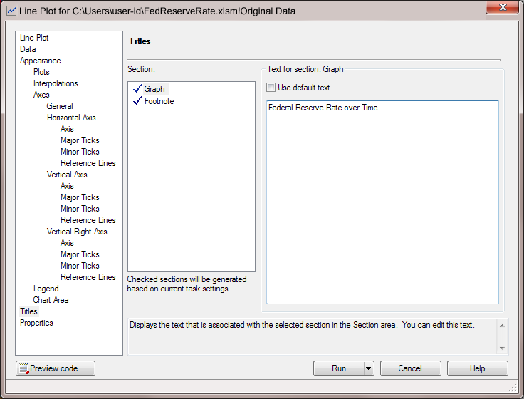
In the selection pane,
click
Titles.
-
In the
Titles panel,
change the title of the line plot and remove the generated footnote.
To change the title
of the line plot:
-
In the
Section box,
select
Graph.
-
In the
Text
for section: Title area, clear the
Use default
text check box. Replace
Line Plot with
Federal
Reserve Rate over Time.
-
In the
Section box,
select
Footnote.
-
In the
Text
for section: Footnote area, clear the
Use
default text check box. Delete the generated text that
appears in the text box.
The results appear in
the new Line Plot worksheet.