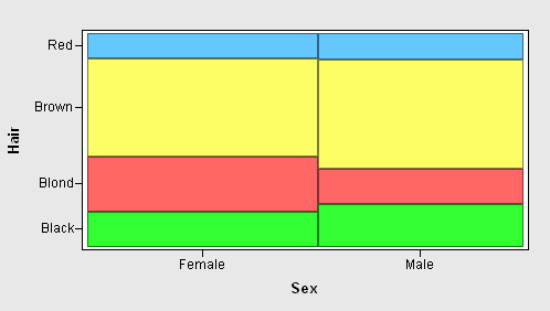
The mosaic plot displays the frequency of data sampled from multiple nominal variables. The mosaic plot is a set of adjacent bar plots formed by first dividing the horizontal axis according to the proportion of observations in each category of the first variable and then by dividing the vertical axis according to the proportion of observations in the second variable. For more than two nominal variables, this process can be continued to alternately subdivide horizontally and vertically. The area of each block is proportional to the number of observations it represents.
For example, the mosaic plot below graphically depicts data from the following survey on hair color:
| Hair\Gender | Female | Male | Total |
|---|---|---|---|
| Black | 52 | 56 | 108 |
| Blond | 81 | 46 | 127 |
| Brown | 143 | 143 | 286 |
| Red | 37 | 34 | 71 |
| Total | 313 | 279 | 592 |
A mosaic plot of this data first subdivides a square horizontally in the proportion 313:279 to form two bars representing all females and all males. The first bar is then split vertically in proportion to the number of black, brown, blond, and red-headed females, and the second bar is similarly split among male hair colors.

To create a mosaic plot using the GUI
For details, see Creating a Data Table.
IML Studio displays the Mosaic Plot dialog box.
You can optionally select a numeric frequency variable and click Set Freq. The ith value of the frequency variable specifies the frequency of the ith value of the Y variable.
Recall that a nominal variable is either a character variable or a numeric variable that can only assume a discrete set of values. You can also create mosaic plots of more than two variables by selecting additional nominal variables and clicking Add X.
For a discussion of the BY Variables and BY Options tabs, see BY Group Processing: Using BY Group Processing.