Paired-sample t Test Task

About the Paired-sample t Test Task

A paired-sample t test compares the mean of the differences in the observations to a given number, the null hypothesis difference. The paired-sample t test is used when the two samples are correlated, such as two measures of blood pressure from the same person.
To compare n paired differences to a value m, use t   equals  . fraction d with macron above , minus m , over fraction s sub d , over square root of n end fraction end fraction  , where d with macron above  is the sample mean of the paired differences and s2d is the sample variance of the paired differences.

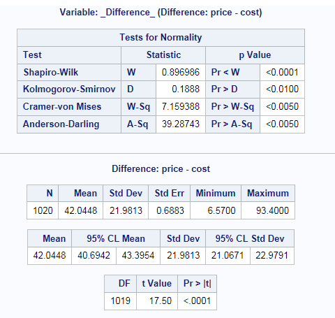
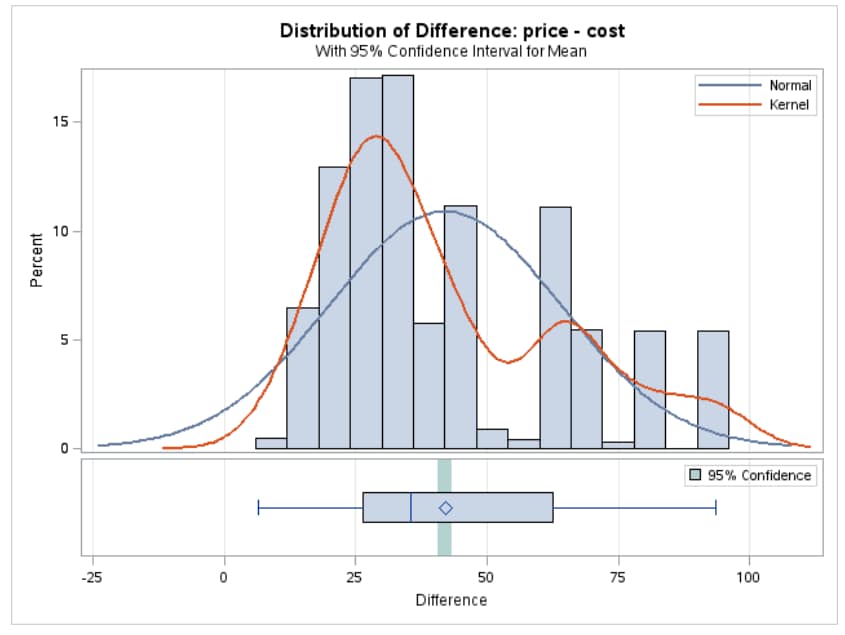
Example: Determining the Distribution of Price - Cost

In this example, you want to compare the means of differences in price and cost in the Sashelp.Pricedata data set. The null hypothesis for this test is 30.
To create this example:
  1. In the Tasks section, expand the Introductory Statistics folder and double-click Paired-sample t Test. The user interface for the Paired-sample t Test task opens.
  2. On the Data tab, select the SASHELP.PRICEDATA data set.
  3. Assign columns to these roles:
    Role
    Column Name
    Group 1 variable
    price
    Group 2 variable
    cost
  4. On the Options tab, enter 30 in the Alternative field.
  5. To run the task, click Submit SAS code.
Here is a subset of the results:
Tabular Results
The Distribution of Difference between Price and Cost

Assigning Data to Roles

To run the Paired-sample t Test, you must assign columns to the Group 1 variable and Group 2 variable roles. The task compares these two variables. Because paired t tests are performed by subtracting each value of the Group 2 variable from the corresponding value of the Group 1 variable, the designation of the variables matters.

Setting Options

Option Name
Description
Test
Tails
specifies the number of sides (or tails) and direction of the statistical tests and test-based confidence intervals. You can choose from these options:
  • Two-tailed test specifies two-sided tests and confidence intervals for means.
  • Upper one-tailed test specifies upper one-sided tests in which the alternative hypothesis indicates a mean greater than the null value. The upper one-sided confidence intervals range between the lower confidence limit and infinity.
  • Lower one-tailed test specifies lower one-sided tests in which the alternative hypothesis indicates a mean less than the null value. The lower one-sided confidence intervals range between minus infinity and the upper confidence limit.
Alternative
specifies the value of the null hypothesis.
Normality Assumption
Tests for normality
runs tests for normality that include a series of goodness-of-fit tests based on the empirical distribution function. The table provides test statistics and p-values for the Shapiro-Wilk test (provided the sample size is less than or equal to 2000), the Kolmogorov-Smirnov test, the Anderson-Darling test, and the Cramér-von Mises test.
Nonparametric Tests
Sign test and Wilcoxon signed rank test
generates the results from these tests:
  • The sign test statistic is m equals open , n to the plus , minus , n to the minus , close slash 2  , where n+ is the number of values that are greater than mu sub 0  , and n- is the number of values that are less than mu sub 0  . Values equal to mu sub 0  are discarded.
  • The Wilcoxon signed rank statistic S is calculated as s   equals  . sum , from , i colon vertical line , x sub i , minus , mu sub 0 , vertical line greater than 0 , to , white square , of .  r with subscript i , and with superscript plus , end sub-superscript , minus . fraction n sub t , open , n sub t , plus 1 close , over 4 end fraction  , where r+i is the rank of x sub i , minus , mu sub 0  after discarding values of x sub i , minus , mu sub 0  and nt is the number of xi values not equal to mu sub 0  . Average ranks are used for tied values.
Plots
Histogram and box plot
creates a histogram and box plot together in a single panel, sharing common X axes.
Normality plot
creates a normal quantile-quantile (Q-Q) plot.
Agreement plot
plots the second response in each pair against the first response, with the mean shown as a large bold symbol. A diagonal line with slope=0 and y-intercept=1 is overlaid. The location of the points with respect to the diagonal line reveals the strength and direction of the difference or ratio. The tighter the clustering along the same direction as the line, the stronger the positive correlation of the two measurements for each subject. Clustering along a direction perpendicular to the line indicates negative correlation.
Response profile plot
creates a plot where a line is drawn for each observation from left to right that connects the first response to the second response. The mean first response and mean second response are connected with a bold line. The more extreme the slope, the stronger the effect. A wide spread of profiles indicates high between-subject variability. Consistent positive slopes indicate strong positive correlation. Widely varying slopes indicate lack of correlation. Consistent negative slopes indicate strong negative correlation.
Confidence interval plot
creates a plot of the confidence interval for the means.