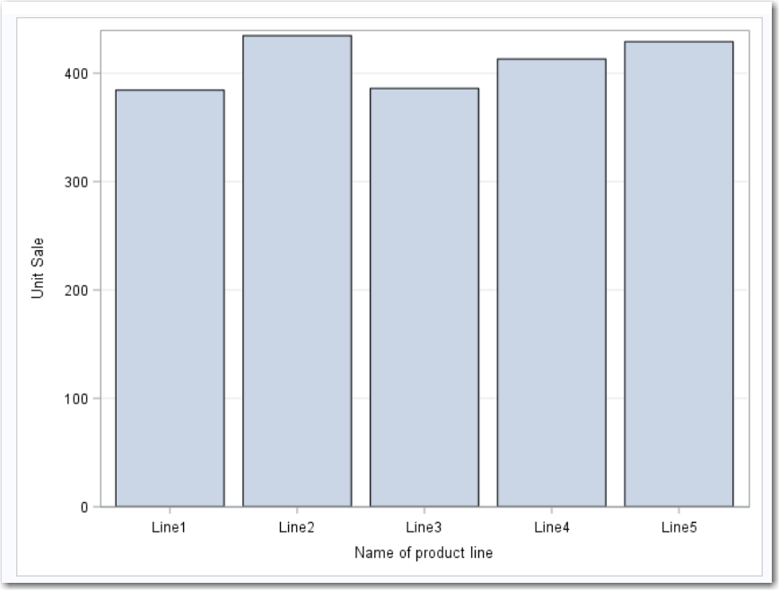
Example: Bar Chart of Mean Sales for Each Product Line
For example, you can
create a bar chart that compares the total amount of sales for each
product line in the Sashelp.Pricedata data set. By default, the task
calculates the mean of the response variable for each product line.
This bar chart shows that Line 2 has the highest mean product sales.
To create this example:
-
TipIf the data set is not available from the drop-down list, click
 . In the Choose a Table window,
expand the library that contains the data set that you want to use.
Select the data set for the example and click OK.
The selected data set should now appear in the drop-down list.
. In the Choose a Table window,
expand the library that contains the data set that you want to use.
Select the data set for the example and click OK.
The selected data set should now appear in the drop-down list.

Copyright © SAS Institute Inc. All rights reserved.