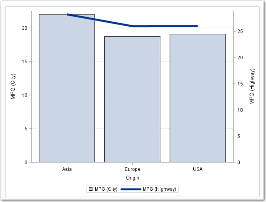
Example: City and Highway Mileage by Origin
For example, you can
create a bar-line chart that compares the number of miles per gallon
(in the city and on the highway) that cars use depending on their
country of origin. The task calculates the mean of the number of miles
per gallon in the city and in the highway for each country. This bar-line
chart shows that cars from Asia tend to get the highest number of
miles per gallon in city and highway driving.
To create this example:
-
TipIf the data set is not available from the drop-down list, click
 . In the Choose a Table window,
expand the library that contains the data set that you want to use.
Select the data set for the example and click OK.
The selected data set should now appear in the drop-down list.
. In the Choose a Table window,
expand the library that contains the data set that you want to use.
Select the data set for the example and click OK.
The selected data set should now appear in the drop-down list.

Copyright © SAS Institute Inc. All rights reserved.