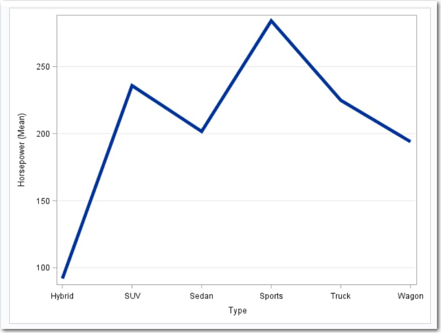
Example: Displaying the Mean Horsepower for Each Car Type
In this example, you
want to display the mean horsepower for each car type in a line plot.
The result shows that sports cars have the highest average horsepower
and hybrid cars have the lowest average horsepower.
To create this example:
-
TipIf the data set is not available from the drop-down list, click
 . In the Choose a Table window,
expand the library that contains the data set that you want to use.
Select the data set for the example and click OK.
The selected data set should now appear in the drop-down list.
. In the Choose a Table window,
expand the library that contains the data set that you want to use.
Select the data set for the example and click OK.
The selected data set should now appear in the drop-down list.

Copyright © SAS Institute Inc. All rights reserved.