Example: Filled Overlay
About the Filled Overlay Example
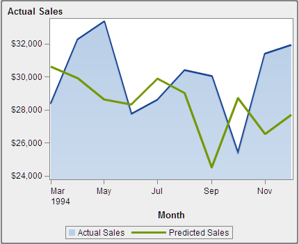
This example uses two time series plots to show actual sales compared to predicted sales for a line of retail products. The
graph is enhanced by applying a filled area to one of the overlaid plots.
Build the Graph Object for the Filled Overlay Example
-
In the graph builder, drag and drop a time series plot from the Graph Elements pane onto the canvas.
-
Drag and drop a second time series plot from the Graph Elements pane onto the first time series plot. This action creates an overlaid plot.Note: When you overlay the plots, the Time role is automatically shared between the plots.
-
-
Save the graph object. See Save a Custom Graph Object So It Appears in the Designer.

Copyright © SAS Institute Inc. All rights reserved.