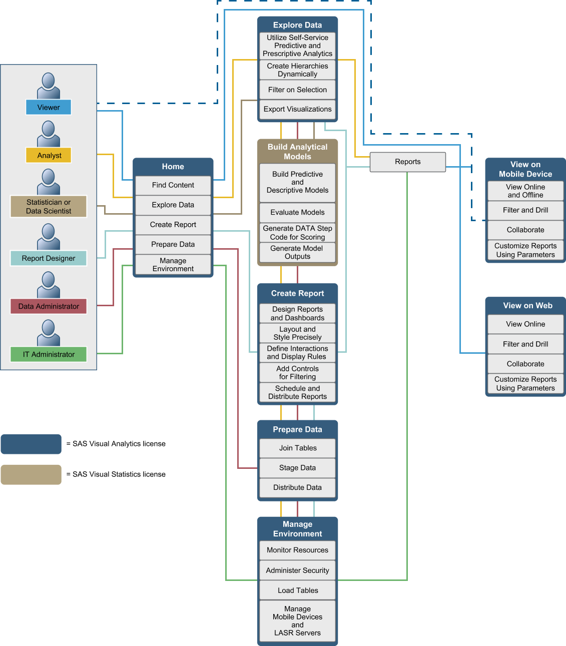
How Does SAS Visual Analytics Work?
You can use SAS Visual Analytics to explore and view data, interact with and create
reports, and display reports using a native mobile app or on the web. You can explore
your data by using interactive visualizations such as charts, histograms, and tables. Report designers can easily point and click
to query central sources of data. You can add filters and design the layout using tables,
graphs, and gauges. You can use drag and drop to create a well-formatted report.
The following figure
illustrates how the different pieces of SAS Visual Analytics work
together. It shows how users interact with the different interfaces.
Copyright © SAS Institute Inc. All rights reserved.