Working with Data Role Assignments
After you have selected a report object and a data
source, the Roles tab in the right pane shows
which data items have been assigned to which roles.
Modify Data Role Assignments in Report Objects
Note: You cannot change data role
assignments for any report object that is imported from the explorer
and uses on-demand data.
To modify data role
assignments:
-
Select a report object in the canvas that has one or more data items assigned.
-
Click
 beside the role that you want to edit. For data roles that allow multiple data items,
the menu items that are available can vary.
If you select a data item in Roles, then the Aggregation (if appropriate), Add, Remove, and Replace menu items are displayed. You can also right-click on a data item and the actions specific to that data item are displayed.Different data roles are available for different report objects.In addition to the basic data roles, you can assign additional data roles. Here is a list of all the data roles available for each report object:Report ObjectBasic Data RolesAdditional Data RolesTablesList tableColumnsNoneCrosstab
beside the role that you want to edit. For data roles that allow multiple data items,
the menu items that are available can vary.
If you select a data item in Roles, then the Aggregation (if appropriate), Add, Remove, and Replace menu items are displayed. You can also right-click on a data item and the actions specific to that data item are displayed.Different data roles are available for different report objects.In addition to the basic data roles, you can assign additional data roles. Here is a list of all the data roles available for each report object:Report ObjectBasic Data RolesAdditional Data RolesTablesList tableColumnsNoneCrosstab-
Columns
-
Rows
MeasuresGraphsBar chart-
Category
-
Measures
-
Group
-
Lattice columns
-
Lattice rows
-
Data tip values
-
Animation
Targeted bar chart-
Category
-
Measure
-
Target
-
Lattice columns
-
Lattice rows
-
Data tip values
-
Animation
Waterfall chart-
Category
-
Measure
-
Lattice columns
-
Lattice rows
-
Data tip values
Line chart-
Category
-
Measures
-
Group
-
Lattice columns
-
Lattice rows
-
Data tip values
-
Animation
Pie chart-
Category
-
Measures
-
Group
-
Lattice columns
-
Lattice rows
-
Data tip values
-
Animation
Scatter plot-
X axis
-
Y axis
-
Color
-
Lattice columns
-
Lattice rows
-
Data tip values
Time series plot-
Time axis
-
Measure (line)
-
Group
-
Data tip values
Bubble plot-
X axis
-
Y axis
-
Size
-
Group
-
Color
-
Lattice columns
-
Lattice rows
-
Data tip values
-
Animation
Treemap-
Tile
-
Size
-
Color
-
Data tip values
Dual axis bar chart-
Category
-
Measure (bar)
-
Measure (bar 2)
-
Lattice columns
-
Lattice rows
-
Data tip values
-
Animation
Dual axis line chart-
Category
-
Measure (line)
-
Measure (line 2)
-
Lattice columns
-
Lattice rows
-
Data tip values
-
Animation
Dual axis bar-line chart-
Category
-
Measure (bar)
-
Measure (line)
-
Lattice columns
-
Data tip values
-
Animation
Dual axis time series plot-
Time axis
-
Measure (line)
-
Measure (line 2)
Data tip valuesSchedule chart1-
Task
-
Start
-
Finish
-
Group
-
Label
-
Data tip values
-
Lattice columns
-
Lattice rows
Vector plot1-
X axis
-
Y axis
-
X Origin
-
Y Origin
-
Color
-
Group
-
Data tip values
-
Lattice columns
-
Lattice rows
Numeric series plot1-
X axis
-
Y axis
-
Group
-
Label
-
Data tip values
-
Lattice columns
-
Lattice rows
Needle plot1-
X axis
-
Y axis
-
Group
-
Data tip values
-
Lattice columns
-
Lattice rows
Step plot1-
X axis
-
Y axis
-
Group
-
Label
-
Data tip values
-
Lattice columns
-
Lattice rows
Dot plot1-
X axis
-
Y axis
-
Data tip values
-
Lattice columns
-
Lattice rows
Butterfly chart1-
Category
-
Measure (bar)
-
Measure (bar 2)
Data tip valuesStock high-low plot1-
Time axis
-
Close
-
High
-
Low
NoneStock volume and volatility plot1-
Time axis
-
Bollinger Upper
-
Bollinger Lower
-
Moving Average
-
High
-
Low
-
Close
-
Volume
NoneBubble change plot1-
Group
-
Y end
-
X end
-
Y start
-
X start
-
Size start
-
Size end
NoneComparative time series plot1-
Time axis
-
Measure (time series)
-
Measure (time series 2)
Data tip valuesControlsDrop-down list-
Category
-
Frequency
-
Parameter
NoneList-
Category
-
Frequency
NoneButton bar-
Category
-
Frequency
-
Parameter
NoneText input-
Category
-
Frequency
-
Parameter
NoneSlider-
Measure/Date
-
Parameter
NoneContainersVertical containerHorizontal containerStack containerPrompt containerNoneNoneOtherTextImageStored processNoneNoneGeo bubble mapGeography-
Size
-
Color
-
Data tip values
-
Animation
Geo coordinate mapGeographyData tip valuesGeo region mapGeography-
Color
-
Data tip values
GaugeMeasure-
Target
-
Group
Word cloud-
Word
-
Size
-
Color
None1This report object is not displayed by default in the designer. Here are definitions for some of the additional data roles:Animationanimates the date category that you assign. You can specify a Loop for the animation, and you can specify the Speed of the animation. For more information, see Add Animation to Charts, Bubble Plots, and Geo Bubble Maps.Note: For a bubble plot only, you must assign the Group role to enable the Animation role. If you remove the Group role after assigning animation, the animation control is disabled.Data tip valuesenables you to add more measures to your data tips.Note: For pie charts, the Other slice does not show the additional information.Groupgroups the data based on the category data item that you assign.Lattice columnscreates a lattice of charts with a column for each value of the category data item that you assign.Lattice rowscreates a lattice of charts with a row for each value of the category data item that you assign. -
Add Animation to Charts, Bubble Plots, and Geo Bubble Maps
An animated bubble plot displays the changes in your data values over time. Each frame of the animation represents a value of the datetime data item
that is assigned to the Animation data role.
For example, if you
assign a category with the Year format to the Animation data role, then each frame of the animation displays a bubble plot of your data for
a specific year.
Starting in the 7.1 release, you can select bubbles, bars, pie slices, and lines in an animated graph. The interaction filter is based on the category
value (or values) and the
selected frame in the animation. When a bubble, bar, pie slice, or line is selected, its row lists all of the category and date values of the selection.
For example, the resulting filter that is applied to any downstream interactions could
be filtered by
car=”Toyota” and year=”2014”.
If you select a bubble
for one frame in the animation and click  , then any downstream interactions play with the animation.
This means that as the animation is running, the interaction targets
are filtered with each frame in the animation.
, then any downstream interactions play with the animation.
This means that as the animation is running, the interaction targets
are filtered with each frame in the animation.
, then any downstream interactions play with the animation.
This means that as the animation is running, the interaction targets
are filtered with each frame in the animation.
Tip
To improve animation performance,
use a color for the graph’s reference line instead of a pattern.
Tip
When you add animation to
a pie chart, it is recommended that you sort the Category in ascending
or descending order. To sort, right-click on a category name in the
pie chart, and select Sort. Then, select
either Ascending or Descending.
To add animation:
When an animated bubble plot is displayed, a set of animation controls appears at
the bottom of the report object.
|
Task
|
Action
|
|---|---|
|
Start the animation.
|
Click
.
|
|
Go to the previous animation
frame.
|
Click
 . .
|
|
Go to the next animation
frame.
|
Click
 . .
|
|
Jump to a specific animation
frame.
|
Use the slider.
|
|
Specify whether to repeat
the animation.
|
Select or deselect Loop.
|
|
Select the animation
speed.
|
Use the Speed slider.
|
|
Track the movement of
a specific bubble.
|
Click the bubble that
you want to track.
|
Note: If you select a bubble to
track, the selected bubble is highlighted in the current animation
frame.
Add Data Roles for Lattice Columns or Lattice Rows in a Graph
A lattice is a multi-cell graph in which you create each cell independently. Each
cell can
contain different types of plots. In the designer, you can create a multi-cell graph by using data roles to add lattice
columns, lattice rows, or both.For a list
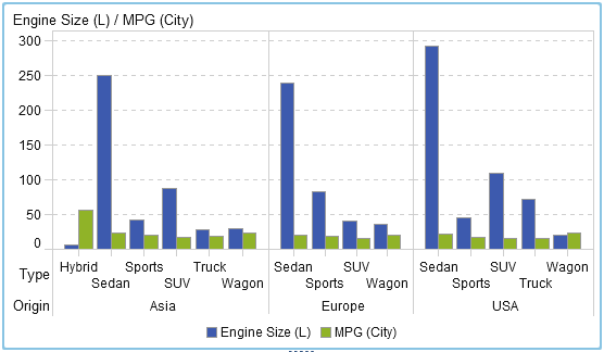
of graphs that have lattice column or lattice row data roles, see Modify Data Role Assignments in Report Objects.
To add a lattice column
or lattice row data role:
Tip
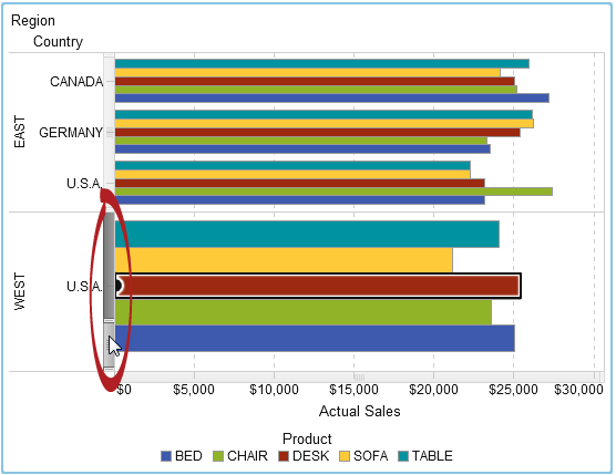
Scroll bars are generated
by the graph if you have a lot of data. These scroll bars work differently
than other scroll bars in the designer. They initially fill the maximum
area so that you can see all of the bars in the lattice row or lattice
column. To zoom in and see specific bars, you have to drag the top
or the bottom of the scroll bar to adjust the height of the scrolling
bar. Labels are added as space becomes available.
Remove Data Role Assignments from Report Objects
To remove data items
from their assigned data roles in a specific report object:
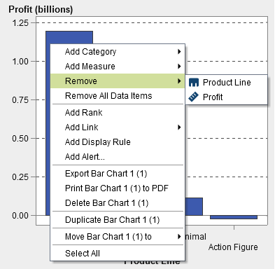
-
Select Remove All Data Items. All data items are removed from the assigned data roles as well as the data-dependent features like filters, ranks, conditions, and so on. The report object turns gray, and the
 status icon appears in the lower right corner to
let you know that the required data roles are not assigned.
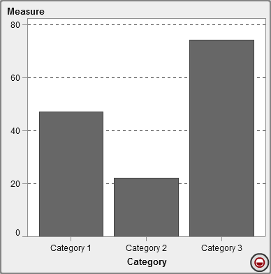
Here is an example of what a bar chart looks like after all the data items have been removed from their assigned data roles:
status icon appears in the lower right corner to
let you know that the required data roles are not assigned.
Here is an example of what a bar chart looks like after all the data items have been removed from their assigned data roles:
Copyright © SAS Institute Inc. All rights reserved.