Working with Box Plots
About Box Plots
A box plot displays the distribution of data values by using a rectangular box and lines called “whiskers.”
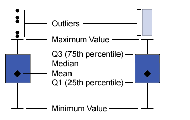
Parts of a Box Plot shows a diagram of a box plot. The bottom and top edges of the box indicate the interquartile
range (IQR). That
is, the range of values that are between the first and third quartiles (the 25th and 75th percentiles). The marker inside the box indicates the mean value. The line inside the box indicates
the median value.
You can enable outliers, which are data points whose distances from the interquartile range are greater than 1.5 times the size
of the interquartile range.
The whiskers (lines protruding from the box) indicate the range of values that are
outside of
the interquartile range. If you do not enable outliers, then the whiskers extend to
the maximum and minimum values in the plot. If you enable outliers, then the whiskers indicate the range of values that are
outside of the interquartile range, but are close enough not to be considered outliers.
If there are a large number of outliers, then the range of outlier values is represented by a bar. The data tip for the bar displays additional information about the outliers. To explore the outliers,
double-click on the outlier bar to view the values as a new histogram visualization.
Data Roles for a Box Plot
The basic data roles for a box plot are categories and measures. You can assign one
category only, and the category values
are plotted on the category axis. You can assign many measures, and the measure values
are plotted on the response axis. At least one measure is required.
In addition to the basic
data roles, you can assign these roles:
Lattice columns
creates a lattice of charts with a column for each value of the category data item that you assign.
Lattice rows
creates a lattice of charts with a row for each value of the category data item that
you assign.
Specify Properties for a Box Plot
On the Properties tab,
you can specify the following options:
Name
specifies the name of the visualization.
Title
specifies the title
that appears above the graph.
Note: The Title option
is disabled if you select Generate graph title.
Generate graph title
specifies that the graph title is generated automatically based on the data items in the visualization.
Show grid lines
displays grid lines for each tick on the response axis.
Box direction
specifies whether the
boxes are vertical or horizontal.
Overview
specifies whether the chart overview is enabled.
Measure layout
specifies whether the
measures share a single response axis (Shared axis)
or have separate response axes for each measure (Separate
axes).
Note: The Measure layout option
is disabled if your visualization contains exactly one measure.
Outliers
specifies how outliers are displayed. An outlier is a data point whose distance from the interquartile range is greater than 1.5 times the size of
the interquartile range.
Select one of the following:
Ignore Outliers
excludes outliers from the plot. If you select this option, then outlier values are
not represented in the plot.
Hide Outliers
includes the outliers within the whiskers. If you select this option, then outlier
values are not represented differently from the other values in the plot.
Show Outliers
displays outliers separately from the whiskers. If there are a small number of outliers,
then each outlier is displayed as a point. If there are a large number of outliers,
then the range
of outlier values is displayed as a bar.
Show averages
displays the mean value
as a marker inside the box.
Rotate axis labels
displays the category
labels at an angle.
Note: The Rotate axis
labels option has no effect if the box plot contains
no categories.
Reference Lines
adds reference lines to the visualization. To create a reference line, click  , and then specify the parameters for the line in the New Reference Line window.
, and then specify the parameters for the line in the New Reference Line window.
The name of each reference line appears below the Reference Lines option. You can edit or delete your reference lines by using the icons next to each
name.
Copyright © SAS Institute Inc. All rights reserved.