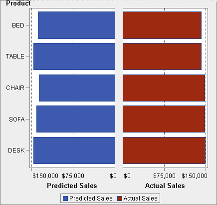
Example: User-Defined Lattice (Butterfly Chart)

About the User-Defined Lattice Example

This example uses a butterfly chart to show the actual sales compared to the predicted sales for a line of retail products. The butterfly chart is useful for comparing two unique values. In this chart, the two values are arranged on each side of the Y axis.
Example User-Defined Lattice
Butterfly plot

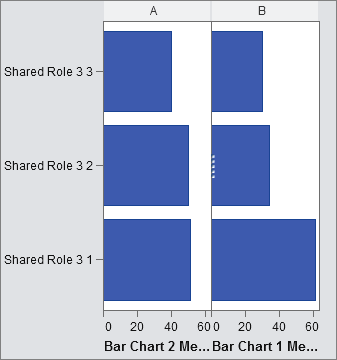
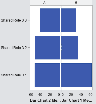
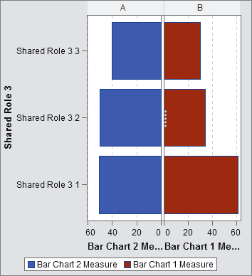
Build the Graph Object for the Butterfly Example

  1. Drag and drop a bar chart from the Graph Elements pane onto the canvas.
  2. Drag and drop a second bar chart from the Graph Elements pane onto the left edge of the canvas. This action creates a new column for the second bar chart.
  3. Share the category roles. On the Role Definitions tab, click down arrow next to the Category for either bar chart. Select Create Shared Role With Another Rolethen selectOther graph element.
    The Add Shared Role window is displayed.
    Click OK.
  4. Change both bar charts to a horizontal layout.
    1. Select a bar chart.
    2. On the Properties tab, click down arrow next to Direction, and select Horizontal.
    3. Repeat the previous two steps for the other bar chart.
  5. Specify a uniform column and row axis.
    1. Select the full graph (click the A or B heading above the bar chart).
    2. On the Properties tab, click down arrow next to Column axis range, and select Uniform across all columns.
    3. On the Properties tab, click down arrow next to Row axis range, and select Uniform across row.
      The bar charts should resemble the following:
      Bar charts with uniform axes
  6. Reverse the order of the X (Measure) axis for the left bar chart.
    1. Click the horizontal axis for the left bar chart.
    2. On the Properties tab, select Reverse order.
      The bar charts resemble the following:
      Left bar chart reversed order
  7. Change the color of the right bar chart to distinguish it from the left bar chart.
    1. Select the right bar chart.
    2. On the Properties tab, click down arrow next to Fill color, and select Data color 3. The right bar chart changes to a different color. In the default theme, the color is deep red.
  8. Display the grid lines for the X axes.
    1. Click the horizontal axis for the left bar chart.
    2. On the Properties tab, select Show grid lines.
    3. Repeat the previous two steps for the right bar chart.
The final graph object, complete with the legend, resembles the following:
Final butterfly graph