Work with Properties
About Properties
The Properties tab
lists the properties for the selected graph component. Components
that have properties include graph elements, cells, axes, legends,
and the entire graph. Properties enable you to control the overall
appearance of your graph, from the graph’s background color
to the tick value interval on the axis. Report designers can override
some properties in their report.
About Style Properties
The color schemes and
visual attributes for a graph come from the active report theme, which
is a named collection of style elements. Each style element contains
attributes such as fill color, marker symbol, line style, font face,
and many others. Each part of a graph element, such as a marker, a
bar, a line, or a label, derives its visual attributes from a specific
style element from the active report theme. Similarly, the attributes
for axes and legends come from a style element.
The style elements are
developed to produce effective graphics without changing the default
settings. However, you can change the default settings by changing
style properties on the Properties tab. When
you specify a style property, such as a color or font style, you are
changing the style element that is applied to the graph component.
The following display
shows the available style elements for bar chart labels. The list
of style elements is displayed when you click  beside the Data label font color drop-down
list on the Properties tab.
beside the Data label font color drop-down
list on the Properties tab.
beside the Data label font color drop-down
list on the Properties tab.
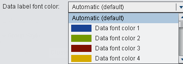
Each color is shown
in the list beside its style element. Automatic indicates
the default value for the graph element. Automatic enables
the graph element to cycle through a list of colors provided for group
colors and multi-response colors.
Visual attributes that
are referenced by a style element provide consistency within the report
theme. If you later change the report theme, the graph element is
compatible with the new theme. In addition, some of the properties
that you specify can be overridden by report designers when they use
your graph objects in their reports.
Custom Graph Properties
Here are some changes
that you can make on the Properties tab when
the graph object is selected:
-
specify an overview axis for the graph. When you specify an overview axis, you can select which graph elements to include in the overview axis. For more information, see Create an Overview Axis.
-
specify how graph attributes are rotated for group data. For more information, see Understanding and Changing Attribute Rotation.
Cell Properties
Graph Element Properties
Graph element properties
determine features that affect the appearance of the plots, charts,
and maps in a graph. The types of properties that you see vary depending
on the type of graph element that you are modifying. In general, you
can specify colors, marker symbols, line attributes, and outline and
fill colors.
Legend Properties
By default, a legend always
appears when the graph object contains two or more graph elements.
You can remove graph elements from the legend. If you remove all graph
elements, then the legend disappears from the graph object.
Axis Properties
Here are the possible
types:
-
Discrete: The axis contains independent data values rather than a range of numeric values. Each distinct value is represented by a tick mark. Discrete is the default axis type for character data. Some graph elements require a discrete axis. For example, bar charts use a discrete axis for the Category role.
-
Logarithmic: The axis contains a logarithmic range of values. The logarithmic axis type is not used as a default.You might want a logarithmic axis type depending on the nature of the data. For example, suppose that your graph element shows growth data with a linear axis. Based on the values, you suspect that the growth rate is exponential. If the data contains a very large range of values (orders of magnitude apart), you can display the values on a logarithmic scale.
To change the properties
for an axis, select the axis in the graph object, and make your changes
on the Properties tab.
Create an Overview Axis
Understanding and Changing Attribute Rotation
When you apply a group
role to your graph element, by default, the graph builder
rotates through predefined style elements to determine how to present
each unique group value. This type of rotation also occurs when multiple
response roles are assigned to the graph element or when graph elements
are overlaid.
When the graph element
is rendered, the attributes for colors, line patterns, and marker
symbols are rotated for the values in your group. Whether you change
the attributes or keep the default attribute values, the manner in
which the attributes are combined is determined by the attribute rotation
priority.
To change the attribute
rotation priority:
-
Select the graph object. For more information, see Select Components and Elements of a Graph Object.
You have two options
for the attribute rotation priority:
| Rotate color only until all colors used | attributes such as marker symbols and line patterns are held constant while each color in the list is applied exhaustively to the graph element. |
| Rotate all attributes | each attribute rotates through its own list to generate a unique combination for each group value. Attributes include colors, marker symbols, line patterns, and so on. |
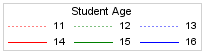
For example, the following
figure shows an example rotation for an age grouping. The dotted-line
pattern is held constant while red, green, and blue colors are applied
to the dotted lines for the consecutive age group values. If there
are more group values, red, green, and blue colors are applied to
the solid lines.
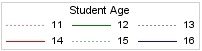
If you change the rotation
pattern, and specify Rotate all attributes for
the attribute rotation priority, the contrasting colors and line patterns
are rotated at the same time.
Copyright © SAS Institute Inc. All rights reserved.