Working with Data Role Assignments

After you have selected a report object and a data source, the Roles tab in the right pane shows which data items have been assigned to which role.

Modify Data Role Assignments in Report Objects

Note: You cannot change data role assignments for any report object that is imported from the explorer.
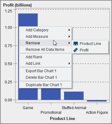
To modify data role assignments:
  1. Select a report object in the canvas that has data items assigned.
  2. Click the Roles tab in the right pane.
  3. Click the down arrow button beside the role that you want to edit. For data roles that allow multiple data items, the menu items that are available can vary.
    If you select a data item in Roles, then the Aggregation (if appropriate), Add, Remove, and Replace menu items are displayed. You can also right-click on a data item, and the actions specific to that data item are displayed.
    Different data roles are available for different report objects.
    In addition to the basic data roles, you can assign additional data roles. Here is a list of all the data roles available for each report object:
    Report Object
    Basic Data Roles
    Additional Data Roles
    Tables
    List table
    Columns
    None
    Crosstab
    • Columns
    • Rows
    Measures
    Graphs
    Bar chart
    • Category
    • Measures
    • Group
    • Lattice columns
    • Lattice rows
    • Data tip values
    • Animation
    Targeted bar chart
    • Category
    • Measure
    • Target
    • Lattice columns
    • Lattice rows
    • Data tip values
    Waterfall chart
    • Category
    • Measure
    • Lattice columns
    • Lattice rows
    • Data tip values
    Line charts
    • Category
    • Measures
    • Group
    • Lattice columns
    • Lattice rows
    • Data tip values
    Pie chart
    • Category
    • Measures
    • Group
    • Lattice columns
    • Lattice rows
    • Data tip values
    Scatter plot
    • X axis
    • Y axis
    • Color
    • Lattice columns
    • Lattice rows
    • Data tip values
    Time series plot
    • Time axis
    • Measure (line)
    • Group
    • Data tip values
    Bubble plot
    • X axis
    • Y axis
    • Size
    • Group
    • Color
    • Lattice columns
    • Lattice rows
    • Data tip values
    • Animation
    Treemap
    Tile
    • Size
    • Color
    • Data tip values
    Dual axis bar chart
    • Category
    • Measure (bar)
    • Measure (bar 2)
    • Lattice columns
    • Lattice rows
    • Data tip values
    Dual axis line chart
    • Category
    • Measure (line)
    • Measure (line 2)
    • Lattice columns
    • Lattice rows
    • Data tip values
    Dual axis bar-line chart
    • Category
    • Measure (bar)
    • Measure (line)
    • Lattice columns
    • Lattice rows
    • Data tip values
    Dual axis time series plot
    • Time axis
    • Measure (line)
    • Measure (line 2)
    Data tip values
    Gauges
    Bullet
    Slider
    Thermometer
    Dial
    Speedometer
    Measure
    • Target
    • Group
    • Data tip values
    Controls
    Drop down list
    List
    Button bar
    Text input
    Category
    Frequency
    Range slider
    Measure/Date
    None
    Other
    Text
    Image
    Stored process
    Vertical container
    Horizontal container
    Stack container
    None
    None
    Geo bubble map
    Geography
    • Size
    • Color
    • Data tip values
    • Animation
    Geo region map
    Geography
    • Color
    • Data tip values
    Here are definitions for some of the additional data roles:
    Animation
    animates the date category that you assign. You can specify a Loop for the animation, and you can specify the Speed of the animation. For more information, see Add Animation to Bar Charts, Bubble Plots, and Geo Bubble Maps.
    Note: For a bubble plot only, you must assign the Group role to enable the Animation role. If you remove the Group role after assigning animation, the animation control is disabled.
    Data tip values
    enables you to add more measures to your data tips.
    Group
    groups the data based on the category data item that you assign.
    Lattice columns
    creates a lattice of charts with a column for each value of the category data item that you assign.
    Lattice rows
    creates a lattice of charts with a row for each value of the category data item that you assign.

Add Animation to Bar Charts, Bubble Plots, and Geo Bubble Maps

An animated bubble plot displays the changes in your data values over time. Each frame of the animation represents a value of the datetime data item that is assigned to the Animation data role.
For example, if you assign a category with the Year format to the Animation data role, then each frame of the animation displays a bubble plot of your data for a specific year.
A bar chart cannot have animation if it has a Group, Lattice Rows, or Lattice Columns role, or if it has a Stacked grouping style property set.
To add animation:
  1. Select an existing bar chart, bubble plot, or geo bubble map, or create a new one.
  2. Add the required roles:
    • For a bubble plot, on the Role tab, assign a data item to the Group data role.
      Note: If you remove the Group data role after assigning animation, the animation control is disabled.
    • For a bar chart or geo bubble map, on the Role tab, assign the other required roles.
  3. Assign a data item with a datetime format to the Animation data role.
When an animated bubble plot is displayed, a set of animation controls appear at the bottom of the report object.
Animation Controls
Task
Action
Start the animation.
Click the Play button.
Go to the previous animation frame.
Click the Previous button.
Go to the next animation frame.
Click the Next button.
Jump to a specific animation frame.
Use the slider.
Specify whether to repeat the animation.
Select or deselect Loop.
Select the animation speed.
Use the Speed slider.
Track the movement of a specific bubble.
Click the bubble that you want to track.
Note: If you select a bubble to track, the selected bubble is not highlighted.

Remove Data Role Assignments from Report Objects

To remove data items from their assigned data roles in a specific report object:
  1. Right-click the report object in the canvas. A menu is displayed.
    Here is an example of a bar chart with the object menu:
    Report Object Menu
  2. Select Remove All Data Items. All data items are removed from the assigned data roles and the report object turns gray. The incomplete status button status icon appears in the lower right corner to let you know that the required data roles are not assigned.
    Here is an example of what a bar chart looks like after all the data items have been removed from their assigned data roles:
    Report Object with Missing Data Assignments