Using Gauges to Display Results
A gauge is a dashboard indicator (also known as a
KPI) that displays the status or measure of a variable or variables
in relation to a target, goal, or interval. Gauges are designed to
achieve this goal in a way that is familiar to users. Many real-life
objects use gauges, such as cars and machines. Gauges can be used
to display a quantity, range, variable, or status. They often appear
in business intelligence dashboards. Qualitative ranges are required
for all gauges in the designer. You can populate the range intervals
manually, or you can have them generated for you based on the range
of the actual data. Gauges in the designer support high cardinality.
Overview of the Gauge Types
About Bullet Gauges
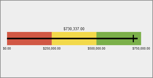
A bullet gauge is a
horizontal dashboard indicator that compares an actual value to a
target value and compares them in intervals. The actual value of the
primary measure is indicated by an inset horizontal bar.
Note that the scale
of a bullet gauge often begins at zero, but it can contain both positive
and negative values if both types of values apply to the primary measure,
such as profit. The inset horizontal bar should always begin at zero
so that comparing multiple bullet graphs is not confusing.
About Slider Gauges
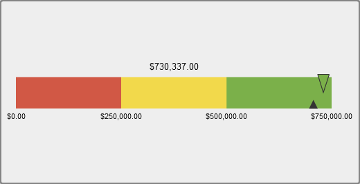
A slider gauge is a
horizontal dashboard indicator that compares an actual value to a
target value and compares them in intervals. The actual value of the
primary measure is indicated by a downward-facing arrow. The target
value is indicated by a small upward-facing arrow.
About Thermometer Gauges
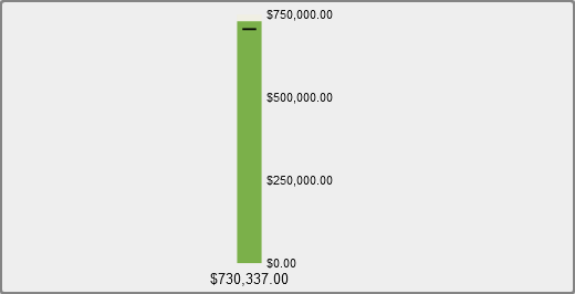
A thermometer gauge
is a vertical dashboard indicator that compares an actual value to
a target value and compares them in intervals. The actual value of
the primary measure is indicated by a vertical bar. The target value
is indicated by a small arrow that is facing the center of the thermometer.
The thermometer gauge
requires a primary measure value and a range-based display rule. A
target measure value is optional. The entire vertical bar is colored
conditionally based on one color from the display rule.
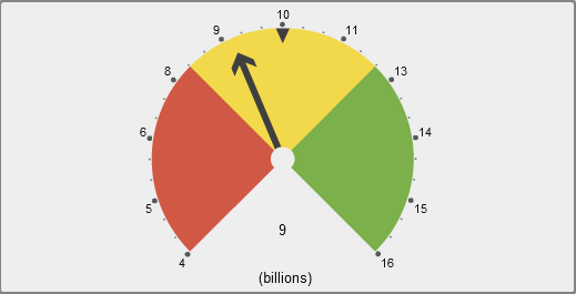
About Dial Gauges
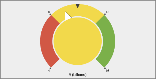
A dial gauge is an arc-shaped
dashboard indicator that compares an actual value to a target value
and compares them in intervals. The actual value of the primary measure
is indicated by an arrow that points outward from the inner circle.
The target value is indicated by an arrow that points inward from
the outer arc. The color of the center circle is the color associated
with the primary measure value’s range interval.
The dial gauge requires
a primary measure value and a range-based display rule. For more
information, see Adding Display Rules to a Gauge.
About Speedometer Gauges
A speedometer gauge
is a circular dashboard indicator that compares an actual value to
a target value and compares them in intervals. The actual value of
the primary measure is indicated by the larger pointer. The target
value is indicated by a small triangle along the quantitative scale,
either pointing inward or outward, depending on the KPI
skin option for the gauge.


Copyright © SAS Institute Inc. All rights reserved.