Gallery
This is an illustrated
gallery of plots and graphs found in SAS Visual Statistics.
Tip
Use the following images for
orientation. Actual appearance and functionality are affected by the
underlying data, any styles that you apply, and the interface that
you are using.
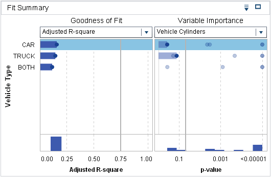 |
Displays the p-value
of each modeling variable on a log scale. The alpha value, plotted
as -log(alpha), is shown as a vertical line that you can click and
drag to adjust. A histogram of the p-values
is displayed at the bottom of the window.
This window is divided
when a group by variable is used. The left side lists the groups and
the right side condenses the p-values
for each group into a single linear scatter plot. You can click on
a group on the left side to change the Residual, Influence, and Assessment
plots to show only the results for that group.
|
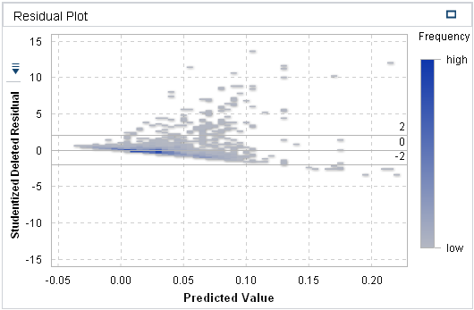 |
Displays various residual
plots for the model. When the plot labels are buttons, you can select
the values that are plotted on that axis. Each model has a unique
set of plot combinations available.
|
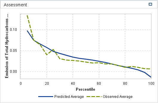 |
For measure target variables,
Assessment plots the average predicted and observed values against
the binned data set. For category target variables, it provides the
Lift, ROC, and Misclassification plots.
|
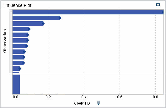 |
Plots each observation
against various computed statistics. The X axis label is a button
that enables you to determine what is plotted. Each model has a unique
set of plot combinations available.
|
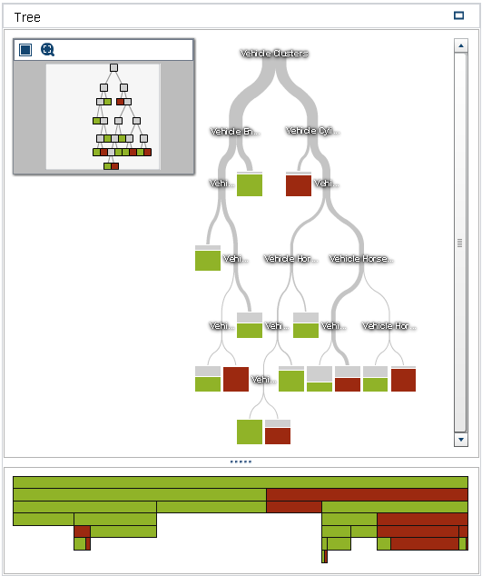 |
Displays the decision
tree and the decision treemap. You can interactively train the decision
tree from this window. Use the scroll wheel on your mouse to zoom
in or out on the location of the mouse pointer.
|
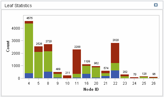 Leaf Statistics Leaf Statistics |
Provides a stacked histogram
of the response variable for each leaf node in the decision tree.
|
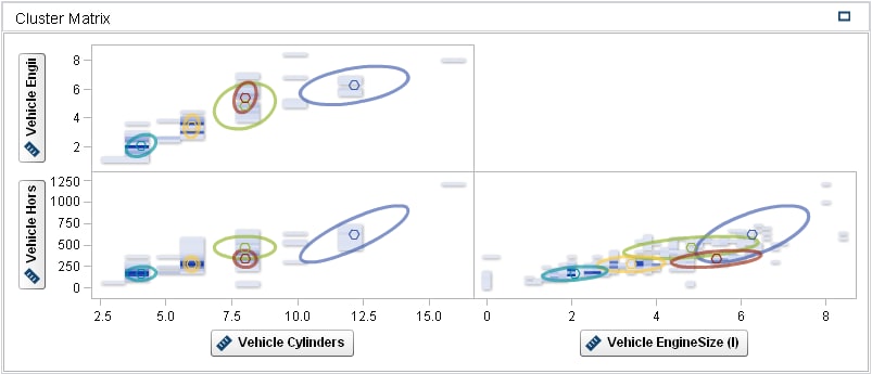 |
Displays the two-dimensional
projection of every cluster for each pair of modeling variables. To
view a larger plot of an individual projection, right-click in that
cell, and select Open.
|
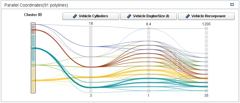 |
Displays a color-coded
strand for each observation, initially sorted by cluster membership.
You can restrict the display to observations that match specific clusters
or ranges of the modeling variables.
|
Copyright © SAS Institute Inc. All Rights Reserved.
Last updated: August 16, 2017