This example uses artificial data to illustrate two basic principles of template writing: that statement order matters and that one of the plotting statements is the primary statement. The data are a sample from a bivariate normal distribution. A custom graph template and PROC SGRENDER are used to plot the data along with vectors and ellipses. The plot consists of four components: a scatterplot of the data; vectors whose end points come from other variables in the data set; ellipses whose parameters are specified in the template; and reference lines whose locations are specified in the template. Initially, thick lines are used to show what happens at the places where the lines and points intersect.
The following steps create the input SAS data set:
data x;
   input x y;
   label x = 'Normal(0, 4)' y = 'Normal(0, 1)';
   datalines;
-4  0
 4  0
 0 -2
 0  2
;

data y(drop=i);
   do i = 1 to 2500;
      r1 = normal( 104 );
      r2 = normal( 104 ) * 2;
      output;
   end;
run;

data all;
   merge x y;
run;
The data set All contains four variables. The variables r1 and r2 contain the random data. These variables contain 2500 nonmissing observations. The data set also contains the variables x and y, which contain the end points for the vectors. These variables contain four nonmissing observations and 2496 observations
that are all missing. A data set like this is not unusual when creating overlaid plots. Different overlays often require input
data with very different sizes. First, the data are plotted by using a template that is deliberately constructed to demonstrate
a number of problems that can occur with statement order.
The following steps create Output 22.7.1:
proc template;
   define statgraph Plot;
      begingraph;
         entrytitle 'Statement Order and the PRIMARY= Option';
         layout overlayequated / equatetype=fit;
            ellipseparm semimajor=eval(sqrt(4)) semiminor=1
                        slope=0 xorigin=0 yorigin=0 /
                        outlineattrs=GraphData2(pattern=solid thickness=5);
            ellipseparm semimajor=eval(2 * sqrt(4)) semiminor=2
                        slope=0 xorigin=0 yorigin=0 /
                        outlineattrs=GraphData5(pattern=solid thickness=5);
            vectorplot  y=y x=x xorigin=0 yorigin=0 /
                        arrowheads=false lineattrs=GraphFit(thickness=5);
            scatterplot y=r1 x=r2 /
                        markerattrs=(symbol=circlefilled size=3);
            referenceline x=0 / lineattrs=(thickness=3);
            referenceline y=0 / lineattrs=(thickness=3);
         endlayout;
      endgraph;
   end;
run;

ods listing style=listing;

proc sgrender data=all template=plot;
run;
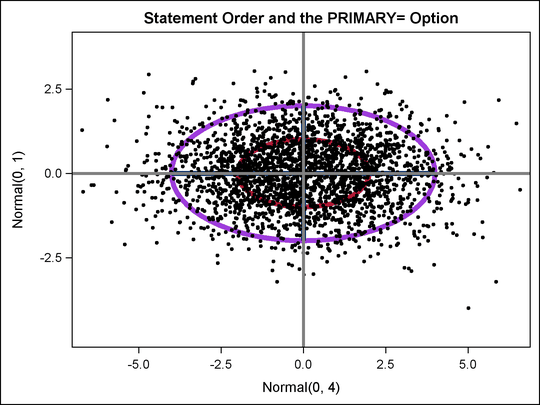
There are a number of problems with the plot in Output 22.7.1. The reference lines obliterate the vectors, and the data are on top of everything but the reference lines. It might be more reasonable to plot the reference lines first, the data next, the vectors next, and the ellipses last. The following steps do this and produce Output 22.7.2:
proc template;
   define statgraph Plot;
      begingraph;
         entrytitle 'Statement Order and the PRIMARY= Option';
         layout overlayequated / equatetype=fit;
            referenceline x=0 / lineattrs=(thickness=3);
            referenceline y=0 / lineattrs=(thickness=3);
            scatterplot y=r1 x=r2 /
                        markerattrs=(symbol=circlefilled size=3);
            vectorplot  y=y x=x xorigin=0 yorigin=0 /
                        arrowheads=false lineattrs=GraphFit(thickness=5);
            ellipseparm semimajor=eval(sqrt(4)) semiminor=1
                        slope=0 xorigin=0 yorigin=0 /
                        outlineattrs=GraphData2(pattern=solid thickness=5);
            ellipseparm semimajor=eval(2 * sqrt(4)) semiminor=2
                        slope=0 xorigin=0 yorigin=0 /
                        outlineattrs=GraphData5(pattern=solid thickness=5);
         endlayout;
      endgraph;
   end;
run;

ods listing style=listing;

proc sgrender data=all template=plot;
run;
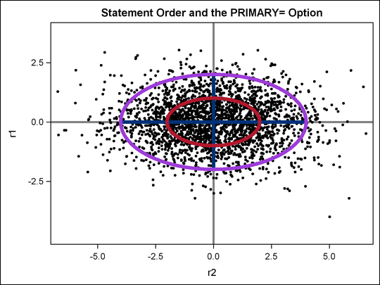
Output 22.7.2 looks better than Output 22.7.1, but the labels for the axes have changed. Output 22.7.1 has the labels of the variables x and y as axis labels, whereas Output 22.7.2 uses the names of the variables r1 and r2. This is because in the Output 22.7.1, the first plot is the vector plot of x and y (which have labels), and in Output 22.7.2, the first plot is the scatter plot of r1 and r2 (which do not have labels). By default, the first plot is the primary plot, and the primary plot is used to determine the axis type and labels. You can designate the vector plot as the primary plot
with the PRIMARY=TRUE option.
The following statements make the final plot, this time with default line thicknesses, and produce Output 22.7.3:
proc template;
   define statgraph Plot;
      begingraph;
         entrytitle 'Statement Order and the PRIMARY= Option';
         layout overlayequated / equatetype=fit;
            referenceline x=0;
            referenceline y=0;
            scatterplot y=r1 x=r2 / markerattrs=(symbol=circlefilled size=3);

            vectorplot  y=y x=x xorigin=0 yorigin=0 / primary=true
                        arrowheads=false lineattrs=GraphFit;

            ellipseparm semimajor=eval(sqrt(4)) semiminor=1
                        slope=0 xorigin=0 yorigin=0 /
                        outlineattrs=GraphData2(pattern=solid);
            ellipseparm semimajor=eval(2 * sqrt(4)) semiminor=2
                        slope=0 xorigin=0 yorigin=0 /
                        outlineattrs=GraphData5(pattern=solid);
         endlayout;
      endgraph;
   end;
run;

ods listing style=listing;

proc sgrender data=all template=plot;
run;
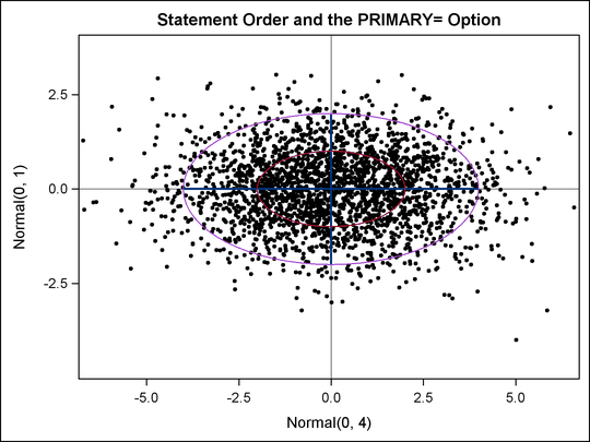
The axis labels in Output 22.7.3 and the overprinting of plot elements look better than in the previous plots. You can further adjust the line thicknesses if you want to emphasize or deemphasize components of this plot. The following list discusses the syntax of the GTL statements used in this example.
-
The template has an ENTRYTITLE statement that specifies the title.
-
The template has an equated overlay. This means that a centimeter on one axis represents the same data range as a centimeter on the other axis. This is done instead of the more common LAYOUT OVERLAY since with these data, the shape and geometry of the data have meaning even though the ranges of the two axis variables are different. The option EQUATETYPE=SQUARE is used to make a square plot, but since the X-axis variable has a larger range than the Y-axis variable, and since the default plot size is wider than high, EQUATETYPE=FIT is specified. The axes are equated but use the available space.
-
A vertical reference line is drawn at X=0, and a horizontal reference line is drawn at Y=0.
-
The scatter plot is based on the Y-axis variable
r2and the X-axis variabler1. The markers are filled circles with a size of three pixels. This is smaller than the default size and works well with a plot that displays many points. -
The vector plot is based on the Y-axis variable
yand the X-axis variablex. The vectors are solid lines with no heads emanating from the origin (X=0 and Y=0). The color and other line attributes such as thickness come from the attributes of theGraphFitstyle element. This is the primary plot, so the default axis labels are the variable labels for the X= and Y= variables if they exist or the variable names if the variables do not have labels. -
The plot also displays two ellipses with X=0 and Y=0 at their center. Their widths are expressions, and their heights are constant. The expressions are not needed in this example; they are used to illustrate the syntax. The SEMIMAJOR= option specifies half the length of the major axis for the ellipse, and the SEMIMINOR= option specifies half the length of the minor axis for the ellipse. The SLOPE= option specifies the slope of the major axis for the ellipse. The colors of the ellipses and other line properties are based on the
GraphData2andGraphData5style elements, but the line pattern attribute from the style is overridden.