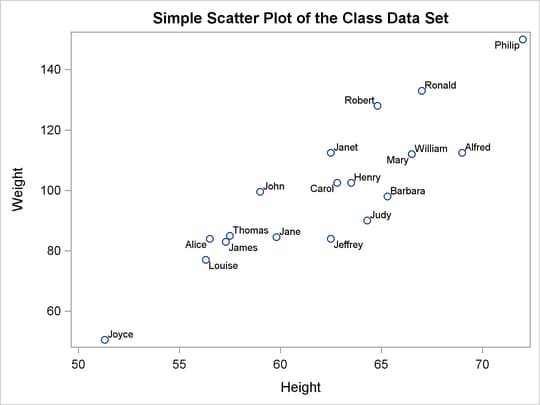
The SGRENDER procedure produces a graph from an input SAS data set and an ODS graph template. With PROC SGRENDER and the Graph
Template Language (GTL), you can create highly customized graphs. The following steps create a simple scatter plot of the
Class data set (available in the Sashelp library) and produce Figure 21.64:
proc template;
   define statgraph Scatter;
      begingraph;
         entrytitle "Simple Scatter Plot of the Class Data Set";
         layout overlay;
            scatterplot y=weight x=height / datalabel=name;
         endlayout;
      endgraph;
   end;
run;

proc sgrender data=sashelp.class template=scatter;
run;
The template definition consists of an outer block that begins with a DEFINE statement and ends with an END statement. Inside of that is a BEGINGRAPH/ENDGRAPH block. Inside that block, the ENTRYTITLE statement provides the plot title, and the LAYOUT OVERLAY block contains the statement or statements that define the graph. In this case, there is just a single SCATTERPLOT statement that names the Y-axis (vertical) variable, the X-axis (horizontal) variable, and an optional variable that contains labels for the points. The PROC SGRENDER statement simply specifies the input data set and the template. The real work in using PROC SGRENDER is writing the template.
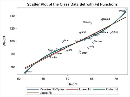
The following steps add a series of fit functions to the scatter plot and create a legend by adding statements to the Scatter template:
proc template;
   define statgraph Scatter;
      begingraph;
         entrytitle "Scatter Plot of the Class Data Set with Fit Functions";
         layout overlay;
            scatterplot y=weight x=height / datalabel=name;
            pbsplineplot y=weight x=height / name='pbs'
                         legendlabel='Penalized B-Spline'
                         lineattrs=GraphData1;
            regressionplot y=weight x=height / degree=1 name='line'
                         legendlabel='Linear Fit'
                         lineattrs=GraphData2;
            regressionplot y=weight x=height / degree=3 name='cubic'
                         legendlabel='Cubic Fit'
                         lineattrs=GraphData3;
            loessplot y=weight x=height / name='loess'
                         legendlabel='Loess Fit'
                         lineattrs=GraphData4;
            discretelegend 'pbs' 'line' 'cubic' 'loess';
         endlayout;
      endgraph;
   end;
run;

proc sgrender data=sashelp.class template=scatter;
run;
The line attributes for each function are specified with different style elements, GraphData1 through GraphData4, so that the functions are adequately identified in the legend. The preceding statements create Figure 21.65.
The following statements create a four-panel display of the Class data set and produce Figure 21.66:
proc template;
   define statgraph Panel;
      begingraph;
         entrytitle "Paneled Display of the Class Data Set";

         layout lattice / rows=2 columns=2 rowgutter=10 columngutter=10;

            layout overlay;
               scatterplot y=weight x=height;
               pbsplineplot y=weight x=height;
            endlayout;

            layout overlay / xaxisopts=(label='Weight');
               histogram weight;
            endlayout;

            layout overlay / yaxisopts=(label='Height');
               boxplot y=height;
            endlayout;

            layout overlay / xaxisopts=(offsetmin=0.1 offsetmax=0.1)
                             yaxisopts=(offsetmin=0.1 offsetmax=0.1);
               scatterplot  y=weight x=height / markercharacter=sex
                  name='color' markercolorgradient=age;
               continuouslegend 'color'/ title='Age';
            endlayout;

         endlayout;
      endgraph;
   end;
run;

proc sgrender data=sashelp.class template=panel;
run;
In this template, the outermost layout is a LAYOUT LATTICE. It creates a ![]() panel of plots with a 10-pixel separation (or gutter) between each plot. Inside the lattice are four LAYOUT OVERLAY blocks—each
defining one of the graphs. The first is a simple scatter plot with a nonlinear penalized B-spline fit. The second is a histogram
of the dependent variable
panel of plots with a 10-pixel separation (or gutter) between each plot. Inside the lattice are four LAYOUT OVERLAY blocks—each
defining one of the graphs. The first is a simple scatter plot with a nonlinear penalized B-spline fit. The second is a histogram
of the dependent variable Weight. The third is a box plot of the independent variable Height. The fourth simultaneously shows height, weight, age, and sex for the students in the class. Each axis has an offset added
at both the maximum and minimum. This provides padding between the axes and the data.

Many other types of graphs are available with the SG procedures. However, even the few examples provided here show the power and flexibility available for making professional-quality statistical graphics. See the SAS/GRAPH: Graph Template Language User's Guide and the SAS/GRAPH: Statistical Graphics Procedures Guide for more information.