CALL HEATMAPCONT (x <*>COLORRAMP=ColorRamp <*>SCALE=scale <*>XVALUES=xValues<*>YVALUES=yValues<*>XAXISTOP=top<*>DISPLAYOUTLINES=outlines<*>TITLE=plotTitle<*>LEGENDTITLE=legendTitle<*>LEGENDLOC=loc <*>SHOWLEGEND=show <*>RANGE=range ) ;
The HEATMAPCONT subroutine is part of the IMLMLIB library. The HEATMAPCONT subroutine displays a heat map of a numeric matrix whose values are assumed to vary continuously. The heat map is produced by calling the SGRENDER procedure to render a template, which is created at run time. The argument x is a matrix that contains numeric data. The ODS statistical graphics subroutines are described in Chapter 15: Statistical Graphics.
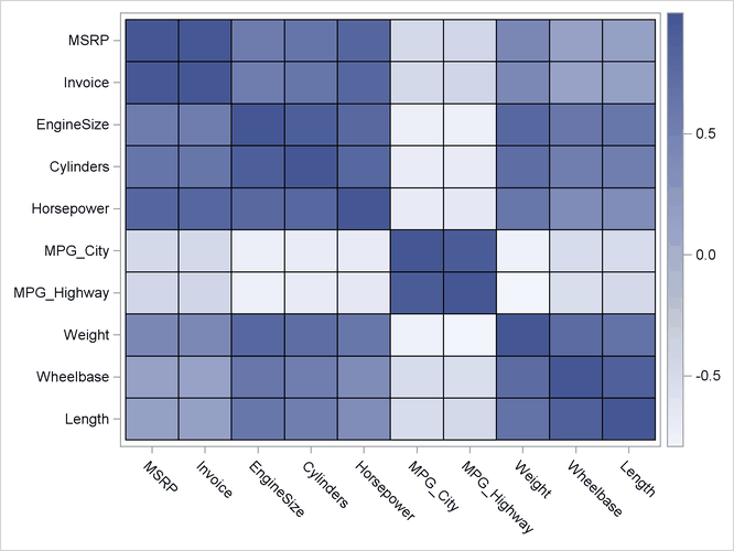
A simple example follows. The numeric variables from the Sashelp.Cars data set are read into a matrix and the CORR function is used to compute the correlation matrix for those variables. The
HEATMAPCONT subroutine creates the image in Figure 24.154, which visualizes the correlations. The correlation matrix has high values (1) on the main diagonal. There are large negative
correlations between horsepower and the fule efficiency variables, MPG_City and MPG_Highway.
use Sashelp.Cars;
read all var _NUM_ into Y[c=varNames];
close Sashelp.Cars;
corr = corr(Y);
call HeatmapCont(corr) xvalues=varNames yvalues=varNames;
Specify the x vector inside parentheses and specify all options outside the parentheses. Titles are specified by using the TITLE= option. Each option corresponds to a statement or option in the graph template languge (GTL).
The following list documents the options to the HEATMAPCONT routine:
- COLORRAMP=
-
specifies a color ramp that assigns colors to cells in the heat map. You can specify the color ramp in the following ways:
-
A character string that matches a predefined color ramp. The “TwoColor” and “ThreeColor” ramps are defined by the current ODS style. Other predefined color ramps are as follows. The first color corresponds to low values; the last color corresponds to high values. Intermediate values are linearly interpolated.
-
“Gray” is a three-color ramp composed of white, gray, and black
-
“BlueRed” is a two-color ramp composed of blue and red
-
“BlueGreenRed” is a four-color ramp composed of blue, cyan, yellow, and red
-
“Rainbow” is a four-color ramp composed of magenta, cyan, yellow, and red
-
“Temperature” is a five-color ramp composed of white, cyan, yellow, red, and black
-
-
A character vector with
 color names that are valid in the GTL. For example, the expression {lightblue blue black red lightred} defines a five-color
ramp.
color names that are valid in the GTL. For example, the expression {lightblue blue black red lightred} defines a five-color
ramp.
-
An
 matrix that defines a user-defined color ramp with colors. Each row specifies an RGB color for the ramp. For example, the expression {255 0 0, 0 255 136, 136 00 255} defines
a three-color ramp.
matrix that defines a user-defined color ramp with colors. Each row specifies an RGB color for the ramp. For example, the expression {255 0 0, 0 255 136, 136 00 255} defines
a three-color ramp.
-
A character vector with
hexadecimal color values that are valid in the GTL. For example, the expression {CXA6611A CXDFC27D CXF5F5F5 CX80CDC1 CX018571}
defines a five-color ramp.
-
- SCALE=
-
specifies how the input matrix should be scaled. Valid values are “None” (the default), “Row”, or “Column”. For data matrices, variables often have different scales. The “Column” option standardizes each column to have zero mean and unit standard deviation. The “Row” option standardizes each row to have zero mean and unit standard deviation.
- XVALUES=
-
specifies a vector of values for ticks for the X axis. If no values are specified, the column numbers are used.
- YVALUES=
-
specifies a vector of values for ticks for the Y axis. If no values are specified, the row numbers are used.
- XAXISTOP=
-
specifies the location of the X axis. The value 0 (the default) specifies that the X axis be displayed at the bottom of the heat map. A nonzero value specifies that the X axis be displayed at the top of the heat map.
- DISPLAYOUTLINES=
-
specifies whether to display grid lines for the heat map cells. The value 0 specifies that the no grid lines be displayed. A nonzero value (the default) specifies that grid lines be displayed.
- TITLE=
-
specifies a title for the heat map. By default, no title is displayed.
- LEGENDTITLE=
-
specifies a title for the legend, which shows the color ramp. By default, no title is displayed.
- LEGENDLOC=
-
specifies a location for the legend. Valid values are “Right” (the default), “Left”, “Top”, and “Bottom”.
- SHOWLEGEND=
-
specifies whether to display the continuous legend. The default value is 1, which shows the legend. To suppress the legend, specify 0.
- RANGE=
-
specifies the range of the color ramp. By default, the range of the datais used. You can specify a two-element array to change the range. For example, RANGE=
 specifies that the color ramp colors values on the interval
 ![$[-1, 1]$](images/imlug_langref0480.png) . You can use missing values to specify the minimum and maximum values. Thus RANGE=
. You can use missing values to specify the minimum and maximum values. Thus RANGE= specifies that
  is the lower endpoint of the range and that the maximum data value should be used for the upper endpoint.
The following example shows how to create a heat map that uses the SCALE=, XVALUES=, YVALUES=, and TITLE= options.
use Sashelp.Class;
read all var _NUM_ into Students[c=varNames r=Name];
close Sashelp.Class;

/* sort data in descending order according to Age and Height */
call sortndx(idx, Students, 1:2, 1:2);
Students = Students[idx,];
Name = Name[idx];

/* standardize each column */
call HeatmapCont(Students) scale="Col"
        xvalues=varNames yvalues=Name title="Student Data";

In Figure 24.155, you can see that Philip is the biggest student, Joyce is the smallest, Robert is heavy for his age, and Alfred is tall for his age.
For a more complicated visualization of a data matrix, the following statements visualize the number of snack items solds at a fictitious store over the course of 1,022 days. The heat map that uses the YVALUES=, DISPLAYOUTLINES=, and TITLE= options. Because the quantity of items sold range over two orders of magnitude (from 0 to 121), a logarithmic transformation is used to transform the data.
use Sashelp.Snacks;
read all var {QtySold Date Product};
close Sashelp.Snacks;

QtySold = choose(QtySold>=0, QtySold, .); /* remove invalid quantities */
Names = unique(Product);
x = shape(QtySold, ncol(Names));

ods graphics / height=800 width=1400;
call HeatmapCont(log10(x+1)) yvalues=Names displayoutlines=0
                             title="Log10(Items Sold) by Day";
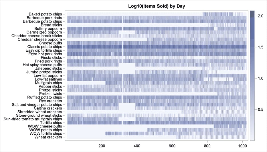
In Figure 24.156, horizontal white bands indicate periods of time for which a particular snack item was not sold. Vertical white bands indicate
days for which the store was closed. Dark shades, such as for “classic potato chips” and “tortilla chips,” indicate items for which the average number of units sold each day was about ![]() . Lighter shades, such as for “fiesta sticks” and “stone-ground wheat sticks,” indicate less popular items.
. Lighter shades, such as for “fiesta sticks” and “stone-ground wheat sticks,” indicate less popular items.