In this example, you visualize the distribution of points in a scatter plot, as subset by values of a categorical variable. This is sometimes called a conditional plot.
-
Open the
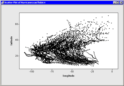
Hurricanesdata set, and create a scatter plot oflatitudeversuslongitude.The scatter plot appears. (See Figure 9.10.) The plot shows the position of Atlantic cyclones during a 16-year period. There is considerable overplotting in this scatter plot, particularly along a path between the Cape Verde Islands (lower right corner of the plot) and the Caribbean Sea (near the coordinates
 ).
).
The overplotting prevents the clear examination of rare events such as category 4 and category 5 hurricanes. You can modify the scatter plot so that it displays only selected observations. This makes it easier to examine these storms.
-
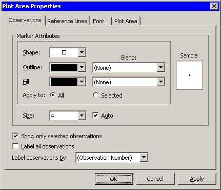
Right-click near the center of the plot, and select from the pop-up menu.
The Plot Area Properties dialog box appears. (See Figure 9.11.)
-
Select .
-
Click .
The scatter plot updates. All of the observations disappear because none are selected. You can use another plot or the data table’s Find dialog box (see the section Finding Observations) to select data of interest.
-
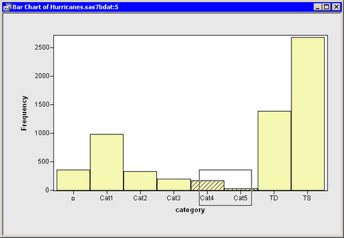
Create a bar chart of the
categoryvariable. -
Select all category 4 and 5 hurricanes in the bar chart, as shown in Figure 9.12.
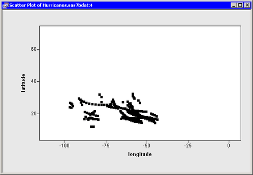
The selected observations appear in the scatter plot, as shown in Figure 9.13. Most of the selected storms appear in the Gulf of Mexico, the Caribbean Sea, and the Atlantic Ocean east of the Greater Antilles.