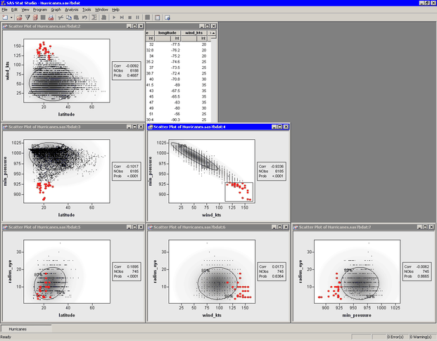
Partly visible in Figure 25.4 is the matrix of pairwise scatter plots between the variables. Some of these plots are hidden by the output window and the pairwise correlation plot.
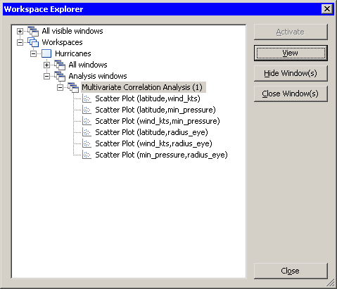
To use the Workspace Explorer to view all the scatter plots:
-
Close the pairwise correlation plot.
-
Press ALT+X to open the Workspace Explorer.
You can use the Workspace Explorer to manage the display of plots. The Workspace Explorer is described in the section Workspace Explorer of Chapter 11: Techniques for Exploring Data.
-
Select the entry in the Workspace Explorer labeled , as shown in Figure 25.5.
-
Click .
The scatter plots that are associated with the analysis appear in front of other windows.
-
Click to close the Workspace Explorer.
The workspace is now arranged as shown in Figure 25.6. The ellipses show where the specified percentage of the data should lie, assuming a bivariate normal distribution. Under bivariate normality, the percentage of observations falling inside the ellipse should closely agree with the specified level. The plots also contain a gradient shading that indicates a nested sequence of ellipses. The darkest shading occurs at the bivariate means for each pair of variables. The lightest shading corresponds to 0.9999 probability.
Variables that are bivariate normal have most of their observations close to the bivariate mean and have a bivariate density
that is proportional to the gradient shading. The plot of wind_kts versus latitude shows that these two variables are not bivariate normal. Similarly, min_pressure and latitude are not bivariate normal.
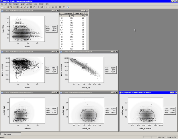
The variables wind_kts and min_pressure are highly correlated and linearly related. In contrast, wind_kts is not correlated with latitude or radius_eye, although you can still notice certain relationships:
-
Cyclones with high wind speeds occur only at lower latitudes.
-
Cyclones north of 43 degrees of latitude tend to have wind speeds less than 75 knots.
-
The size of a cyclone’s eye seems to be unrelated to the speed of its winds.
You can observe similar relationships between min_pressure and the latitude and radius_eye variables.
The matrix of scatter plots also reveals an aspect of the data that might not be apparent from univariate plots. The plots
that display wind_kts or radius_eye show a granular appearance that indicates the data are rounded. Most of the wind speed measurements are rounded to the nearest
five knots, whereas the values for the eye radius are rounded to the nearest 2.5 nautical miles. (You can also find observations
for these variables that are not rounded.)
Figure 25.7 shows another use of the scatter plot matrix. Some observations with extreme values of min_pressure and wind_kts are selected. The marker shape and color for these observations were changed to make them more noticeable. You can use this
technique to investigate whether outliers for one pair of variables are, in fact, multivariate outliers with respect to multivariate
normality. Most of the selected data in Figure 25.7 are inside the 80% ellipse for the radius_eye versus latitude scatter plot. This indicates that these data are not far from the mean in those variables. However, a few observations (corresponding
to Hurricane Hugo when it was category 5) do appear to be multivariate outliers in these variables.