| Example: Create a Scatter Plot |
In this section you create a scatter plot of the wind_kts and min_pressure variables of the Hurricanes data set. The wind_kts variable is the wind speed in knots; the min_pressure variable is the minimum central pressure for each observation.
The min_pressure variable has a few missing values; those observations are not included in the scatter plot.
To create a scatter plot:
-
Select Graph
 Scatter Plot from the main menu, as shown in Figure 6.6.
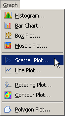
The Scatter Plot dialog box appears. (See Figure 6.7.)
Select the variable wind_kts, and click Set Y.
Select the variable min_pressure, and click Set X.
-
Click OK.
Figure 6.7 The Scatter Plot Dialog Box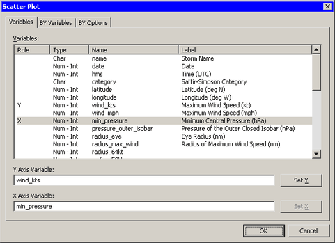
A scatter plot appears (Figure 6.8) that shows the bivariate data. The plot shows a strong negative correlation (
 ) between wind speed and pressure. The plot also shows that most, although not all, wind speeds are rounded to the nearest 5 knots.
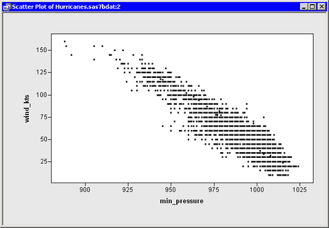
You can click any observation marker to select the observation. You can click while holding down the CTRL key to select multiple observations. You can draw a selection rectangle to select a group of observations.