You might find it useful to color observation markers by using the value of an interval (that is, continuous) variable. This enables you to examine values of the coloration variable, even if that variable is not being explicitly plotted.
Suppose you are looking at a scatter plot of the min_pressure and wind_kts variables in the Hurricanes data set. You want to color-code observations by using the value of a third variable, latitude. You want to assign red to the most southerly observation, blue to the most northerly, and other colors to observations with
intermediate values.
To accomplish this, you can call the ColorCodeObs module, which is distributed with SAS/IML Studio. The module colors observations according to values of a single variable by using a user-defined color blend. Type or copy the following statements into the program window, and select → from the main menu.
   declare DataObject dobj;
   dobj = DataObject.CreateFromFile("Hurricanes");

   declare ScatterPlot plot;
   plot = ScatterPlot.Create( dobj, "min_pressure", "wind_kts" );

   ColorMap = RED//YELLOW//CYAN//BLUE;
   NumColors = 13;
   run ColorCodeObs( dobj, "latitude", ColorMap, NumColors );

   declare Histogram hist;
   hist = Histogram.Create( dobj, "latitude" );
   hist.SetWindowPosition( 50, 50, 50, 50 );
   hist.SetAxisNumericTicks( XAXIS, 10, 5, 0, 75 );
The first and last statements create a scatter plot and histogram as described in Chapter 3: Creating Dynamically Linked Graphs. They also adjust the histogram bins as described in Chapter 9: Adjusting Axes and Locations of Ticks. The resulting scatter plot is shown in Figure 10.1.
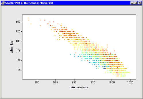
The new statements in this program are those that color markers by using the latitude variable. This is done with the ColorCodeObs module. In this example, the latitude variable is used to color observations. The smallest value of the latitude variable (7.2) is assigned to the first color (red) in the ColorMap matrix. The largest value of the latitude variable (70.7) is assigned to the last color (blue) in the ColorMap matrix. The remaining values are assigned to one of 13 colors obtained by linearly blending the four colors defined in the
ColorMap matrix. Observations are colored yellow if they are near 28.4 degrees (![]() ). Observations are colored cyan if they are near 49.5 degrees (
). Observations are colored cyan if they are near 49.5 degrees (![]() ).
).
Note: Observations with missing values for the requested variable are not colored. The latitude variable used in this example does not contain any missing values.
To confirm that the observations were color-coded according to values of latitude, follow these steps:
-
Click on the histogram bars for low values of
latitude.Note that the observations are mainly colored red and orange. Orange appears because the red and yellow colors in the
ColorMapmatrix were blended. -
Click on the histogram bars for high values of
latitude.High values of
latitudeare colored in shades of blue. Each shade is a blend of cyan and blue. -
Click on the histogram bars for medium values of
latitude.Medium values of
latitudeare colored in shades of yellows and greens.
You can use the predefined colors available in SAS/IML Studio, or you can create your own colors by specifying their RGB or hexadecimal values as described in the SAS/IML Studio online Help. Table 10.1 lists the predefined colors in SAS/IML Studio. Each color (written in all capitals) is an IMLPlus keyword.
Table 10.1: Predefined Colors
|
BLACK |
CHARCOAL |
GRAY, GREY |
WHITE |
|
RED |
MAROON |
SALMON |
ROSE |
|
MAGENTA |
PURPLE |
LILAC |
PINK |
|
BLUE |
STEEL |
VIOLET |
CYAN |
|
GREEN |
OLIVE |
LIME |
|
|
YELLOW |
ORANGE |
GOLD |
|
|
BROWN |
TAN |
CREAM |