DISCRETE Axes
Setting the Axis Tick Values
For a DISCRETE axis, you can include
the TICKVALUELIST=(values)
option in the DISCRETEOPTS= list to set the axis tick values. The
TICKVALUELIST= option enables you to subset the tick values and to
display the values in a specific order. The values that you use with the TICKVALUELIST= option must be within the actual
data range and they must correspond to the formatted values of the
data. Here is an example of a template that uses the TICKVALUELIST=
option to display the first six months of annual failure data.
/* Create a test data set of annual failure data */
data failrate;
  do month=1 to 12 by 1;
    failures=2*ranuni(ranuni(12345));
    label failures="Failure Rate (% of Units Produced)";
    output;
  end;
run;

/* Create a template to display the first six months of data */
proc template;
 define statgraph firsthalf;
  begingraph;
  entrytitle "Unit Failure Rate in First Half";
   layout overlay /
      xaxisopts=(
         discreteopts=(tickvaluelist=("1" "2" "3" "4" "5" "6")));
    barchart x=month y=failures;
   endlayout;
   endgraph;
 end;
run;

/* Plot the data */
proc sgrender data=failrate template=firsthalf;
run;Avoiding Tick Value Collisions
To avoid tick-value collisions, a DISCRETE axis uses
several of the fit policies that a LINEAR axis uses. These policies
include THIN, ROTATE, STAGGER, ROTATETHIN, STAGGERTHIN, and STAGGERROTATE. For information about these policies, see Avoiding Tick Value Collisions. A DISCRETE axis uses the following additional fit policies:
| TRUNCATE | TRUNCATETHIN |
| STAGGERTRUNCATE | EXTRACT |
| TRUNCATEROTATE | EXTRACTALWAYS |
| TRUNCATESTAGGER |
You can set TICKVALUEFITPOLICY=TRUNCATE
to shorten the tick values. Axis values that are greater than 12 characters
in length are truncated to 12 characters. Ellipses are added to the
end of the truncated values to indicate that truncation has occurred.
When there is sufficient room on the axis to fit the full axis values,
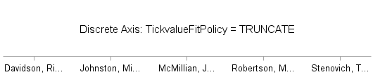
no truncation occurs. For example, consider the following axis values.
| Davidson, Richard | Robertson, MaryAnn |
| Johnston, Miranda | Stenovich, Timothy |
| McMillian, Joseph |
If the TRUNCATE policy
is used to fit these values on the X axis, the values are truncated
as shown in the following figure.
The compound policies
STAGGERTRUNCATE, TRUNCATEROTATE, TRUNCATESTAGGER, and TRUNCATETHIN
apply the first fit policy, and then apply the second fit policy when
fitting the tick values.
For a large number of
tick values, you can set TICKVALUEFITPOLICY=EXTRACT or TICKVALUEFITPOLICY=EXTRACTALWAYS
to move the axis values to an AXISLEGEND. In that case, on the axis,
the values are replaced with consecutive integers, and an AXISLEGEND
is added that cross references the integer values on the axis to the
actual axis values.
Note: If the axis type is not DISCRETE,
the TICKVALUEFITPOLICY=EXTRACT and TICKVALUEFITPOLICY=EXTRACTALWAYS
options are ignored.
When you set TICKVALUEFITPOLICY
to EXTRACT or EXTRACTALWAYS, you must also include the NAME= option
in your axis option list and an AXISLEGEND “name” statement in your layout block.
In the AXISLEGEND statement, you must set name to the value that you specified with the NAME= option in the axis
options list. Here is an example.
proc template;
define statgraph discretefitpolicyextract;
begingraph / border=false designwidth=450px designheight=400px;
entrytitle "Average MPG City by Make: Trucks";
Layout overlay /
    yaxisopts=(label="Average MPG")
    xaxisopts=(label="Make"
       name="axisvalues"
       tickvalueattrs=(size=9pt)
       discreteopts=(tickvaluefitpolicy=extract));
    barchart x=make y=mpg_city/orient=vertical stat=mean;
    axislegend "axisvalues" / pad=(top=5 bottom=5) title="Makes";
endlayout;
endgraph;
end;
run;

proc sgrender data=sashelp.cars template=discretefitpolicyextract;
   where type="Truck";
run;
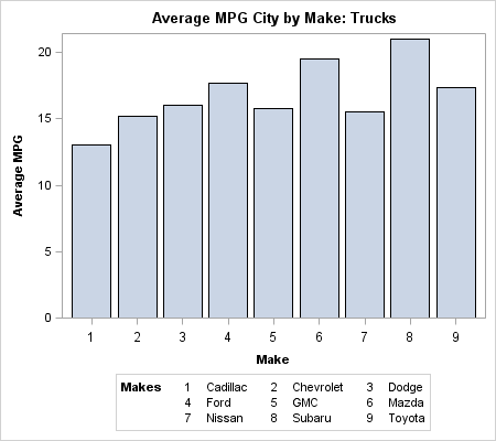
In this example, the
name AXISVALUES is used to associate the AXISLEGEND statement with
the X axis. The graph size is set to 450 pixels wide by 400 pixels
high. Since there is not enough room on the X axis to fit the make
names, the names are extracted to an axis legend as shown.
In most cases, the EXTRACT
policy moves the axis values to an axis legend only if a collision
occurs. If no collision occurs, the values are displayed on the axis
in the normal manner. In this example, if you increase the width of
the graph to 650 pixels and rerun the program, the legend disappears.
In contrast, the EXTRACTALWAYS policy moves the axis values to a legend
regardless of whether a collision occurs.
Note: With the exception of TICKVALUEFITPOLICY=EXTRACTALWAYS,
the TICKVALUEFITPOLICY= is never applied unless a tick value collision
situation is present. That is, you cannot force tick values to be
rotated, staggered, or moved to an axis legend if there is no collision
situation.
For information about
the tick value fit policies that can be used with a discrete axis
in each of the applicable layouts, see Tick Value Fit Policy Applicability Matrix.
Setting Alternating Wall Color Bands for Discrete Intervals
For a discrete axis, you can use
the COLORBANDS= option in your DISCRETEOPTS= option list to specify
alternating wall color bands for each of the discrete axis intervals.
The alternating bands can help improve the readability of complex
plots. You can specify attributes for the odd or even bands. The odd
bands begin with the first axis interval, while the even bands begin
with the second interval.
Note: If you specify the COLORBANDS
option for more than one axis, such as both the X and Y axes, in an
overlay, you might get unexpected results.
Include the COLORBANDSATTRS= option
in your DISCRETEOPTS= option list to specify the fill color and transparency
of the bars. You can specify either a style element or a list of fill
options. If you specify fill options, you must enclose the options
in parenthesis.
Tip
You can add a border around
the color bands by including the TICKPOSITION=INBETWEEN option in
the DISCRETEOPTS= option list and the GRIDDISPLAY=ON and GRIDATTRS=
options in the XAXISOPTIONS= or YAXISOPTIONS= options list.
Here is an example that
adds alternating light-gray color bands to the discrete Y axis of
a plot. The bands begin on the second (even) interval.
proc template;
  define statgraph colorbands;
    begingraph;
	  entrytitle "MPG City - European Makes";
      layout overlay /
	    xaxisopts=(griddisplay=on)
        yaxisopts=(type=discrete offsetmin=0.05 offsetmax=0.05
           discreteopts=(colorbands=EVEN
              colorbandsattrs=(transparency=0.6 color=lightgray)));
        scatterplot y=make x=mpg_city / name="sp"
           group=type groupdisplay=cluster;
		discretelegend "sp" / title="Vehicle Type";
      endlayout;
    endgraph;
  end;
run;

proc sgrender data=sashelp.cars template=colorbands;
   where origin="Europe";
run;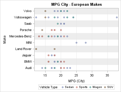
Offsetting Graph Elements from the Category Midpoint
When
you overlay plots that support discrete data, you can use the DISCRETEOFFSET=
option to offset the graph elements from the midpoints on the discrete
axis. Plots that support discrete data on one axis include:
| BARCHART | BOXPLOTPARM | SCATTERPLOT |
| BARCHARTPARM | SERIESPLOT | DROPLINE |
| BOXPLOT | STEPPLOT |
By default, the graph
elements, such as bars or markers, are positioned on the midpoint
tick marks as shown in the following example. In this example, three
bar charts are drawn using transparency and varying bar widths so
that you can see how the bars are overlaid. The DATATRANSPARENCY=
option is used to control the transparency, and the BARWIDTH= option
is used to control the bar widths.
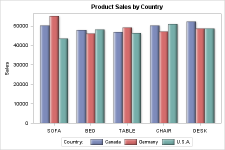
Instead of overlaying
the bars on each tick mark, you can use the DISCRETEOFFSET= and BARWIDTH=
options in the plot statement to move the bars away from the midpoint
and size them to form a cluster of side-by-side bars or overlapped
bars on each tick mark. The DISCRETEOFFSET= option can be set to a
value ranging from –0.5 to 0.5. The value specifies the offset
as a percentage of the distance between the midpoints on the axis.
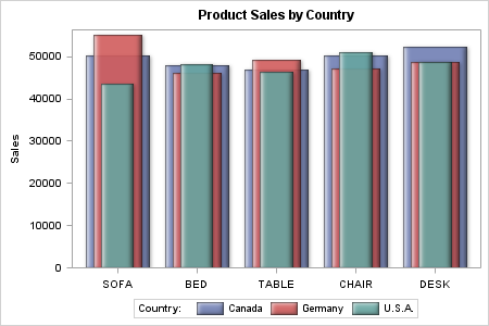
Here is the previous example modified to use the DISCRETEOFFSET= and
BARWIDTH= options to form a cluster of side-by-side bars around each
tick mark on the X axis.
/* Extract the sales data for each country from SASHELP.PRDSALE. */
data sales;
   set sashelp.prdsale(keep=country actual product);
   if (country eq "CANADA") then canada=actual;
   else if (country eq "GERMANY") then germany=actual;
   else if (country eq "U.S.A.") then usa=actual;
run;

/* Create the graph template. */
proc template;
   define statgraph offset;
      begingraph;
      entrytitle "Product Sales by Country";
      layout overlay / cycleattrs=true
         xaxisopts=(display=(tickvalues)) yaxisopts=(label="Sales");
         barchart x=product y=canada / stat=sum name="canada"
            legendlabel="Canada" dataskin=sheen datatransparency=0.1
            barwidth=0.25 discreteoffset=-0.25;
         barchart x=product y=germany / stat=sum name="germany"
            legendlabel="Germany" dataskin=sheen datatransparency=0.1
            barwidth=0.25;
         barchart x=product y=usa / stat=sum name="usa"
            legendlabel="U.S.A." dataskin=sheen datatransparency=0.1
            barwidth=0.25 discreteoffset=0.25;
         discretelegend "canada" "germany" "usa" / title="Country:"
            location=outside;
      endlayout;
      endgraph;
   end;
run;

/* Generate the graph. */
proc sgrender data=sales template=offset;
run;
In this example, the
DISCRETEOFFSET=–0.25 option in the first BARCHART statement
moves its bars to the left of each tick mark by 25% of the distance
between the tick marks. The second BARCHART statement uses the default
offset (0), which positions its bars on the tick marks. The DISCRETEOFFSET=0.25
option on the third BARCHART statement positions its bars to the right
of each tick mark by 25% of the distance between the tick marks. The
BARWIDTH=0.25 option in each of the BARCHART statements sizes the
bars to form a cluster with no space between the bars as shown. You
can adjust the DISCRETEOFFSET= and BARWIDTH= option values to overlap
the bars or add space between the bars in each cluster as desired.