The SGSCATTER procedure creates a paneled
graph of scatter plots for multiple combinations of variables, depending
on the plot statement that you use. You can use options to overlay
fit plots and ellipses on your scatter plots.
Here are examples of
some types of graphs that the SGSCATTER procedure can create.
Examples of Graphs that Can Be Generated by the SGSCATTER Procedure
|
|
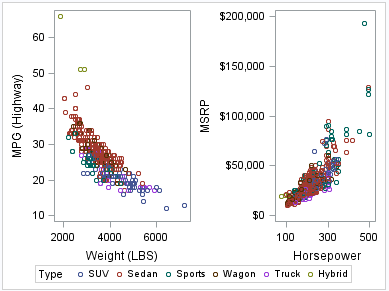
The following code creates
a paneled graph of scatter plots:
proc sgscatter data=sashelp.cars;
  plot mpg_highway*weight msrp*horsepower
          / group=type;
run; |
|
|
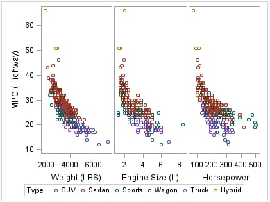
The following code creates
a paneled graph of scatter plots with shared axes:
proc sgscatter data=sashelp.cars;
  compare y=mpg_highway
          x=(weight enginesize horsepower )
          / group=type;
run; |
|
|
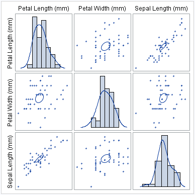
The following code creates
a scatter plot matrix with prediction ellipses and a diagonal with
histograms and density plots:
proc sgscatter data=sashelp.iris
               (where=(species eq "Virginica"));
matrix petallength petalwidth sepallength
       / ellipse=(type=mean)
         diagonal=(histogram kernel);
run; |
Note: The graphs that you create
with the SGSCATTER procedure can have many individual graph cells.
As the number of cells increases, the overall graph size does not
automatically increase. To increase the graph size, use the HEIGHT=
and WIDTH= options of the ODS GRAPHICS statement.