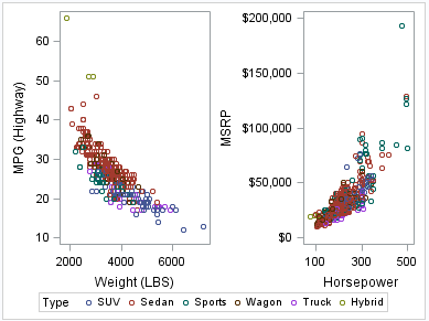
Creating Paneled Scatter Plots
The following example
creates a panel using the PLOT layout. The PLOT statement creates
a paneled graph of scatter plots where each cell has its own independent
set of axes.
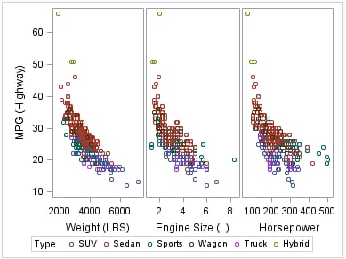
The following example
creates a panel using the COMPARE layout. The COMPARE statement creates
a paneled graph that uses common axes for each row and column of cells.
Cells are created for all crossing of the X and Y variables.
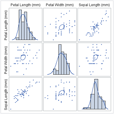
The following example
creates a panel using the MATRIX layout. The MATRIX statement creates
a matrix of scatter plots where each cell represents a different combination
of variables. In the diagonal cells, you can place labels or histograms
with or without density curves.
For more information
about the SGSCATTER procedure and the procedure syntax, see SGSCATTER Procedure.