Categorization Plots and Charts
About Categorization Plots and Charts
Categorization plots and charts produce a series of graph
elements, one for each selected category of cases. For example, the
relation between the age and the risk of a heart attack might differ
between males and females. Categorization plots and charts can reveal
patterns, complex interactions, exceptions, and anomalies.
You can use the SGPLOT
and SGPANEL procedures to produce a variety of categorization plots
and charts. The plot and chart statements include many options for
controlling how the output is displayed. The options that are available
depend on the plot type. The following sections describe each type
and the options that are available.
About Bar Charts
Overview of Standard and Parameterized Bar Charts
Bar charts
use bars to represent statistics based on the values of a category
variable. Bar charts are useful for displaying magnitudes and emphasizing
differences.
Bar Chart Examples
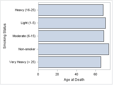
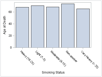
The following examples
show statistics for different categories of smokers. The examples
use the SGPLOT procedure to create a horizontal and a vertical bar
chart, respectively. By default, the charts show the frequency for
each category. The examples specify an optional response variable
to show the average age at death for each category rather than the
frequency.
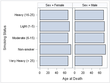
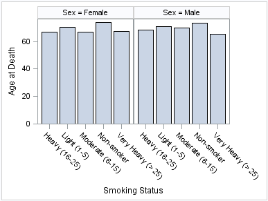
The following two examples
use the SGPANEL procedure to create a horizontal and a vertical chart,
respectively. The bar charts are paneled by gender.
Parameterized Bar Chart Examples
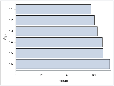
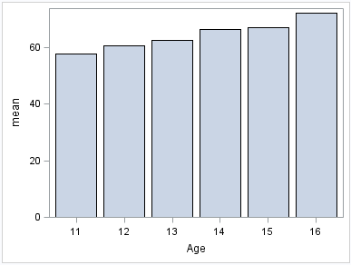
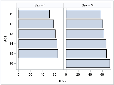
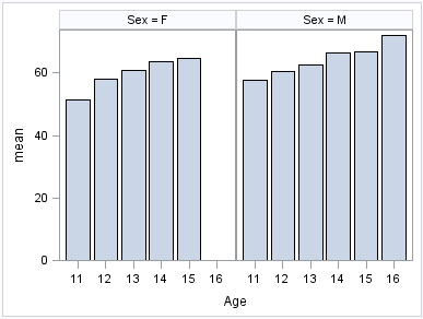
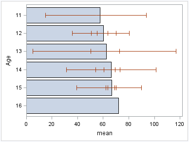
The following examples
show height averages for a class of students. The averages are obtained
using the following program.
proc means data=sashelp.class alpha=.05 clm mean std;
  class age sex;
  var height;
  output out=classMean uclm=uclm lclm=lclm mean=mean;
run;
The following two examples
use the SGPLOT procedure to create a horizontal and a vertical chart,
respectively. The response variable contains the computed mean values
that were created with the MEANS procedure.
The following two examples
use the SGPANEL procedure to create horizontal and vertical bar charts,
respectively. The charts are paneled by gender.
See Also
HBAR Statement (SGPANEL procedure)
VBAR Statement (SGPANEL procedure)
HBAR Statement (SGPLOT procedure)
VBAR Statement (SGPLOT procedure)
HBARPARM Statement (SGPANEL procedure)
VBARPARM Statement (SGPANEL procedure)
HBARPARM Statement (SGPLOT procedure)
VBARPARM Statement (SGPLOT procedure)
About Dot Plots
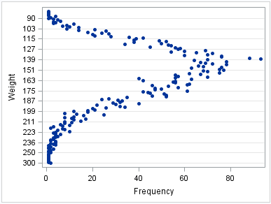
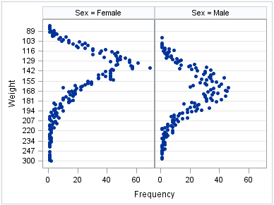
Dot plots summarize
horizontally the values of a category variable. By default, each dot
represents the frequency for each value of the category variable.
The following examples
show the frequency of different weights of patients in a study. The
examples use the SGPLOT and the SGPANEL procedures.
About Line Charts
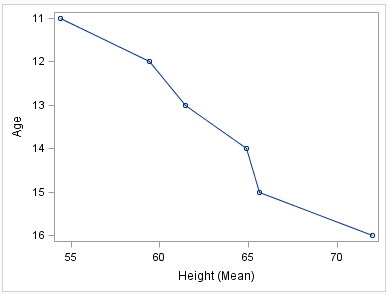
Line charts displays
information as a series of data points connected by straight line
segments. The SGPLOT and the SGPANEL procedures have separate statements
for creating horizontal and vertical line charts.
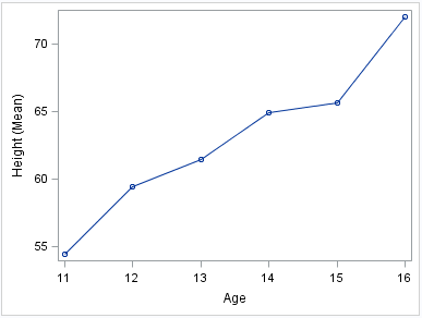
The following examples
show mean weight values for a class. Examples are provided for the
SGPLOT and the SGPANEL procedures. The examples specify an optional
response variable and use the mean statistic for that variable. The
examples also add data point markers.
These two examples use
the SGPLOT procedure to create a horizontal and a vertical chart,
respectively.
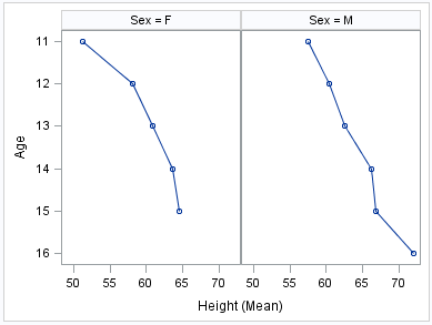
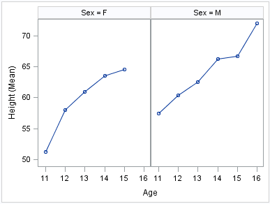
The following two examples
use the SGPANEL procedure to create panels of horizontal and vertical
charts, respectively.
See Also
HLINE Statement (SGPANEL procedure)
VLINE Statement (SGPANEL procedure)
HLINE Statement (SGPLOT procedure)
VLINE Statement (SGPLOT procedure)
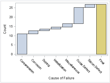
About Waterfall Charts (Preproduction)
Waterfall charts show
how the value of a variable increases or decreases until it reaches
a final value. In the chart, bars represent an initial value of Y
and a series of intermediate values identified by X leading to a final
value of Y. Waterfall charts are available only for the SGPLOT procedure.
See Also
WATERFALL (Preproduction) Statement (SGPLOT procedure)